Beauty & Skincare Welcome Email Template
“It’s 2003 again: Be your best self”
Design Score
78/100This email is visually polished and contains a high-value offer, but the messaging strategy is disjointed. The hero section's 'early 2000s' reference feels disconnected from the brand's core value proposition of scientific precision and authority, creating cognitive dissonance right at the start. While the visual hierarchy is strong, the most compelling conversion driver (the 50% off discount) is buried at the bottom, forcing users to scroll to find the main reason to convert.
Create Your Own
Generate professional email designs like this one in seconds with Kopi AI.
Email Details
- Subject Line
- It’s 2003 again: Be your best self
- Brand
- Prose
- Industry
- Beauty & Skincare
- Email Type
- Welcome
- Created
- February 6, 2026
Brand Colors
Email Copy
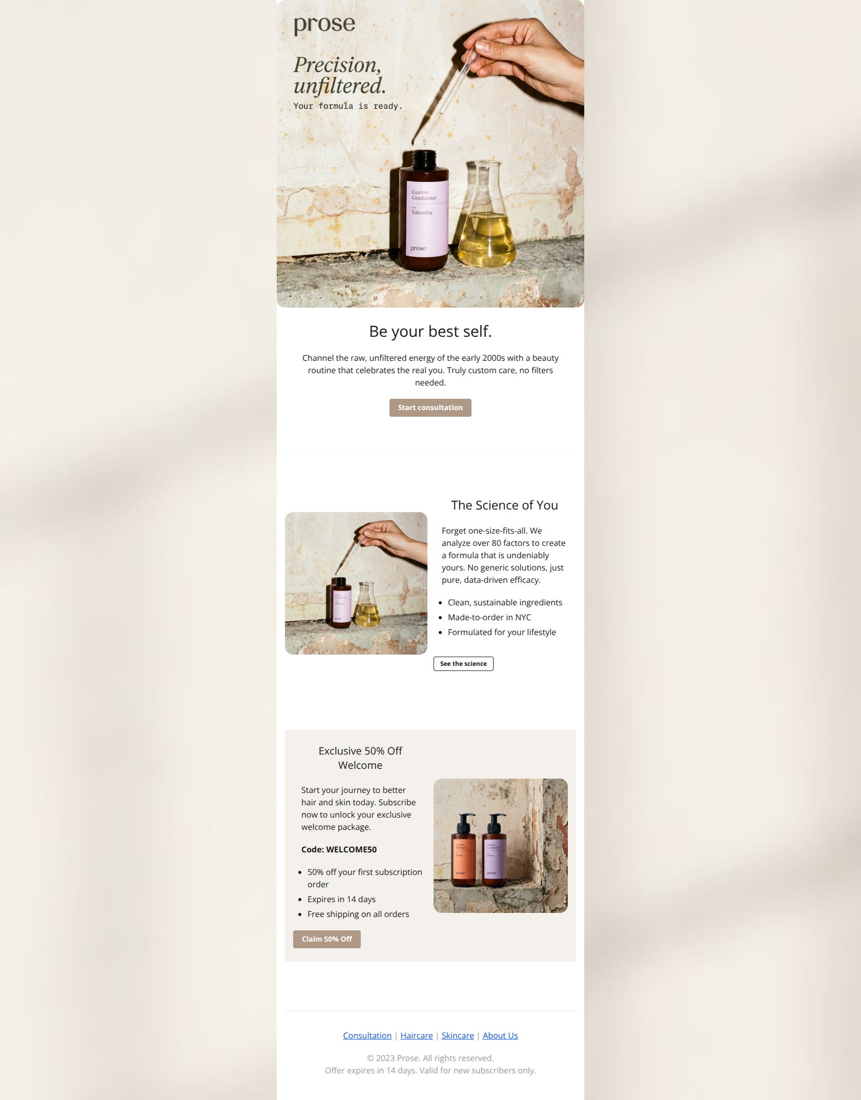
Be your best self.
Channel the raw, unfiltered energy of the early 2000s with a beauty routine that celebrates the real you. Truly custom care, no filters needed.
→ Start consultation
The Science of You
Forget one-size-fits-all. We analyze over 80 factors to create a formula that is undeniably yours. No generic solutions, just pure, data-driven efficacy.
- Clean, sustainable ingredients
- Made-to-order in NYC
- Formulated for your lifestyle
→ See the science
Exclusive 50% Off Welcome
Start your journey to better hair and skin today. Subscribe now to unlock your exclusive welcome package.
Code: WELCOME50
- 50% off your first subscription order
- Expires in 14 days
- Free shipping on all orders
→ Claim 50% Off
Consultation | Haircare | Skincare | About Us
© 2023 Prose. All rights reserved. Offer expires in 14 days. Valid for new subscribers only.
Why This Email Works
This email is visually polished and contains a high-value offer, but the messaging strategy is disjointed. The hero section's 'early 2000s' reference feels disconnected from the brand's core value proposition of scientific precision and authority, creating cognitive dissonance right at the start. While the visual hierarchy is strong, the most compelling conversion driver (the 50% off discount) is buried at the bottom, forcing users to scroll to find the main reason to convert.
Hero Impact
70/100- High-quality, on-brand imagery that feels premium.
- Clear, isolated primary CTA button that is easy to tap.
Content Structure & Flow
75/100- Clear progression from 'Idea' to 'Proof' (Science) to 'Incentive' (Offer).
- Distinct section breaks using whitespace and background colors make the journey easy to follow.
Visual Hierarchy & Layout
85/100- Excellent use of the 'Inverted Pyramid' method in the Offer card (Heading -> Benefit -> Code -> CTA).
- The background color change for the Offer section (#F4F1ED) effectively signals a shift in content type.
Call-to-Action Strength
80/100- Primary CTAs use the brand's primary color (#B09886) effectively to stand out.
- Button sizes are generous and mobile-friendly.
Message Clarity & Tone
65/100- The 'Science of You' section is perfectly on-brand: authoritative, reassuring, and data-driven.
- The offer details are crystal clear and free of jargon.
Readability & Scannability
90/100- Use of bullet points in the Science and Offer sections makes key info skimmable.
- High contrast text on clean backgrounds ensures accessibility.
Offer & Value Proposition
85/100- The 50% discount is a compelling, high-value incentive for a luxury product.
- Explicitly stating 'Expires in 14 days' adds necessary urgency.
Personalization & Audience Fit
70/100- The copy emphasizes 'formulas made just for you', reinforcing the core audience desire for customization.
Quick Wins
- Rewrite the Hero headline and body copy to remove the confusing 'early 2000s' reference and focus on 'Science & Customization'.
- Add '50% Off' text or a badge to the Hero image to hook price-sensitive scanners immediately.
- Bold the 'Expires in 14 days' text in the offer card to increase urgency.
- Change the primary CTA label from 'Start consultation' to 'Build My Custom Formula'.


Create Professional Email Designs
Generate beautiful, on-brand email designs in seconds. Just enter your brand URL and let AI do the rest.