Home & Garden Promotional Email Template
“Is your home scent stressing out your dog?”
Design Score
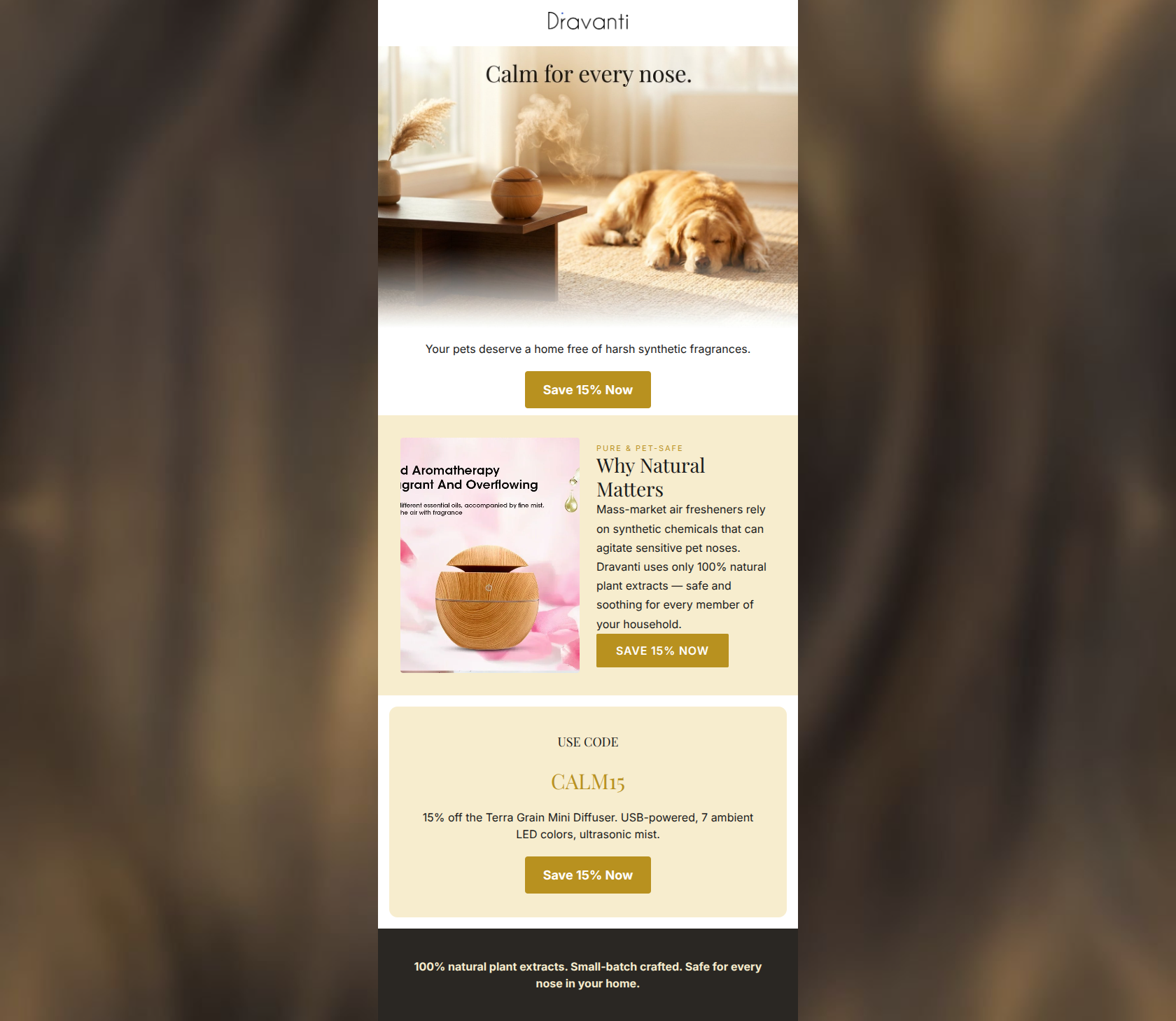
81/100This email features a highly effective, emotionally resonant strategic angle by addressing pet owners' concerns about synthetic fragrances. The inverted pyramid flow generally works well, and the primary CTA is repeated consistently, driving clear intent. However, the premium, 'luxury magazine' brand positioning is severely compromised by a low-quality product image containing chopped-off, embedded text. Additionally, the presentation of the offer feels disjointed, as the user is asked to 'Save 15%' twice before the actual promo code is revealed.
Create Your Own
Generate professional email designs like this one in seconds with Kopi AI.
Email Details
- Subject Line
- Is your home scent stressing out your dog?
- Brand
- Dravanti Co
- Industry
- Home & Garden
- Email Type
- Promotional
- Created
- April 25, 2026
Brand Colors
Email Copy
Your pets deserve a home free of harsh synthetic fragrances.
→ Save 15% Now
USE CODE
CALM15
15% off the Terra Grain Mini Diffuser. USB-powered, 7 ambient LED colors, ultrasonic mist.
→ Save 15% Now
100% natural plant extracts. Small-batch crafted. Safe for every nose in your home.
Why This Email Works
This email features a highly effective, emotionally resonant strategic angle by addressing pet owners' concerns about synthetic fragrances. The inverted pyramid flow generally works well, and the primary CTA is repeated consistently, driving clear intent. However, the premium, 'luxury magazine' brand positioning is severely compromised by a low-quality product image containing chopped-off, embedded text. Additionally, the presentation of the offer feels disjointed, as the user is asked to 'Save 15%' twice before the actual promo code is revealed.
Hero (top/initial part) Impact
85/100- Strong emotional hook using aspirational, serene pet imagery.
- Directly addresses a primary customer pain point (synthetic fragrances around pets).
Content Structure & Flow
82/100- Clear, distinct sections that guide the reader downwards.
- Alternating background colors (white to warm sand) effectively delineate content blocks.
Visual Hierarchy & Layout
62/100- Good use of negative space in the promo code section.
- The primary CTA buttons have excellent contrast and immediately draw the eye.
Call-to-Action Strength
98/100- Flawless repetition of the primary action.
- High-contrast button design (#B8911F on #FFFFFF and #F7EDCE backgrounds).
- Clear, benefit-driven CTA copy.
Message Clarity & Tone
75/100- The 'Why Natural Matters' copy is clear and persuasive.
- Strong juxtaposition between 'mass-market' and 'Dravanti' quality.
Readability & Scannability
85/100- Short, digestible paragraphs.
- Excellent use of clear subheadings to guide the eye.
Offer & Value Proposition
80/100- Strong thematic tie-in between the promo code ('CALM15') and the brand identity.
- Clear, tangible financial incentive.
Personalization & Audience Fit
90/100- Nails the 'customer pain points' outlined in the brand brief (fear of synthetic chemicals causing agitation).
- Aligns perfectly with the aspirational 'safe sanctuary' messaging.
Copy Conciseness & Word Economy
84/100- No throat-clearing openers or fluffy filler text.
- The 'Why Natural Matters' paragraph is distilled to exactly what the reader needs to know.
Quick Wins
- Replace the product image in the second section immediately to remove the cheap, cut-off embedded text overlay.
- Add the text 'Use code CALM15 at checkout' near the hero section so the first two CTAs have proper context.
- Remove the final dark gray banner at the bottom of the email to reduce redundancy.


Create Professional Email Designs
Generate beautiful, on-brand email designs in seconds. Just enter your brand URL and let AI do the rest.