Finance & Fintech Promotional Email Template
“Is It Time for Your Rummel Review?”
Design Score
85/100This is a strong, highly cohesive email that perfectly captures the brand's 'warm, local, and professional' tone. The localization is excellent, and the messaging speaks directly to the target audience's desire for stability and human connection. The primary weakness lies in the email's flow and structural rhythm. The hero section lacks a definitive, scannable headline, and the inclusion of a referral request in the middle of an email pitching a personal policy review dilutes the primary conversion goal. However, the relentless consistency of the primary CTA is a major strength.
Create Your Own
Generate professional email designs like this one in seconds with Kopi AI.
Email Details
- Subject Line
- Is It Time for Your Rummel Review?
- Brand
- Emil Rummel Insurance Agency
- Industry
- Finance & Fintech
- Email Type
- Promotional
- Created
- May 20, 2026
Brand Colors
Email Copy
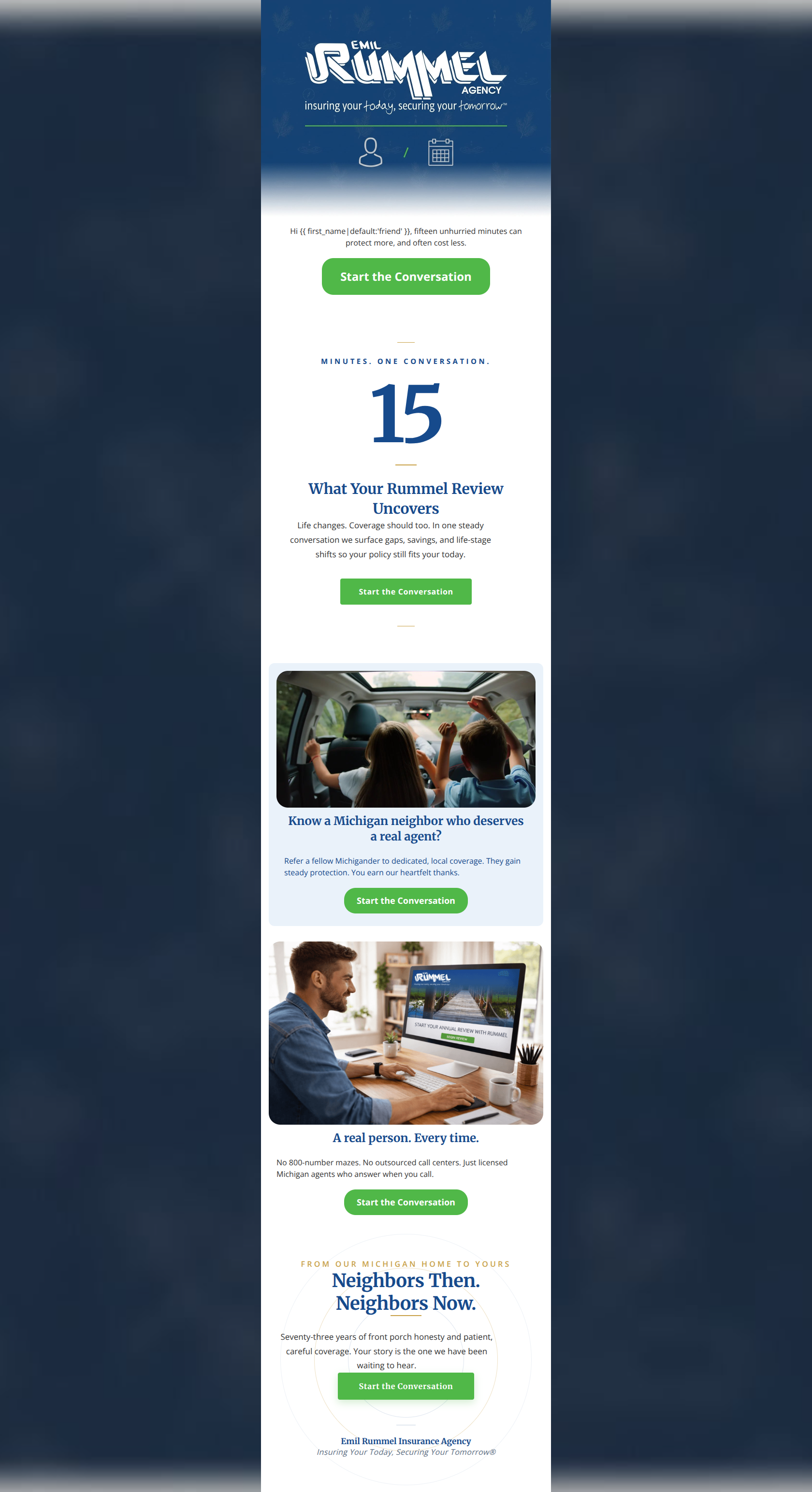
Hi friend, fifteen unhurried minutes can protect more, and often cost less.
→ Start the Conversation
Know a Michigan neighbor who deserves a real agent?
Refer a fellow Michigander to dedicated, local coverage. They gain steady protection. You earn our heartfelt thanks.
→ Start the Conversation
A real person. Every time.
No 800-number mazes. No outsourced call centers. Just licensed Michigan agents who answer when you call.
→ Start the Conversation
Why This Email Works
This is a strong, highly cohesive email that perfectly captures the brand's 'warm, local, and professional' tone. The localization is excellent, and the messaging speaks directly to the target audience's desire for stability and human connection. The primary weakness lies in the email's flow and structural rhythm. The hero section lacks a definitive, scannable headline, and the inclusion of a referral request in the middle of an email pitching a personal policy review dilutes the primary conversion goal. However, the relentless consistency of the primary CTA is a major strength.
Hero (top/initial part) Impact
70/100- The copy immediately quantifies the effort ('fifteen unhurried minutes') and the outcome ('protect more, often cost less').
- The hero image elegantly incorporates the brand's visual motifs without being overly distracting.
Content Structure & Flow
75/100- The use of the oversized '15' serves as an excellent visual anchor that pulls the eye down the page.
- Generous whitespace between sections prevents the email from feeling cluttered.
Visual Hierarchy & Layout
82/100- Excellent use of the '15' numeral to create a strong focal point.
- The structural symmetry aligns perfectly with the brand's archetype of reliability and order.
Call-to-Action Strength
98/100- Every button shares the identical phrasing, reinforcing the low-pressure, relationship-driven brand tone.
- The green buttons pop brilliantly against both the white and light blue backgrounds.
Message Clarity & Tone
92/100- Hyper-localized language ('fellow Michigander') builds immediate rapport with the target audience.
- The messaging directly addresses customer pain points (e.g., 'No 800-number mazes').
Readability & Scannability
85/100- Excellent use of short, punchy sentences ('Life changes. Coverage should too.').
- High contrast text ensures easy reading.
Offer & Value Proposition
88/100- Clearly defines what the user gets out of the interaction (peace of mind, potential savings).
- Positions the agency as proactive rather than reactive.
Personalization & Audience Fit
90/100- Strong use of state-specific pride and terminology.
- The imagery supports the narrative of family, community, and local business.
Copy Conciseness & Word Economy
88/100- Punchy, memorable phrasing ('Real Coverage. Real People.').
- Avoids complex insurance jargon.
Quick Wins
- Convert the first sentence under the hero image into a prominent H1 headline.
- Swap the order of the 'Referral' section and the 'Real person' section to keep the focus on the user's benefits longer.
- Bold the phrase 'surface gaps, savings, and life-stage shifts' to improve scannability in the main body block.



Create Professional Email Designs
Generate beautiful, on-brand email designs in seconds. Just enter your brand URL and let AI do the rest.