SaaS & Software Announcement Email Template
“Inside the John Deere deployment”
Design Score
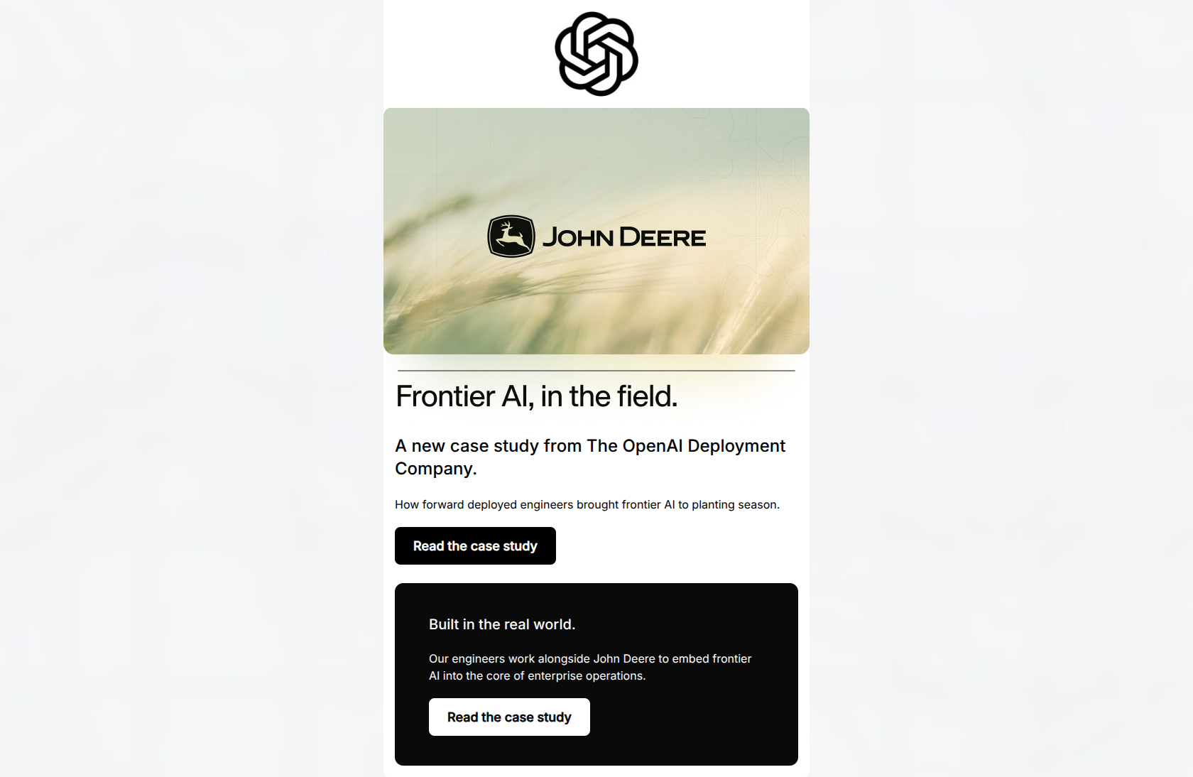
80/100This email is a visually striking, highly on-brand execution that perfectly captures OpenAI's 'quietly authoritative' and minimalist aesthetic. The layout is clean, the scannability is exceptional, and the CTA strategy is mechanically flawless. However, it leaves conversion leverage on the table by being too company-centric. It announces that a case study exists, but fails to tease the specific business value, ROI, or outcomes that would compel an enterprise leader to actually click and read it.
Create Your Own
Generate professional email designs like this one in seconds with Kopi AI.
Email Details
- Subject Line
- Inside the John Deere deployment
- Brand
- OpenAI
- Industry
- SaaS & Software
- Email Type
- Announcement
- Created
- May 11, 2026
Brand Colors
Email Copy
A new case study from The OpenAI Deployment Company.
How forward deployed engineers brought frontier AI to planting season.
→ Read the case study
Built in the real world.
Our engineers work alongside John Deere to embed frontier AI into the core of enterprise operations.
→ Read the case study
Why This Email Works
This email is a visually striking, highly on-brand execution that perfectly captures OpenAI's 'quietly authoritative' and minimalist aesthetic. The layout is clean, the scannability is exceptional, and the CTA strategy is mechanically flawless. However, it leaves conversion leverage on the table by being too company-centric. It announces that a case study exists, but fails to tease the specific business value, ROI, or outcomes that would compel an enterprise leader to actually click and read it.
Hero (top/initial part) Impact
75/100- Immediate brand association with a massive, recognizable enterprise (John Deere).
- Clean, undistracted visual presentation that fits the brutalist/modernist brand guidelines.
Content Structure & Flow
82/100- Distinct visual banding (light to dark) forces the user to keep scrolling.
- Zero superfluous elements; every block has a distinct purpose and CTA.
Visual Hierarchy & Layout
92/100- Exceptional use of negative space to project a 'quiet luxury' and academic tone.
- The dark mode card creates a strong, distinct visual break that re-engages scanning eyes.
Call-to-Action Strength
95/100- Consistent primary destination across all interactive elements.
- Excellent color contrast on both the light and dark versions of the button.
Message Clarity & Tone
80/100- Projects immense credibility through understated, matter-of-fact language.
- Avoids buzzwords and filler adjectives.
Readability & Scannability
95/100- Extremely low cognitive load required to parse the text.
- Optimal line lengths and line heights.
Offer & Value Proposition
60/100- The offer (a case study) is highly relevant to the target audience's desire for real-world proof.
Personalization & Audience Fit
75/100- Matches the intellectual rigor and aesthetic expectations of the target demographic.
Copy Conciseness & Word Economy
85/100- Zero filler words; highly distilled messaging.
- Punchy, evocative phrasing ('frontier AI to planting season').
Quick Wins
- Swap the H2 ('A new case study...') with the more compelling body text ('How forward deployed engineers brought frontier AI to planting season.') to hook the reader instantly.
- Add one specific, teased outcome to the dark card (e.g., 'Discover how we integrated with legacy field equipment to process data at scale.').

Create Professional Email Designs
Generate beautiful, on-brand email designs in seconds. Just enter your brand URL and let AI do the rest.