Health & Wellness Promotional Email Template
“If I could only keep one supplement…”
Design Score
92/100This is an exceptionally strong product spotlight email that perfectly captures the brand's 'wise mentor' persona. The layout follows a logical, highly persuasive narrative flow: personal anecdote -> macro validation (statistic) -> product solution -> social proof. The copy is tight, empathetic, and benefits-driven, avoiding the trap of overwhelming the reader with technical jargon while still highlighting the 8:1 extract potency. To push this from an A to an A+, the brand needs to elevate its primary differentiator ('Zero Fillers / Strict NO list') from fine print into the main narrative, and ensure the final call-to-action catches scrollers with a proper button rather than a quiet text link.
Create Your Own
Generate professional email designs like this one in seconds with Kopi AI.
Email Details
- Subject Line
- If I could only keep one supplement…
- Brand
- Schizandu Organics
- Industry
- Health & Wellness
- Email Type
- Promotional
- Created
- July 11, 2026
Brand Colors
Email Copy
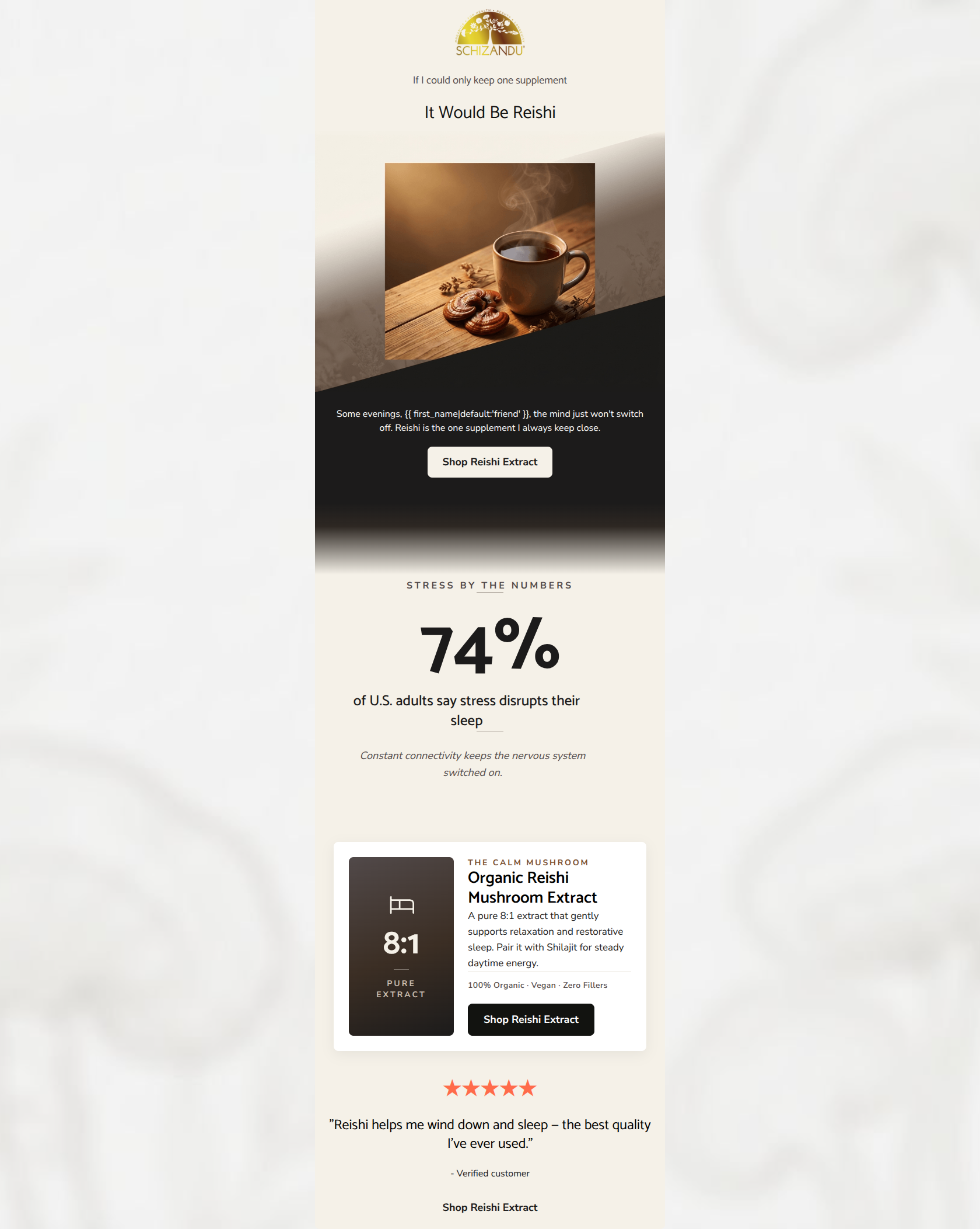
If I could only keep one supplement
It Would Be Reishi
Some evenings, friend, the mind just won't switch off. Reishi is the one supplement I always keep close.
→ Shop Reishi Extract
★★★★★
"Reishi helps me wind down and sleep — the best quality I've ever used."
- Verified customer
→ Shop Reishi Extract
Why This Email Works
This is an exceptionally strong product spotlight email that perfectly captures the brand's 'wise mentor' persona. The layout follows a logical, highly persuasive narrative flow: personal anecdote -> macro validation (statistic) -> product solution -> social proof. The copy is tight, empathetic, and benefits-driven, avoiding the trap of overwhelming the reader with technical jargon while still highlighting the 8:1 extract potency. To push this from an A to an A+, the brand needs to elevate its primary differentiator ('Zero Fillers / Strict NO list') from fine print into the main narrative, and ensure the final call-to-action catches scrollers with a proper button rather than a quiet text link.
Hero (top/initial part) Impact
92/100- Strong, confident headline that immediately builds intrigue.
- Beautiful, on-brand imagery that sets a calming, evening mood.
- Immediate transition into a relatable customer pain point.
Content Structure & Flow
96/100- Logical progression from emotional hook to logical validation (the 74% stat).
- Clear delineation of sections using background colors to guide the eye.
- Zero extraneous content; every block serves the primary conversion goal.
Visual Hierarchy & Layout
88/100- Excellent use of the oversized stat to break up the reading experience.
- The product card clearly separates the technical details from the narrative copy.
- High-contrast color blocking maintains visual interest.
Call-to-Action Strength
90/100- Unambiguous CTA wording ('Shop Reishi Extract').
- Perfect repetition of the same primary goal across all click targets.
- Good contrast on the top two buttons against their respective backgrounds.
Message Clarity & Tone
98/100- Empathetic phrasing that aligns with the audience's 'wellness fatigue'.
- Confident, non-salesy language.
- Consistent calming emotional quality throughout.
Readability & Scannability
94/100- Short, digestible text blocks.
- Strong typographic hierarchy (clear distinction between H1, H4, and body text).
- Excellent use of whitespace around key elements.
Offer & Value Proposition
85/100- Clearly connects the product feature (Reishi) to the desired outcome (sleep/calm).
- Highlights the potency (8:1) which appeals to the educated target audience.
- Suggests a pairing (Shilajit for daytime) which smartly plants the seed for cross-selling.
Personalization & Audience Fit
92/100- Addresses a highly relevant, modern pain point (hyper-arousal/connectivity).
- Uses personalization organically in the opening sentence.
- The testimonial feels authentic and matches the desired outcome.
Copy Conciseness & Word Economy
96/100- Zero filler content or redundant sections.
- Gets straight to the point while maintaining an editorial feel.
- Testimonial is short, punchy, and outcome-focused.
Quick Wins
- Change the text link at the very bottom of the email into a solid, highly visible CTA button.
- Verify the contrast ratio of the small italicized text beneath the 74% statistic to ensure it remains legible on mobile devices in low light.

Create Professional Email Designs
Generate beautiful, on-brand email designs in seconds. Just enter your brand URL and let AI do the rest.