SaaS & Software Announcement Email Template
“I spent 2 years building this for you”
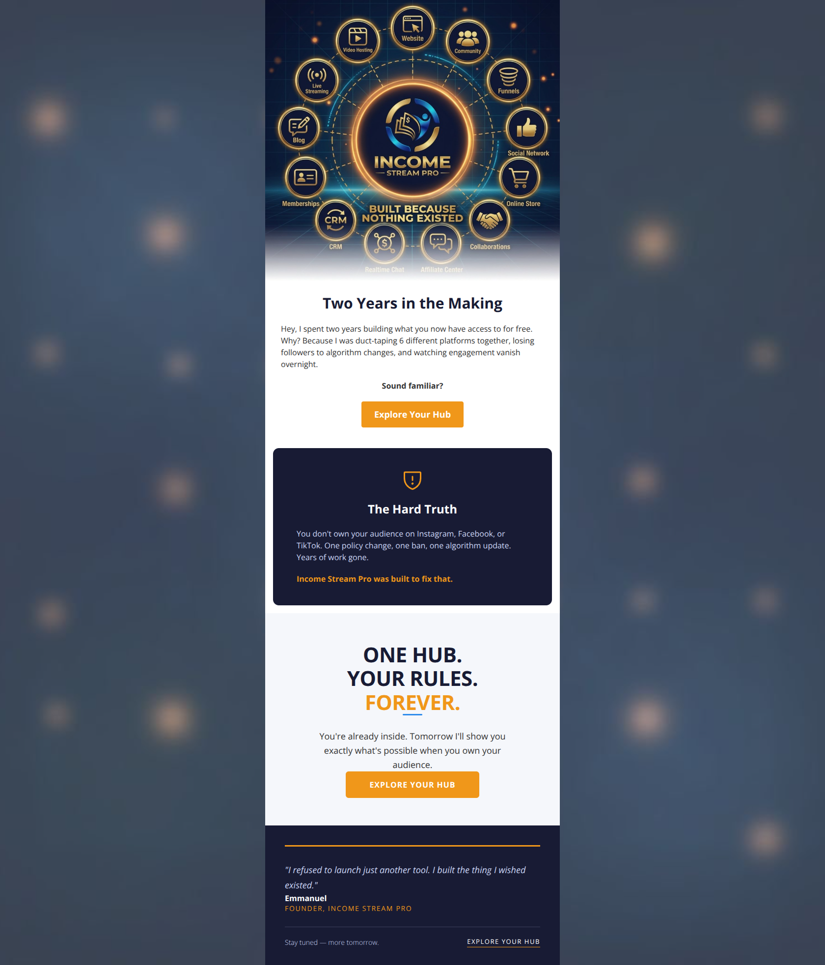
Design Score
85/100This is a strong, highly effective email that nails the 'Entrepreneurial Energy' tone of the brand. It successfully uses an inverted pyramid structure, moving from a visual representation of the product to a relatable pain point, and finally to a clear solution. The visual blocking (alternating white and navy backgrounds) creates an excellent scan path. The primary area for improvement is shifting the opening copy from a founder-centric narrative ('I spent two years...') to a more user-centric hook, and slightly adjusting the placement of the first CTA.
Create Your Own
Generate professional email designs like this one in seconds with Kopi AI.
Email Details
- Subject Line
- I spent 2 years building this for you
- Brand
- Income Stream Pro
- Industry
- SaaS & Software
- Email Type
- Announcement
- Created
- March 31, 2026
Brand Colors
Email Copy
Two Years in the Making
Hey, I spent two years building what you now have access to for free. Why? Because I was duct-taping 6 different platforms together, losing followers to algorithm changes, and watching engagement vanish overnight.
Sound familiar?
→ Explore Your Hub
The Hard Truth
You don't own your audience on Instagram, Facebook, or TikTok. One policy change, one ban, one algorithm update. Years of work gone.
Income Stream Pro was built to fix that.
Why This Email Works
This is a strong, highly effective email that nails the 'Entrepreneurial Energy' tone of the brand. It successfully uses an inverted pyramid structure, moving from a visual representation of the product to a relatable pain point, and finally to a clear solution. The visual blocking (alternating white and navy backgrounds) creates an excellent scan path. The primary area for improvement is shifting the opening copy from a founder-centric narrative ('I spent two years...') to a more user-centric hook, and slightly adjusting the placement of the first CTA.
Hero Impact
75/100- The complex infographic immediately communicates the platform's comprehensive nature.
- The image acts as a strong visual hook to draw the reader in.
Content Structure & Flow
82/100- Excellent use of the PAS (Problem, Agitation, Solution) framework.
- The transition into the 'Hard Truth' section effectively raises the stakes for the reader.
Visual Hierarchy & Layout
85/100- Distinct visual containment (the rounded navy box) makes key arguments stand out.
- The layout perfectly supports scanning behavior.
Call-to-Action Strength
88/100- Consistent, benefit-driven CTA copy.
- Excellent color contrast makes the primary action undeniable.
Message Clarity & Tone
85/100- The 'Hard Truth' section speaks directly to a primary fear of creators (losing their audience).
- The language is energetic and authoritative, fitting the brand.
Readability & Scannability
90/100- Bolding phrases like 'Sound familiar?' effectively pauses the reader.
- No intimidating 'walls of text'.
Offer & Value Proposition
84/100- The value proposition is heavily outcome-focused ('own your audience' rather than just listing features).
Personalization & Audience Fit
85/100- The narrative feels highly relevant to anyone building an online business.
Copy Conciseness & Word Economy
95/100- Zero fluff; highly distilled messaging.
- Fast-paced reading experience.
Quick Wins
- Change the H1 from 'Two Years in the Making' to a benefit-driven headline.
- Center-align the first CTA button.
- Remove the underline from 'FOREVER' in the third block to clean up the design.

Create Professional Email Designs
Generate beautiful, on-brand email designs in seconds. Just enter your brand URL and let AI do the rest.