Health & Wellness Promotional Email Template
“Hydration that changes the world.”

Design Score
72/100This email succeeds as a brand manifesto but stumbles as a conversion engine. It beautifully articulates Liquid I.V.'s commendable global impact mission, perfectly aligning with its socially conscious target audience. The visual aesthetic is polished and the brand voice is strong. However, it relies too heavily on brand recognition—the actual product is hidden below the fold, and the email lacks urgency. A massive, un-clickable middle banner halts scrolling momentum, and missing CTAs in key sections leave click opportunities on the table. To move this from a 'nice to look at' email to a high-converting one, the focus must shift to balancing the charitable mission with immediate product visibility and clearer, varied pathways to purchase.
Create Your Own
Generate professional email designs like this one in seconds with Kopi AI.
Email Details
- Subject Line
- Hydration that changes the world.
- Brand
- Liquid IV [eval 2026-03-25]
- Industry
- Health & Wellness
- Email Type
- Promotional
- Created
- March 25, 2026
Brand Colors
Email Copy
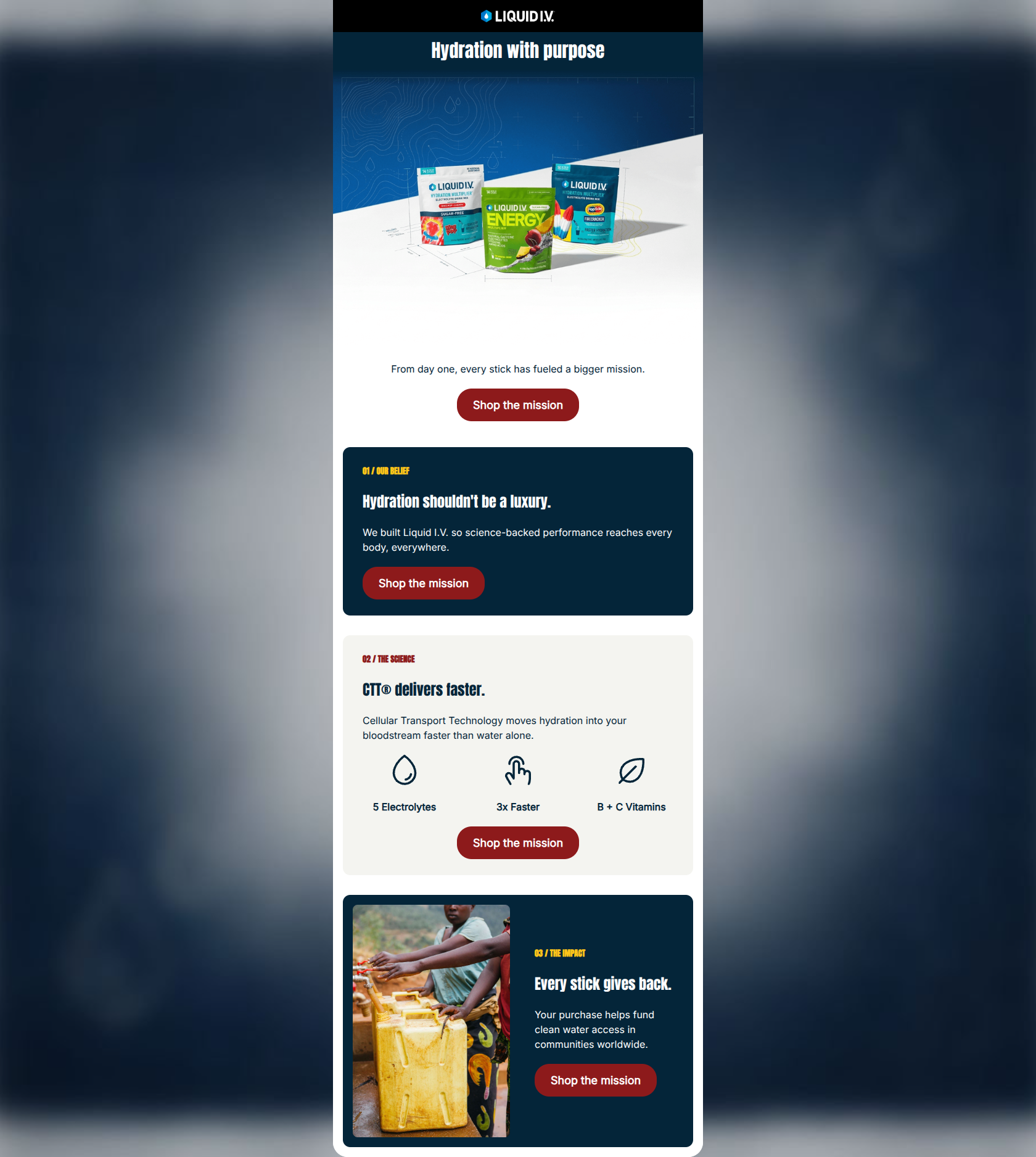
Hydration With A Purpose
Discover the global mission behind every stick.
→ Shop & Support
Real Science, Real Impact
Our Cellular Transport Technology® delivers clinical hydration fast. That same efficiency drives our mission to expand clean water access.
The Ripple Effect
Your wellness routine changes lives, friend. Every purchase funds worldwide water projects, bringing secure hydration to communities in need.
→ Shop & Support
Why This Email Works
This email succeeds as a brand manifesto but stumbles as a conversion engine. It beautifully articulates Liquid I.V.'s commendable global impact mission, perfectly aligning with its socially conscious target audience. The visual aesthetic is polished and the brand voice is strong. However, it relies too heavily on brand recognition—the actual product is hidden below the fold, and the email lacks urgency. A massive, un-clickable middle banner halts scrolling momentum, and missing CTAs in key sections leave click opportunities on the table. To move this from a 'nice to look at' email to a high-converting one, the focus must shift to balancing the charitable mission with immediate product visibility and clearer, varied pathways to purchase.
Hero (top/initial part) Impact
68/100- Highly emotive, high-quality hero imagery that immediately establishes the brand's core values.
- Primary CTA is clearly visible above the fold with strong color contrast.
Content Structure & Flow
65/100- Clear use of column structures and alternating background colors (light gray, cyan) to delineate different sections.
- Logical narrative flow moving from macro impact to micro science, then back to impact.
Visual Hierarchy & Layout
75/100- Excellent use of the brand's cyan and navy colors to create a cohesive, vibrant aesthetic.
- Icons (droplets, globe) effectively draw the eye to key value propositions.
Call-to-Action Strength
60/100- Buttons feature excellent color contrast (Cyan on White/Navy, Navy on Cyan) making them impossible to miss.
- Button text is legible and appropriately sized.
Message Clarity & Tone
82/100- Tone is empowering and authoritative without being preachy.
- Directly addresses the user ('Your wellness routine changes lives') to foster a personal connection to the mission.
Readability & Scannability
88/100- Excellent use of short paragraphs and clear, bold headings.
- The Z-pattern layout naturally guides the eye through the key points.
Offer & Value Proposition
65/100- The dual value proposition (clinical hydration + global impact) is highly compelling for the target demographic.
Personalization & Audience Fit
78/100- Aesthetic and messaging are perfectly calibrated for a millennial/Gen Z wellness audience.
- Use of dynamic tags adds a baseline level of personalization.
Copy Conciseness & Word Economy
85/100- Punchy headlines ('Real Science, Real Impact').
- No wasted space on long, meandering introductions.
Quick Wins
- Add a 'Shop Hydration Multiplier' CTA button to the 'Real Science, Real Impact' section.
- Change the hero CTA to 'Shop Best Sellers' to differentiate it from the bottom CTA.
- Add a product shot (e.g., a box or a stick pack) as an inset or overlay in the main hero image.
Create Professional Email Designs
Generate beautiful, on-brand email designs in seconds. Just enter your brand URL and let AI do the rest.