SaaS & Software Promotional Email Template
“How L-Nutra drove a 21% lift”
Design Score
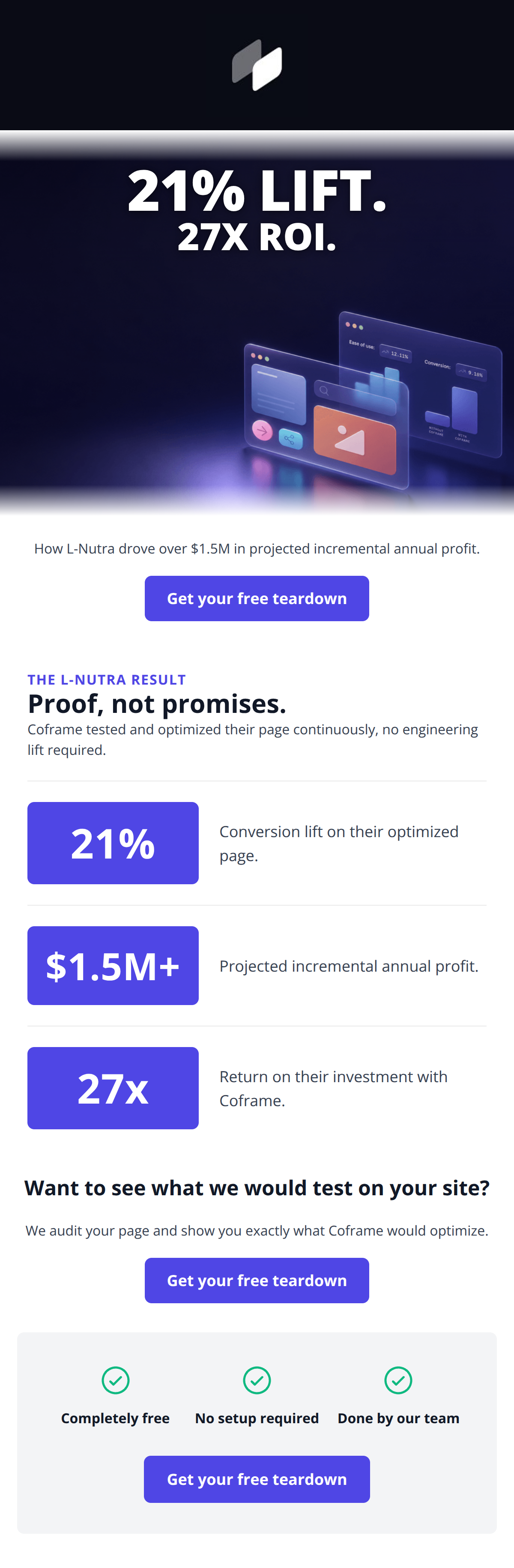
85/100This is a highly effective, punchy email that correctly prioritizes a strong, low-friction offer (a free teardown) and leads with undeniable proof. The visual design is exceptionally clean, utilizing the brand's indigo and white palette to create a high-contrast, scannable experience. The primary CTA is excellently executed—repeated consistently without distracting variations. The main area for improvement lies in the depth of the case study. The email currently repeats the exact same three statistics (21% lift, 27x ROI, $1.5M profit) across the hero, sub-headline, and the body's stat chips. For a highly technical target audience of PMs and developers, swapping some of this repetition for a brief explanation of *what* was optimized or *how* the AI achieved it without engineering lift would significantly increase credibility and click-through intent.
Create Your Own
Generate professional email designs like this one in seconds with Kopi AI.
Email Details
- Subject Line
- How L-Nutra drove a 21% lift
- Brand
- Coframe
- Industry
- SaaS & Software
- Email Type
- Promotional
- Created
- July 23, 2026
Brand Colors
Email Copy
Preview text: 21% conversion lift, $1.5M projected profit, 27x ROI, in under four months.
Hi ,
L-Nutra sells fasting and longevity products. Their traffic was fine. Their conversion rate was not, and the CRO agency they were paying wasn't keeping up.
In under four months of weekly testing, winning variants lifted conversion 21%. That came to $1.5M in projected incremental annualised profit, about 27x ROI.
Their SVP of Growth put it more bluntly than we would have:
"Very impressed by Coframe. They're more than another AI tool. They've replaced my entire CRO function."
Bryan Welker, SVP of Growth and Consumer, L-Nutra
We can run the same first pass on your site. It takes about a minute, and you get the variants built, not just a report.
→ See what your site would do
Martin Dimitrov Growth @ Coframe
Why This Email Works
This is a highly effective, punchy email that correctly prioritizes a strong, low-friction offer (a free teardown) and leads with undeniable proof. The visual design is exceptionally clean, utilizing the brand's indigo and white palette to create a high-contrast, scannable experience. The primary CTA is excellently executed—repeated consistently without distracting variations. The main area for improvement lies in the depth of the case study. The email currently repeats the exact same three statistics (21% lift, 27x ROI, $1.5M profit) across the hero, sub-headline, and the body's stat chips. For a highly technical target audience of PMs and developers, swapping some of this repetition for a brief explanation of *what* was optimized or *how* the AI achieved it without engineering lift would significantly increase credibility and click-through intent.
Hero Impact
88/100- Massive, impossible-to-miss value proposition in the hero image.
- Abstract but relevant visual aesthetic that implies UI/UX optimization.
Content Structure & Flow
78/100- Logical top-to-bottom funnel that drives toward the teardown.
- Excellent use of a bottom 'friction reducer' card to secure clicks from hesitant readers.
Visual Hierarchy & Layout
90/100- Brilliant use of large, colored containers (the stat chips) to break up the white space and command attention.
- Generous whitespace around text elements ensures zero cognitive overload.
Call-to-Action Strength
96/100- Perfect consistency in CTA copy across all buttons.
- High-contrast indigo buttons stand out distinctly against the white body and light gray bottom card.
- The offer itself (a 'teardown') is a high-value, low-commitment action.
Message Clarity & Tone
82/100- Confident, jargon-free voice.
- Directly addresses a major audience pain point (engineering bottlenecks).
Readability & Scannability
94/100- Short, punchy sentences.
- Excellent use of iconography and large typography to communicate key concepts.
Offer & Value Proposition
88/100- Clear, high-value, tailored offer.
- The final section explicitly removes friction ('No setup required', 'Done by our team').
Personalization & Audience Fit
85/100- Focuses purely on metrics that matter to growth and product teams (conversion lift, ROI).
- Aesthetic aligns perfectly with a modern, tech-forward SaaS brand.
Copy Conciseness & Word Economy
84/100- Zero throat-clearing or unnecessary introductions.
- Bullet points and short headings do the heavy lifting.
Quick Wins
- Increase the font size and weight of 'How L-Nutra drove over $1.5M in projected incremental annual profit.' so it functions as a strong sub-headline.
- Add specificity to the case study copy by identifying the type of page that was optimized (e.g., 'optimized their checkout flow').
- Move the explanation of the teardown ('We audit your page...') higher in the email to clarify the offer earlier.



Create Professional Email Designs
Generate beautiful, on-brand email designs in seconds. Just enter your brand URL and let AI do the rest.