Food & Beverage Announcement Email Template
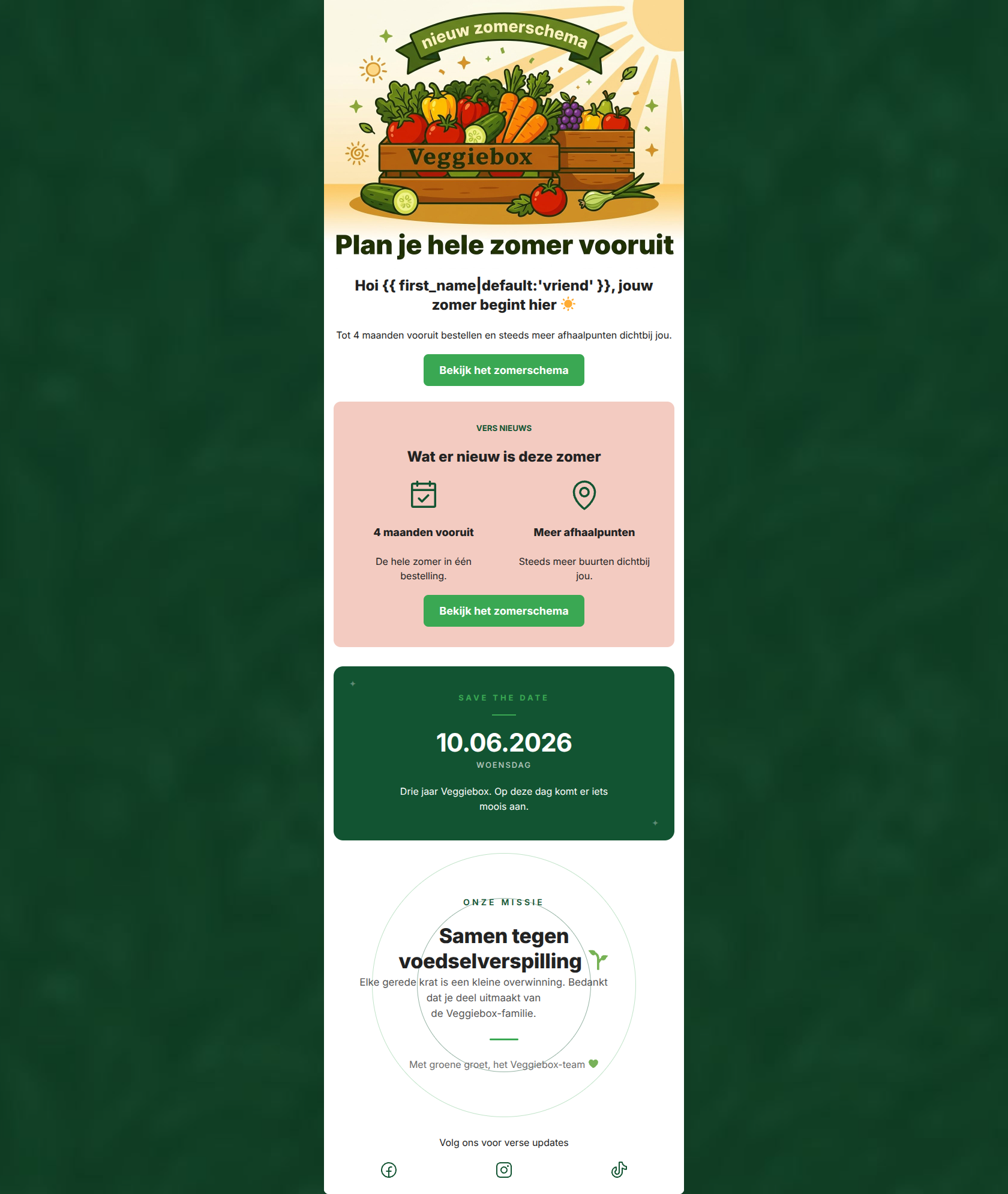
“Het nieuwe zomerschema is er ☀️”
Design Score
86/100This is a strong, highly scannable announcement email that effectively communicates a logistical update (the summer schedule) as a clear customer benefit (convenience and planning). The visual design is vibrant, on-brand, and uses color blocking well to separate information. The primary call-to-action is perfectly executed with consistent repetition and high visibility. The main areas for improvement involve removing mild copy repetition, resolving a confusing 'Save the Date' timeline, and injecting more specific personalization regarding the new pickup points.
Create Your Own
Generate professional email designs like this one in seconds with Kopi AI.
Email Details
- Subject Line
- Het nieuwe zomerschema is er ☀️
- Brand
- Veggiebox
- Industry
- Food & Beverage
- Email Type
- Announcement
- Created
- May 21, 2026
Brand Colors
Email Copy
Hoi vriend, jouw zomer begint hier ☀️
Tot 4 maanden vooruit bestellen en steeds meer afhaalpunten dichtbij jou.
→ Bekijk het zomerschema
VERS NIEUWS
Wat er nieuw is deze zomer
4 maanden vooruit
De hele zomer in één bestelling.
Meer afhaalpunten
Steeds meer buurten dichtbij jou.
→ Bekijk het zomerschema
Volg ons voor verse updates
Why This Email Works
This is a strong, highly scannable announcement email that effectively communicates a logistical update (the summer schedule) as a clear customer benefit (convenience and planning). The visual design is vibrant, on-brand, and uses color blocking well to separate information. The primary call-to-action is perfectly executed with consistent repetition and high visibility. The main areas for improvement involve removing mild copy repetition, resolving a confusing 'Save the Date' timeline, and injecting more specific personalization regarding the new pickup points.
Hero (top/initial part) Impact
82/100- Bright, engaging custom illustration that immediately communicates the 'summer' theme.
- Clear, action-oriented primary CTA placed prominently above the fold.
- Sub-headline clearly states the two main value propositions (ordering ahead, new locations).
Content Structure & Flow
78/100- Logical progression from the hero announcement into the 'Wat er nieuw is' supporting details.
- The concluding mission statement block serves as a warm, community-building sign-off that reinforces brand values.
Visual Hierarchy & Layout
85/100- Excellent use of the soft peach (#F3CBC1) background to group the 'Vers Nieuws' features together into a cohesive, scannable block.
- Clean, balanced two-column layout for the features with well-sized, recognizable icons.
Call-to-Action Strength
95/100- Perfect execution of CTA repetition: identical wording and intent across both buttons.
- Buttons use the high-contrast brand green (#3AA853), making them pop clearly against both the white and peach backgrounds.
- Action-oriented verb choice ('Bekijk' - View) sets clear expectations.
Message Clarity & Tone
88/100- Friendly, conversational tone ('Hoi...', 'jouw zomer begint hier') that feels like an update from a community organizer.
- The concluding mission block ('Samen tegen voedselverspilling') beautifully reinforces the brand's 'why'.
Readability & Scannability
92/100- Excellent use of bullet-point style icons to replace what could have been a dense paragraph.
- Strong contrast between the dark text (#222222) and the light backgrounds ensures easy reading.
- Generous padding and whitespace prevent the design from feeling cluttered.
Offer & Value Proposition
85/100- Focuses on the 'benefit over feature'—instead of just saying 'the calendar is open', it highlights 'De hele zomer in één bestelling' (The whole summer in one order).
- Directly addresses the target audience's need for practical, time-saving solutions.
Personalization & Audience Fit
80/100- Safe and brand-aligned fallback for the first-name merge tag.
- The messaging respects the audience's time by getting straight to the point.
Copy Conciseness & Word Economy
85/100- No walls of text; relies on punchy headlines and single-sentence descriptors.
- Avoids generic corporate throat-clearing ('We are excited to announce...').
Quick Wins
- Verify and correct the '10.06.2026' date in the teaser block to remove cognitive friction.
- Rewrite the hero sub-headline so it doesn't duplicate the exact phrasing used in the 'Vers Nieuws' feature block below it.
- Make the 'Save the Date' block functional by adding a subtle text link to a calendar invite, or remove it entirely to keep focus on the summer schedule.


Create Professional Email Designs
Generate beautiful, on-brand email designs in seconds. Just enter your brand URL and let AI do the rest.