Media & Entertainment Promotional Email Template
“Help shape the future of indie entertainment”
Design Score
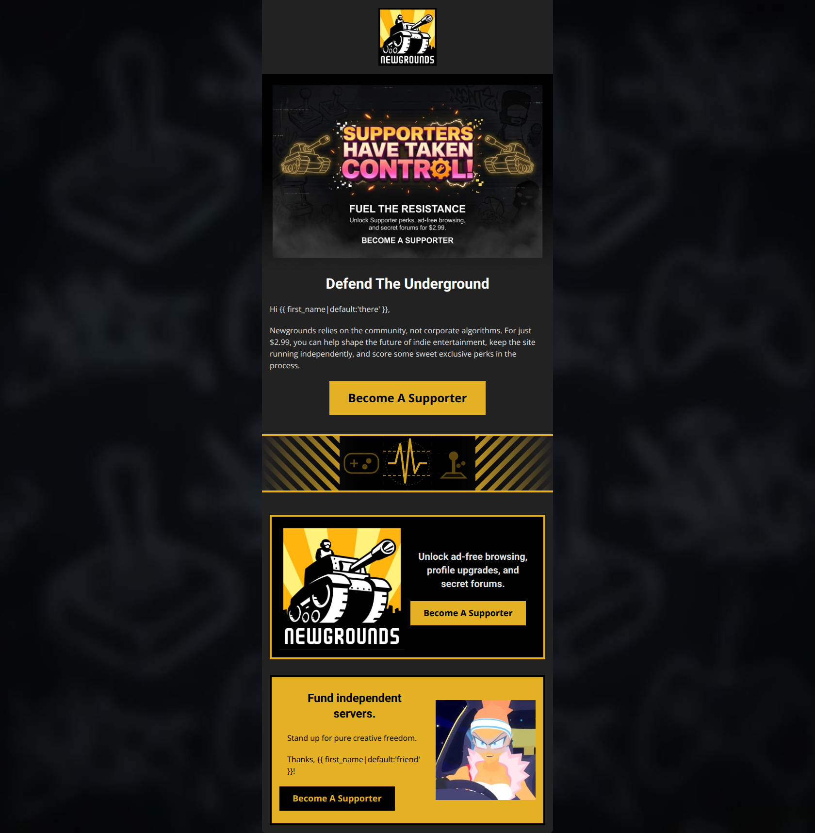
83/100This email is a strong, highly targeted promotional piece that perfectly captures the gritty, independent spirit of the Newgrounds brand. Its biggest strength is its message clarity and emotional resonance with its core anti-corporate audience, while its main weakness is repetitive CTA copy and a disjointed structural ending.
Create Your Own
Generate professional email designs like this one in seconds with Kopi AI.
Email Details
- Subject Line
- Help shape the future of indie entertainment
- Brand
- Newgrounds
- Industry
- Media & Entertainment
- Email Type
- Promotional
- Created
- March 10, 2026
Brand Colors
Email Copy
Defend The Underground
Hi there,
Newgrounds relies on the community, not corporate algorithms. For just $2.99, you can help shape the future of indie entertainment, keep the site running independently, and score some sweet exclusive perks in the process.
→ Become A Supporter
Unlock ad-free browsing, profile upgrades, and secret forums.
→ Become A Supporter
Fund independent servers.
Stand up for pure creative freedom.
Thanks, friend!
→ Become A Supporter
Why This Email Works
This email is a strong, highly targeted promotional piece that perfectly captures the gritty, independent spirit of the Newgrounds brand. Its biggest strength is its message clarity and emotional resonance with its core anti-corporate audience, while its main weakness is repetitive CTA copy and a disjointed structural ending.
Hero Impact
85/100- The hero image graphics immediately establish the raw, underground tone of the brand.
- The primary value proposition ($2.99 for perks and independence) is stated clearly above the fold in both the image and the supporting text.
Content Structure & Flow
75/100- The visual divider successfully transitions the user from the emotional opening to the specific, practical benefits.
- The Z-pattern layout of the two feature cards keeps the eye moving and prevents the layout from feeling static.
Visual Hierarchy & Layout
80/100- The alternating card backgrounds (black vs. yellow) create distinct, highly visible content zones.
- The dark mode aesthetic matches the website and brand expectations perfectly, keeping the user immersed in the Newgrounds ecosystem.
Call-to-Action Strength
75/100- Excellent color contrast on all buttons ensures they pop out against both the dark and light backgrounds.
- The buttons are consistently styled with sharp, square corners (borderRadius='0'), which fits the utilitarian, retro brand aesthetic.
Message Clarity & Tone
92/100- Phrases like 'not corporate algorithms' and 'pure creative freedom' act as powerful dog-whistles for the target psychographics.
- The tone feels like a peer-to-peer request rather than a corporate marketing push, building trust.
Readability & Scannability
82/100- The introductory paragraph is kept to two sentences, minimizing cognitive load.
- Font colors are chosen wisely; the white and light gray text stands out clearly against the dark background without causing eye strain.
Offer & Value Proposition
90/100- The low barrier to entry ($2.99) is stated upfront, removing ambiguity about cost.
- The email effectively translates features ('independent servers') into emotional benefits ('pure creative freedom').
Personalization & Audience Fit
85/100- The imagery (the Newgrounds Tank, classic characters like Pico) instantly signals to the core audience that this is authentic.
- The messaging directly targets the pain points of creators dealing with algorithmic platforms.
Quick Wins
- Vary the CTA button text in the cards to highlight specific benefits (e.g., 'Get Ad-Free Browsing' instead of repeating 'Become A Supporter').
- Move the 'Thanks, {{ first_name... }}' text out of the yellow feature block and place it at the bottom of the email as a formal sign-off.
- Left-align the H3 text in the first card to create a cleaner, unified alignment with the button below it.

Create Professional Email Designs
Generate beautiful, on-brand email designs in seconds. Just enter your brand URL and let AI do the rest.