Nonprofit Promotional Email Template
“Fundraising is a team sport.”
Design Score
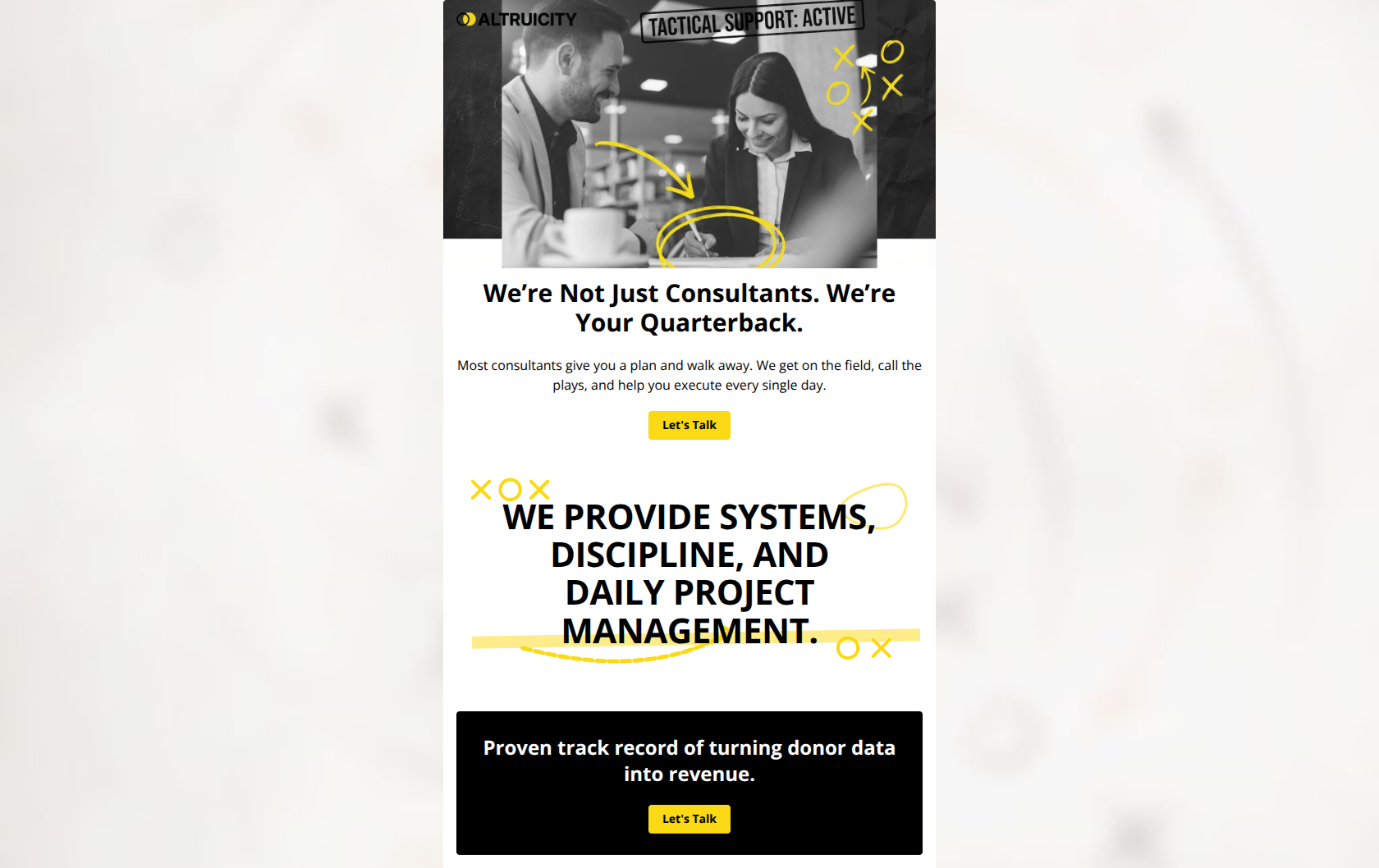
76/100This email succeeds visually with a distinct, high-energy brand aesthetic that perfectly matches the 'quarterback' positioning. However, it relies entirely on high-level assertions ('we help you execute') without providing the concrete evidence (metrics, testimonials, case studies) required to validate those claims for a skeptical non-profit leader.
Create Your Own
Generate professional email designs like this one in seconds with Kopi AI.
Email Details
- Subject Line
- Fundraising is a team sport.
- Brand
- Altruicity
- Industry
- Nonprofit
- Email Type
- Promotional
- Created
- February 10, 2026
Brand Colors
Email Copy
We’re Not Just Consultants. We’re Your Quarterback.
Most consultants give you a plan and walk away. We get on the field, call the plays, and help you execute every single day.
→ Let's Talk
Proven track record of turning donor data into revenue.
→ Let's Talk
Why This Email Works
This email succeeds visually with a distinct, high-energy brand aesthetic that perfectly matches the 'quarterback' positioning. However, it relies entirely on high-level assertions ('we help you execute') without providing the concrete evidence (metrics, testimonials, case studies) required to validate those claims for a skeptical non-profit leader.
Hero Impact
85/100- Strong use of the 'Modern Playbook' aesthetic with doodle overlays that reinforces the 'quarterback' metaphor.
- The headline 'We’re Not Just Consultants. We’re Your Quarterback' creates an immediate, memorable differentiation.
Content Structure & Flow
75/100- The linear narrative (Problem: Passive consultants -> Solution: Active quarterbacking) is easy to follow.
- The short length respects the time of busy Executive Directors.
Visual Hierarchy & Layout
90/100- High-contrast palette (Highlighter Yellow #FBD914 on Black/White) creates immediate visual interest and brand recognition.
- Excellent use of whitespace and bold typography to make the key messages pop.
Call-to-Action Strength
70/100- Buttons are visually distinct, using the brand's primary yellow color against contrasting backgrounds.
- The repetition of the CTA at the top and bottom provides two clear opportunities to click.
Message Clarity & Tone
80/100- The 'Quarterback' metaphor is consistently applied through copy and visuals.
- Language is direct and action-oriented ('call the plays', 'execute'), avoiding dry corporate jargon.
Readability & Scannability
85/100- Short paragraphs and punchy headlines make it effortless to consume.
- The use of graphical text elements breaks up the standard 'image-text-button' monotony.
Offer & Value Proposition
55/100- The core value proposition (active execution vs. passive advice) is a strong, compelling hook.
- The focus on 'turning donor data into revenue' addresses a specific pain point.
Personalization & Audience Fit
60/100- It correctly identifies the audience's frustration with consultants who just 'give a plan and walk away'.
- The tone resonates with leaders looking for accountability.
Quick Wins
- Change the footer headline from 'Proven track record...' to a specific data point (e.g., '$10M+ Raised for Clients').
- Update the CTA button copy from 'Let's Talk' to 'Build Your Game Plan' to match the sports/coach theme.
- Add a row of 3-4 client logos (social proof) immediately after the 'Systems/Discipline' section.
- Change the all-caps middle text to sentence case or title case for better readability.


Create Professional Email Designs
Generate beautiful, on-brand email designs in seconds. Just enter your brand URL and let AI do the rest.