Travel & Hospitality Promotional Email Template
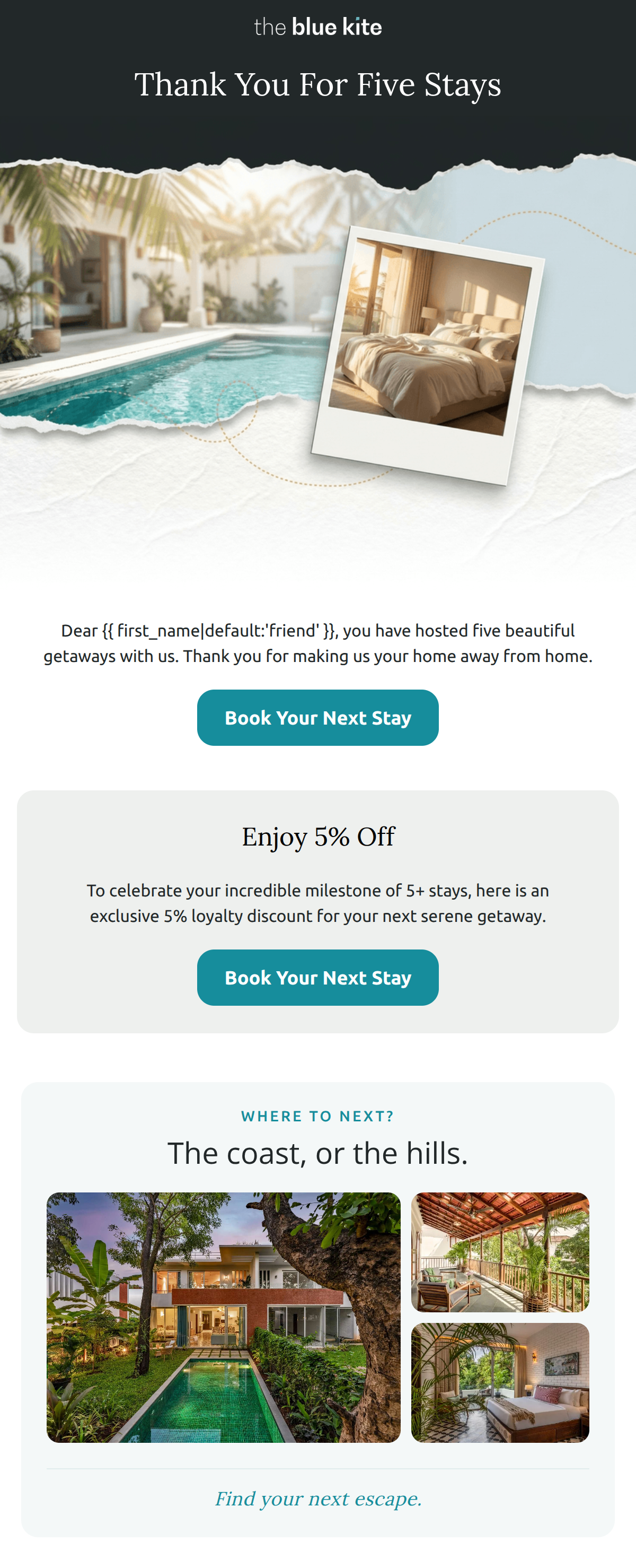
“Five stays and counting, [First Name]”
Design Score
83/100This is a sophisticated retention email that effectively leverages personalization and an understated, premium tone. The 'no tiers, no points' value proposition is a masterclass in understanding the affluent psychographic—valuing recognition over transactional gamification. The email's visual flow is generally strong, though it suffers from some internal copy redundancy and a jarring shift in CTA color palette between sections.
Create Your Own
Generate professional email designs like this one in seconds with Kopi AI.
Email Details
- Subject Line
- Five stays and counting, [First Name]
- Brand
- The Blue Kite
- Industry
- Travel & Hospitality
- Email Type
- Promotional
- Created
- August 20, 2026
Brand Colors
Email Copy
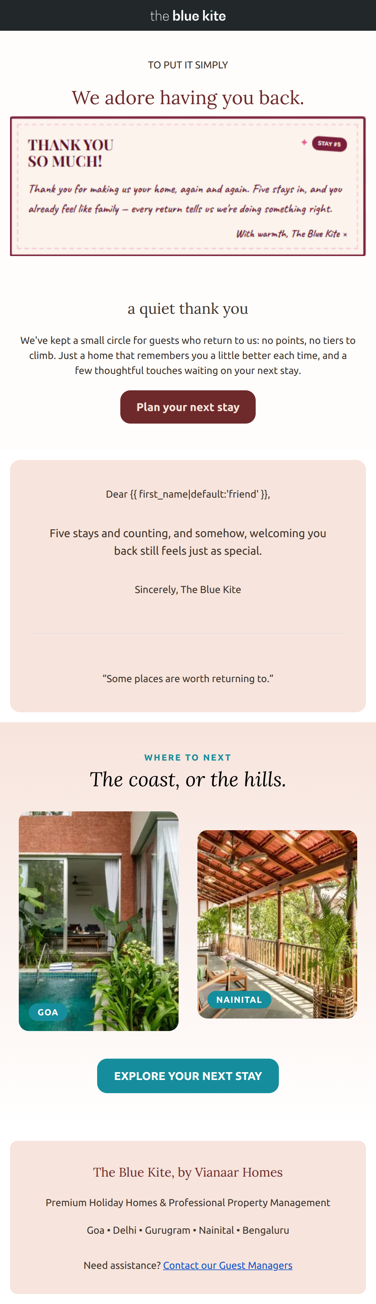
Preview text: Welcoming you back always feels just as special. A quiet thank you from The Blue Kite.
TO PUT IT SIMPLY
We adore having you back.
a quiet thank you
We've kept a small circle for guests who return to us: no points, no tiers to climb. Just a home that remembers you a little better each time, and a few thoughtful touches waiting on your next stay.
→ Plan your next stay
Dear friend,
Five stays and counting, and somehow, welcoming you back still feels just as special.
Sincerely, The Blue Kite
“Some places are worth returning to.”
The Blue Kite, by Vianaar Homes
Premium Holiday Homes & Professional Property Management
Goa • Delhi • Gurugram • Nainital • Bengaluru
Need assistance? Contact our Guest Managers
Why This Email Works
This is a sophisticated retention email that effectively leverages personalization and an understated, premium tone. The 'no tiers, no points' value proposition is a masterclass in understanding the affluent psychographic—valuing recognition over transactional gamification. The email's visual flow is generally strong, though it suffers from some internal copy redundancy and a jarring shift in CTA color palette between sections.
Hero (top/initial part) Impact
88/100- Specific, personalized recognition of stay count.
- Understated, non-promotional opening that builds trust.
Content Structure & Flow
78/100- Excellent use of the inverted pyramid in the hero.
- Clear transition from emotional acknowledgement to destination inspiration.
Visual Hierarchy & Layout
85/100- The masonry grid provides a sophisticated way to showcase variety.
- Clean serif typography establishes an immediate sense of luxury.
Call-to-Action Strength
75/100- CTAs are clearly defined and isolated with plenty of whitespace.
- Action-oriented verbs are used effectively.
Message Clarity & Tone
92/100- Avoids the hyperbole typical of travel brands.
- The 'no points, no tiers' copy is a brilliant differentiator for the target audience.
Readability & Scannability
90/100- Short, punchy paragraphs.
- High-contrast text-to-background ratio.
Offer & Value Proposition
85/100- Correctly identifies that this audience is 'points-fatigued'.
- Positions the brand as a consistent 'safety net' for luxury travel.
Personalization & Audience Fit
95/100- Direct use of first name and stay history.
- Psychographic alignment with the 'discerning traveler'.
Copy Conciseness & Word Economy
74/100- The 'Where to next' sub-copy is exceptionally tight.
- The quote 'Some places are worth returning to' adds emotional resonance without bloat.
Quick Wins
- Unify the button colors to the primary Ocean Teal (#168D9C).
- Remove the redundant 'a quiet thank you' text block to reduce scrolling effort.
- Change the secondary maroon heading 'We adore having you back' to the brand's charcoal or teal for better visual harmony.
Create Professional Email Designs
Generate beautiful, on-brand email designs in seconds. Just enter your brand URL and let AI do the rest.