Health & Wellness Announcement Email Template
“Every sip fuels a bigger mission”
Design Score
83/100A highly scannable, visually clean mission-driven email that effectively communicates Liquid I.V.'s philanthropic efforts. The copy is exceptionally tight, and the visual hierarchy guides the eye effortlessly through the narrative. The primary weakness lies in a mismatched Hero CTA that asks for a purchase before fully establishing the emotional hook of the mission.
Create Your Own
Generate professional email designs like this one in seconds with Kopi AI.
Email Details
- Subject Line
- Every sip fuels a bigger mission
- Brand
- Liquid IV [eval 2026-03-26]
- Industry
- Health & Wellness
- Email Type
- Announcement
- Created
- March 26, 2026
Brand Colors
Email Copy
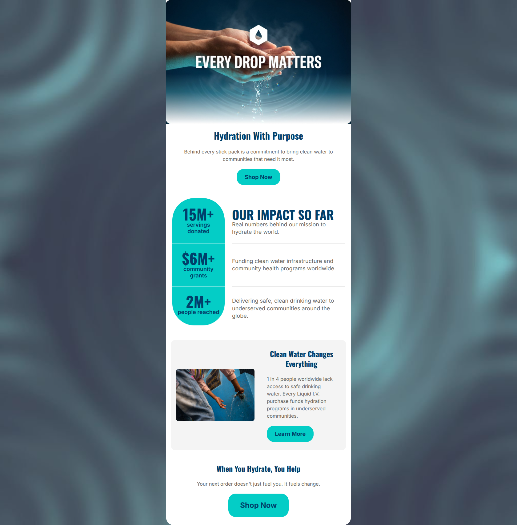
Hydration With Purpose
Behind every stick pack is a commitment to bring clean water to communities that need it most.
→ Shop Now
Clean Water Changes Everything
1 in 4 people worldwide lack access to safe drinking water. Every Liquid I.V. purchase funds hydration programs in underserved communities.
→ Learn More
When You Hydrate, You Help
Your next order doesn't just fuel you. It fuels change.
→ Shop Now
Why This Email Works
A highly scannable, visually clean mission-driven email that effectively communicates Liquid I.V.'s philanthropic efforts. The copy is exceptionally tight, and the visual hierarchy guides the eye effortlessly through the narrative. The primary weakness lies in a mismatched Hero CTA that asks for a purchase before fully establishing the emotional hook of the mission.
Hero Impact
75/100- Strong, evocative imagery that aligns perfectly with the headline.
- Clear, concise hero copy that sets the stage without overwhelming the reader.
Content Structure & Flow
85/100- Excellent pacing; the story unfolds naturally as the user scrolls.
- The positioning of the final section effectively summarizes the preceding content and logically leads to the final CTA.
Visual Hierarchy & Layout
80/100- The high-contrast cyan against white ensures the most impressive numbers are unmissable.
- Effective use of a container card to break up the vertical scroll.
Call-to-Action Strength
65/100- CTAs contrast well against their backgrounds.
- The final CTA is perfectly positioned after a strong, you-centric value proposition.
Message Clarity & Tone
90/100- Zero ambiguity about how the program works.
- Tone is empowering rather than guilt-inducing.
Readability & Scannability
95/100- Brilliant use of large typographic numbers to communicate value instantly.
- Short, punchy paragraphs that eliminate visual fatigue.
Offer & Value Proposition
85/100- Clearly articulates the emotional and social ROI of purchasing.
- Frames the brand's work as a partnership with the customer.
Personalization & Audience Fit
80/100- Strong alignment with target audience values.
- Effective pivot from 'we/our' impact to 'you/your' impact at the end.
Copy Conciseness & Word Economy
95/100- Extremely tight sentence structure.
- High impact-to-word-count ratio.
Quick Wins
- Change the Hero 'Shop Now' CTA to a mission-aligned phrase like 'Shop to Support' to reduce immediate friction.
- Update the final CTA from the generic 'Shop Now' to something that pays off the section copy, such as 'Fuel Change Today'.

Create Professional Email Designs
Generate beautiful, on-brand email designs in seconds. Just enter your brand URL and let AI do the rest.