Health & Wellness Announcement Email Template
“Every sip fuels a bigger mission.”
Design Score
72/100This email effectively communicates Liquid I.V.'s commendable purpose-driven mission, utilizing a clean, scannable layout and strong emotional imagery. However, it falls into a common trap for 'impact' emails: it forgets to sell the product. By entirely omitting product visuals and failing to tie the altruistic message back to the immediate physical benefits for the consumer (energy, performance), it asks the user to convert based solely on charity rather than a dual-value exchange. Furthermore, the repetitive copy and vague CTAs introduce unnecessary friction.
Create Your Own
Generate professional email designs like this one in seconds with Kopi AI.
Email Details
- Subject Line
- Every sip fuels a bigger mission.
- Brand
- Liquid IV [eval 2026-03-26]
- Industry
- Health & Wellness
- Email Type
- Announcement
- Created
- March 26, 2026
Brand Colors
Email Copy
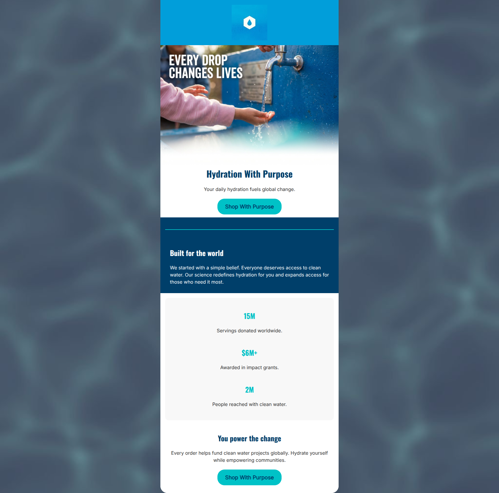
Hydration With Purpose
Your daily hydration fuels global change.
→ Shop With Purpose
Built for the world
We started with a simple belief. Everyone deserves access to clean water. Our science redefines hydration for you and expands access for those who need it most.
15M
Servings donated worldwide.
$6M+
Awarded in impact grants.
2M
People reached with clean water.
You power the change
Every order helps fund clean water projects globally. Hydrate yourself while empowering communities.
→ Shop With Purpose
Why This Email Works
This email effectively communicates Liquid I.V.'s commendable purpose-driven mission, utilizing a clean, scannable layout and strong emotional imagery. However, it falls into a common trap for 'impact' emails: it forgets to sell the product. By entirely omitting product visuals and failing to tie the altruistic message back to the immediate physical benefits for the consumer (energy, performance), it asks the user to convert based solely on charity rather than a dual-value exchange. Furthermore, the repetitive copy and vague CTAs introduce unnecessary friction.
Hero (top/initial part) Impact
70/100- Strong, emotionally resonant hero imagery.
- Clear, easily digestible primary headline.
Content Structure & Flow
82/100- Excellent pacing; chunks of information are well-separated.
- The transition from qualitative claims to quantitative proof (stats) is highly persuasive.
Visual Hierarchy & Layout
75/100- The stat block card visually groups related proof points effectively.
- The teal divider line is a nice touch to bridge sections visually.
Call-to-Action Strength
60/100- CTAs have excellent contrast against both the white background and the hero image.
- Buttons are isolated with good surrounding whitespace, making them clear tap targets.
Message Clarity & Tone
70/100- The altruistic tone feels authentic and not overly corporate.
- Language is empowering ('You power the change').
Readability & Scannability
88/100- Excellent use of numbers as visual anchors in the stat block.
- Headings clearly summarize the text that follows them.
Offer & Value Proposition
55/100- The emotional value proposition ('Your daily hydration fuels global change') is clearly stated upfront.
Personalization & Audience Fit
75/100- Aesthetic and cause directly match the psychographics of the target demographic.
Copy Conciseness & Word Economy
70/100- No massive walls of text; relies on punchy sentences.
Quick Wins
- Change the vague 'Shop With Purpose' CTAs to concrete actions like 'Shop Hydration Multipliers' or 'Stock Up & Give Back'.
- Darken the teal text (#00C2C7) in the stat block to improve contrast against the light gray background.
- Remove throat-clearing phrases like 'We started with a simple belief' to make the copy more direct.

Create Professional Email Designs
Generate beautiful, on-brand email designs in seconds. Just enter your brand URL and let AI do the rest.