Fitness Promotional Email Template
“Essential gear for leg day.”
Design Score
81/100This email succeeds in delivering Gymshark's 'Industrial Athlete' aesthetic with high-impact visuals and punchy, benefit-driven copy. However, conversion is hindered by a lack of audience segmentation (mixing men's and women's products in the primary grid) and a primary hero CTA that lacks visual weight compared to secondary buttons.
Create Your Own
Generate professional email designs like this one in seconds with Kopi AI.
Email Details
- Subject Line
- Essential gear for leg day.
- Brand
- Gymshark
- Industry
- Fitness
- Email Type
- Promotional
- Created
- January 22, 2026
Brand Colors
Email Copy
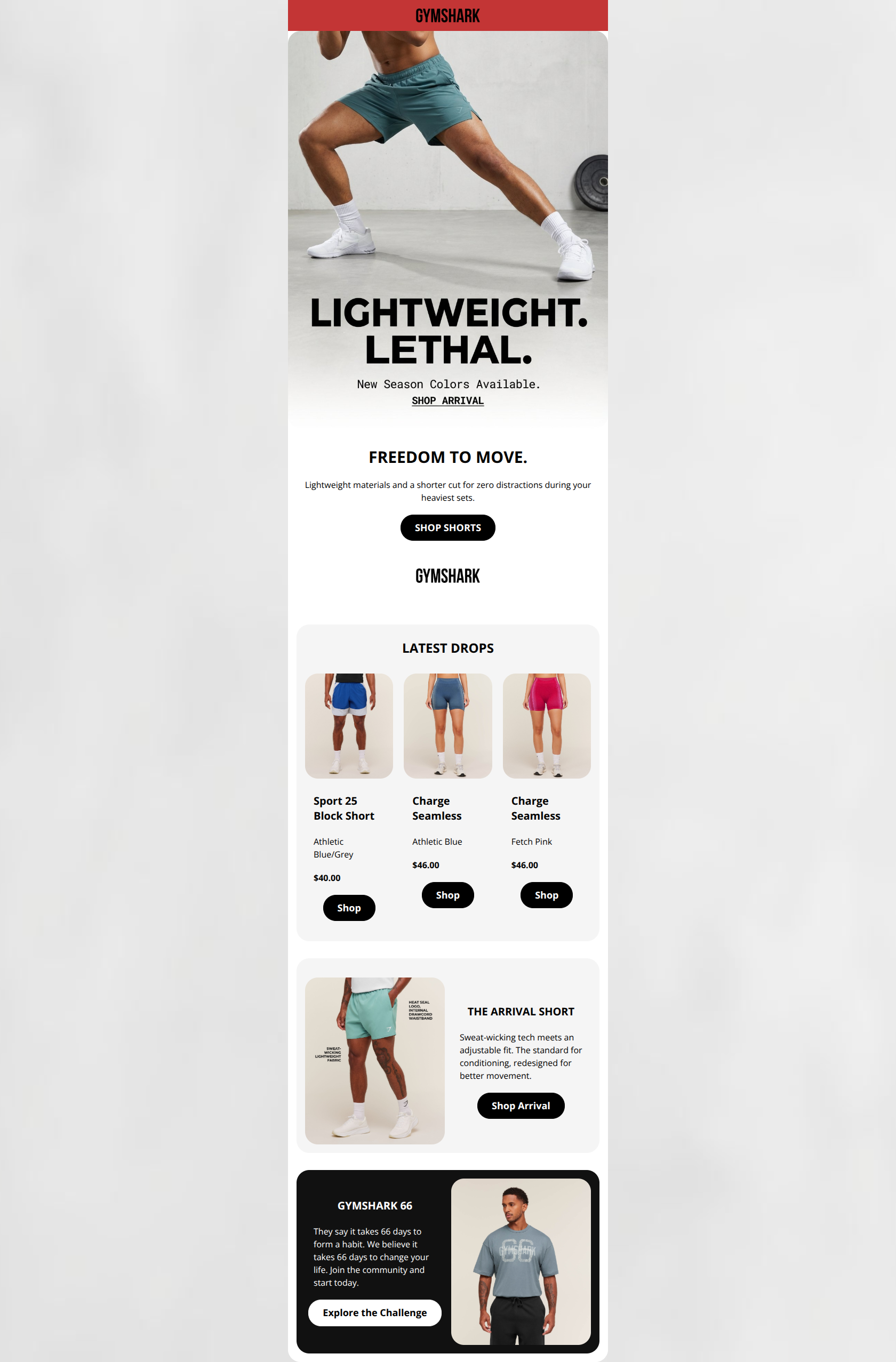
FREEDOM TO MOVE.
Lightweight materials and a shorter cut for zero distractions during your heaviest sets.
→ SHOP SHORTS
LATEST DROPS
Sport 25 Block Short
Athletic Blue/Grey
$40.00
→ Shop
Charge Seamless
Athletic Blue
$46.00
→ Shop
Charge Seamless
Fetch Pink
$46.00
→ Shop
THE ARRIVAL SHORT
Sweat-wicking tech meets an adjustable fit. The standard for conditioning, redesigned for better movement.
→ Shop Arrival
GYMSHARK 66
They say it takes 66 days to form a habit. We believe it takes 66 days to change your life. Join the community and start today.
→ Explore the Challenge
Why This Email Works
This email succeeds in delivering Gymshark's 'Industrial Athlete' aesthetic with high-impact visuals and punchy, benefit-driven copy. However, conversion is hindered by a lack of audience segmentation (mixing men's and women's products in the primary grid) and a primary hero CTA that lacks visual weight compared to secondary buttons.
Hero Impact
85/100- Headline 'LIGHTWEIGHT. LETHAL.' creates immediate intrigue and aligns perfectly with the 'hard work' brand ethos.
- High-quality photography clearly demonstrates the product in a performance context (lunging).
Content Structure & Flow
80/100- Logical progression from 'Hype' (Hero) to 'Shop' (Grid) to 'Education' (Tech card).
- Clear demarcation between sections using whitespace.
Visual Hierarchy & Layout
85/100- Excellent use of whitespace prevents the monochrome palette from feeling heavy or cluttered.
- The alternating layout (Grid -> Left/Right Split -> Right/Left Split) keeps the eye moving down the page.
Call-to-Action Strength
75/100- Secondary buttons ('Shop Shorts', 'Shop Arrival') are high-contrast black pills that stand out well.
- Button copy is generally specific ('Shop Shorts' vs just 'Shop').
Message Clarity & Tone
95/100- Phrases like 'Zero distractions during your heaviest sets' connect features directly to user benefits.
- Use of 'We believe it takes 66 days to change your life' adds emotional weight to the community section.
Readability & Scannability
90/100- Short paragraphs (1-2 sentences) make skimming effortless.
- Bold headlines clearly signal section topics.
Offer & Value Proposition
80/100- Clear focus on the 'Newness' of the drop.
- Price points are clearly visible.
Personalization & Audience Fit
60/100- Imagery style fits the 'hardcore gym goer' persona perfectly.
Quick Wins
- Change the 'SHOP ARRIVAL' text link in the hero to a solid black button.
- Bold the prices in the 'Latest Drops' product grid to make them pop.
- Change the generic 'Shop' copy on grid buttons to 'Shop Now' or 'Get It'.



Create Professional Email Designs
Generate beautiful, on-brand email designs in seconds. Just enter your brand URL and let AI do the rest.