Media & Entertainment Promotional Email Template
“El costo silencioso de rentar”
Design Score
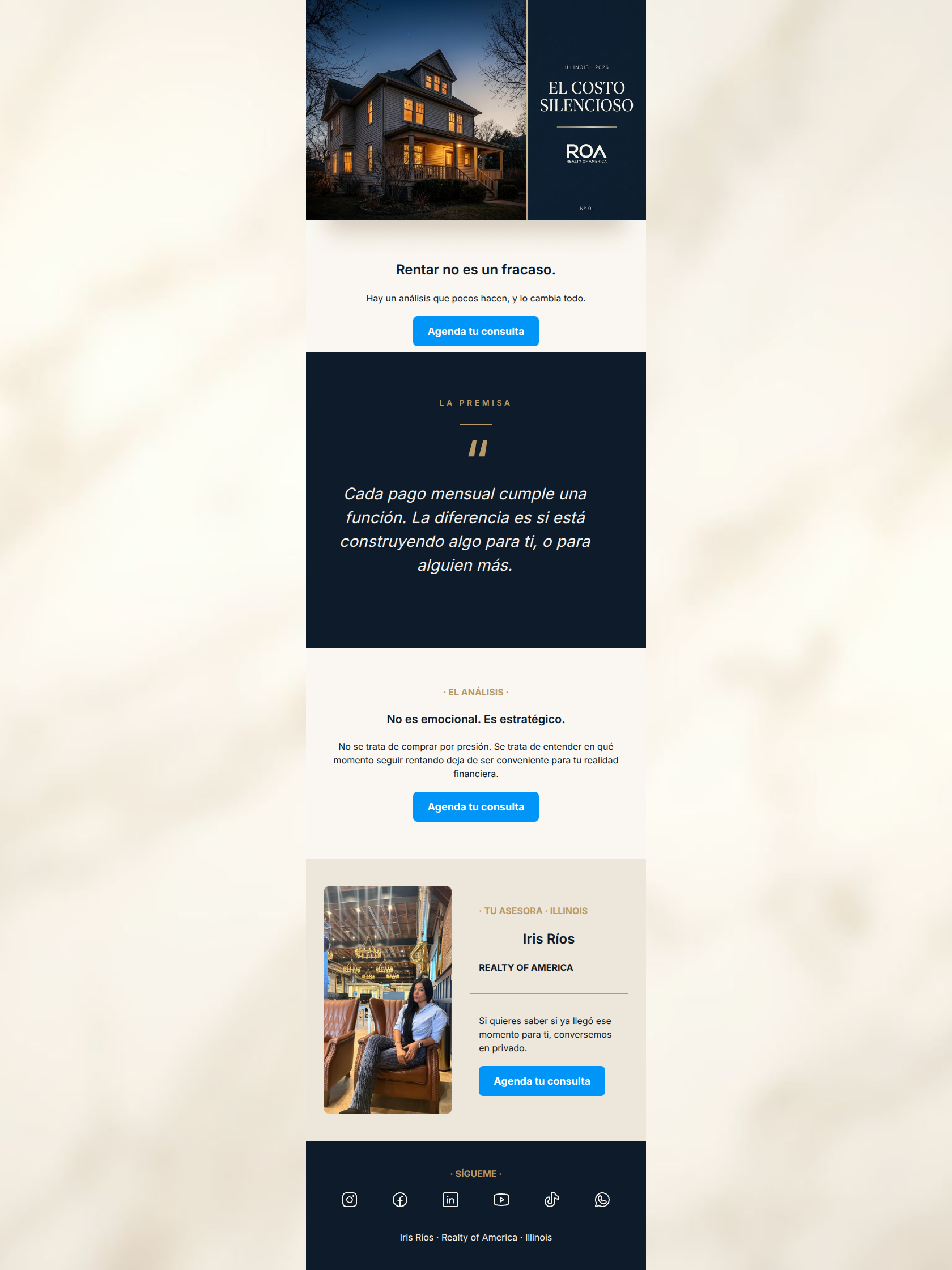
85/100This is a highly sophisticated, editorial-style lead generation email that successfully frames real estate consultation as a strategic, rather than purely transactional, decision. The pacing, use of negative space, and typographic hierarchy are excellent, creating a premium 'magazine spread' feel. The primary copy is tight, empathetic, and disarming ('Renting is not a failure'). The main area for improvement lies in the visual integration of the Call-to-Action buttons; the bright, saturated blue heavily clashes with the refined navy, cream, and gold palette, slightly breaking the luxury illusion.
Create Your Own
Generate professional email designs like this one in seconds with Kopi AI.
Email Details
- Subject Line
- El costo silencioso de rentar
- Brand
- Industry
- Media & Entertainment
- Email Type
- Promotional
- Created
- May 9, 2026
Brand Colors
Email Copy
Rentar no es un fracaso.
Hay un análisis que pocos hacen, y lo cambia todo.
→ Agenda tu consulta
· EL ANÁLISIS ·
No es emocional. Es estratégico.
No se trata de comprar por presión. Se trata de entender en qué momento seguir rentando deja de ser conveniente para tu realidad financiera.
→ Agenda tu consulta
· TU ASESORA · ILLINOIS
Iris Ríos
REALTY OF AMERICA
Si quieres saber si ya llegó ese momento para ti, conversemos en privado.
→ Agenda tu consulta
· SÍGUEME ·
Iris Ríos · Realty of America · Illinois
Why This Email Works
This is a highly sophisticated, editorial-style lead generation email that successfully frames real estate consultation as a strategic, rather than purely transactional, decision. The pacing, use of negative space, and typographic hierarchy are excellent, creating a premium 'magazine spread' feel. The primary copy is tight, empathetic, and disarming ('Renting is not a failure'). The main area for improvement lies in the visual integration of the Call-to-Action buttons; the bright, saturated blue heavily clashes with the refined navy, cream, and gold palette, slightly breaking the luxury illusion.
Hero (top/initial part) Impact
85/100- Strong, empathy-driven headline that disrupts standard real estate sales pitches.
- High-quality imagery that sets an immediate luxury standard.
Content Structure & Flow
90/100- The dark, full-width pull-quote section creates a stunning visual break that forces the reader to pause and absorb the core message.
- Excellent pacing; the user is never overwhelmed with too much information in a single scroll depth.
Visual Hierarchy & Layout
75/100- Sophisticated use of typography (mixing small caps, serifs, and sans-serifs) to denote different types of information.
- The single-column, centered layout keeps cognitive load exceptionally low.
Call-to-Action Strength
85/100- Perfect repetition of a single, clear action across the entire email.
- The CTA copy is direct and sets clear expectations about what happens next (booking a consultation).
Message Clarity & Tone
88/100- Avoids typical real estate clichés ('Buy your dream home today!') in favor of financial strategy.
- The hushed, editorial tone matches the visual aesthetic perfectly.
Readability & Scannability
85/100- Excellent use of negative space to let the text breathe.
- Clear demarcation of sections using contrasting background colors.
Offer & Value Proposition
80/100- The offer is framed around the user's financial reality, not the agent's desire to sell a house.
- Removes the emotional pressure typically associated with real estate decisions.
Personalization & Audience Fit
85/100- Deeply empathetic understanding of the target audience's pain points (the 'failure' stigma of renting).
- Clear localization ('Illinois') builds immediate relevance.
Copy Conciseness & Word Economy
95/100- The pull-quote distills a complex financial concept into two highly readable sentences.
- Zero fluff; respects the reader's time.
Quick Wins
- Change the bright blue CTA button backgrounds to a deep navy (#0D1B2A) with white text to harmonize with the luxury editorial design while maintaining visibility.
- Increase the font weight slightly on the gold overline texts (e.g., '· LA PREMISA ·') to ensure they remain legible against the cream backgrounds.
Create Professional Email Designs
Generate beautiful, on-brand email designs in seconds. Just enter your brand URL and let AI do the rest.