Health & Wellness Promotional Email Template
“Discover Our New Collection!”
Design Score
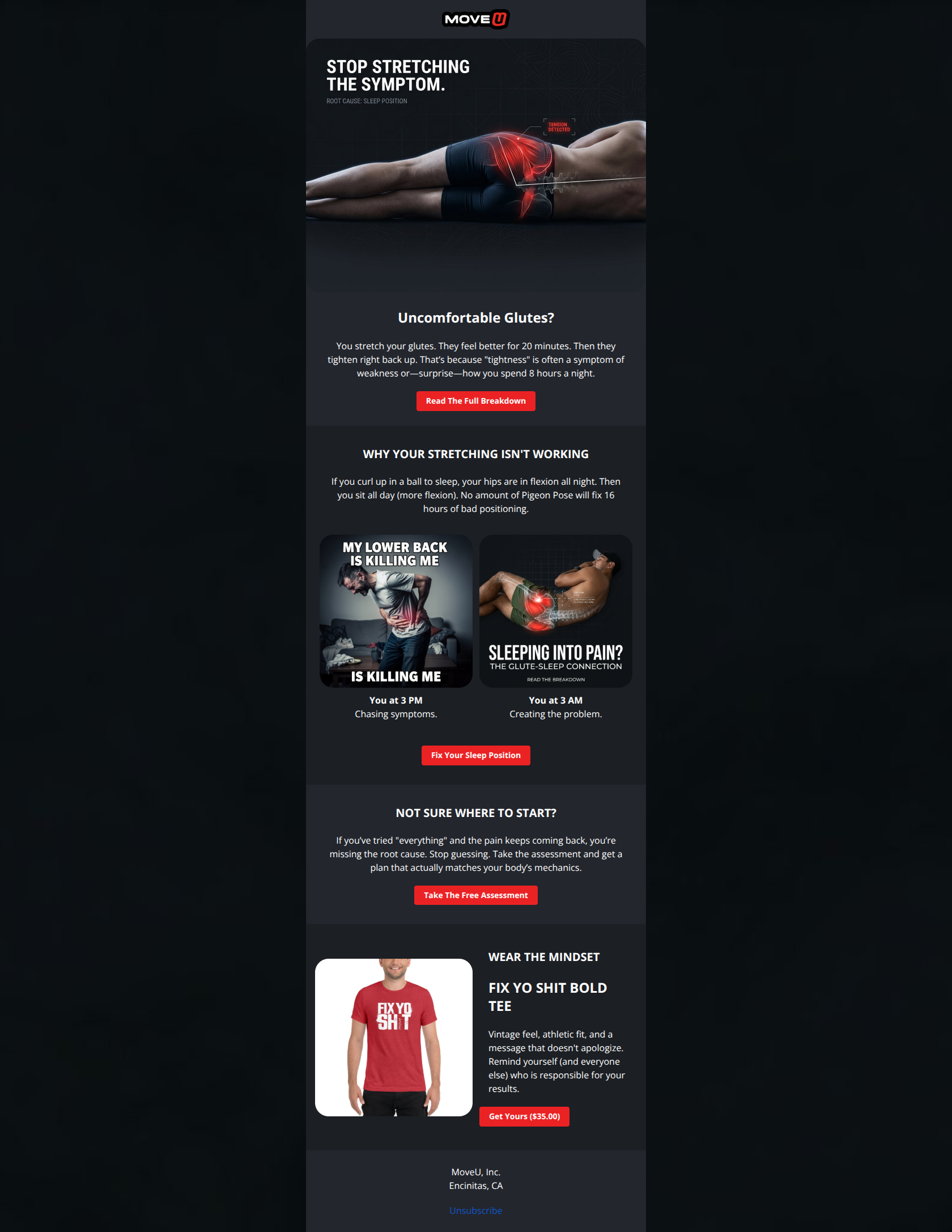
85/100This is a strong, authority-driven email that effectively uses the 'Problem-Agitation-Solution' framework. The high-contrast 'Dark Mode' aesthetic and anatomical visuals build immediate trust and brand recognition. The biggest strength is the clarity of the educational hook ('Stop stretching the symptom'), while the biggest weakness is the diluted focus at the bottom—tacking on a merch sale distracts from the primary goal of content engagement and the secondary goal of the diagnostic assessment.
Create Your Own
Generate professional email designs like this one in seconds with Kopi AI.
Email Details
- Subject Line
- Discover Our New Collection!
- Brand
- MoveU
- Industry
- Health & Wellness
- Email Type
- Promotional
- Created
- February 25, 2026
Brand Colors
Email Copy
Uncomfortable Glutes?
You stretch your glutes. They feel better for 20 minutes. Then they tighten right back up. That’s because "tightness" is often a symptom of weakness or—surprise—how you spend 8 hours a night.
→ Read The Full Breakdown
WHY YOUR STRETCHING ISN'T WORKING
If you curl up in a ball to sleep, your hips are in flexion all night. Then you sit all day (more flexion). No amount of Pigeon Pose will fix 16 hours of bad positioning.
You at 3 PM Chasing symptoms.
You at 3 AM Creating the problem.
→ Fix Your Sleep Position
NOT SURE WHERE TO START?
If you’ve tried "everything" and the pain keeps coming back, you’re missing the root cause. Stop guessing. Take the assessment and get a plan that actually matches your body’s mechanics.
→ Take The Free Assessment
WEAR THE MINDSET
FIX YO SHIT BOLD TEE
Vintage feel, athletic fit, and a message that doesn't apologize. Remind yourself (and everyone else) who is responsible for your results.
→ Get Yours ($35.00)
MoveU, Inc. Encinitas, CA
Unsubscribe
Why This Email Works
This is a strong, authority-driven email that effectively uses the 'Problem-Agitation-Solution' framework. The high-contrast 'Dark Mode' aesthetic and anatomical visuals build immediate trust and brand recognition. The biggest strength is the clarity of the educational hook ('Stop stretching the symptom'), while the biggest weakness is the diluted focus at the bottom—tacking on a merch sale distracts from the primary goal of content engagement and the secondary goal of the diagnostic assessment.
Hero (top/initial part) Impact
88/100- The headline 'STOP STRETCHING THE SYMPTOM' is a perfect hook that challenges common behavior.
- Anatomical graphical overlays reinforce the 'medical authority' brand positioning instantly.
Content Structure & Flow
82/100- Excellent use of the 'Inverted Pyramid'—starting with a broad hook and narrowing down to a specific mechanism (sleep position).
- The side-by-side comparison (3 PM vs 3 AM) visually proves the thesis without needing a wall of text.
Visual Hierarchy & Layout
85/100- High-contrast red buttons (#EB2224) stand out vividly against the dark background.
- Good use of whitespace (padding) between the text blocks and images.
Call-to-Action Strength
80/100- Primary CTAs are consistently styled and easy to spot.
- 'Fix Your Sleep Position' is a strong, action-oriented CTA.
Message Clarity & Tone
92/100- The 'Smoke vs. Fire' analogy is brilliant for explaining referred pain.
- The 'Fix Yo Shit' tee copy ('message that doesn't apologize') reinforces the brand voice effectively.
Readability & Scannability
90/100- Short, punchy sentences reduce cognitive load.
- Bolding key phrases ('You at 3 PM', 'You at 3 AM') guides the skimming eye.
Offer & Value Proposition
85/100- The email gives value (education) before asking for a transaction, building trust.
- The 'Free Assessment' is a strong lead magnet for users not ready to buy a membership.
Personalization & Audience Fit
75/100- The copy speaks directly to the user's frustration ('tried everything', 'pain keeps coming back').
Quick Wins
- Rename the first CTA from 'Read The Full Breakdown' to 'See The Sleep Fix' to focus on the benefit.
- Break the paragraph in the 'Why Your Stretching Isn't Working' section into two shorter lines for better mobile scanning.
- Center-align the text in the Merch section to match the visual rhythm of the previous sections.
- Add 'Free' to the headline of the Assessment section: 'NOT SURE WHERE TO START? TRY THE FREE QUIZ.'

Create Professional Email Designs
Generate beautiful, on-brand email designs in seconds. Just enter your brand URL and let AI do the rest.