SaaS & Software Promotional Email Template
“Design stunning infographics — new template inside”
Design Score
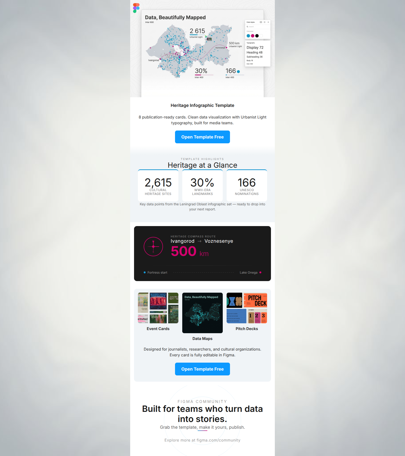
77/100Visually, this email is a textbook execution of Figma's clean, utilitarian aesthetic. The stark contrasts, excellent use of white space, and unmistakable primary CTAs make it highly scannable and visually frictionless. However, it suffers from a significant strategic flaw: it spends more time selling the placeholder data (Leningrad Oblast heritage sites) than the utility of the template itself. For a target audience of designers, journalists, and researchers looking for workflow solutions, the email needs to pivot from 'Look at these specific Russian landmarks' to 'Look how easily you can map your own data using our pre-built components.' The email earns high marks for layout and CTA clarity but loses points on message clarity and audience fit.
Create Your Own
Generate professional email designs like this one in seconds with Kopi AI.
Email Details
- Subject Line
- Design stunning infographics — new template inside
- Brand
- Figma
- Industry
- SaaS & Software
- Email Type
- Promotional
- Created
- April 7, 2026
Brand Colors
Email Copy
Heritage Infographic Template
8 publication-ready cards. Clean data visualization with Urbanist Light typography, built for media teams.
→ Open Template Free
Event Cards
Data Maps
Pitch Decks
Designed for journalists, researchers, and cultural organizations. Every card is fully editable in Figma.
→ Open Template Free
Why This Email Works
Visually, this email is a textbook execution of Figma's clean, utilitarian aesthetic. The stark contrasts, excellent use of white space, and unmistakable primary CTAs make it highly scannable and visually frictionless. However, it suffers from a significant strategic flaw: it spends more time selling the placeholder data (Leningrad Oblast heritage sites) than the utility of the template itself. For a target audience of designers, journalists, and researchers looking for workflow solutions, the email needs to pivot from 'Look at these specific Russian landmarks' to 'Look how easily you can map your own data using our pre-built components.' The email earns high marks for layout and CTA clarity but loses points on message clarity and audience fit.
Hero Impact
85/100- Immediate introduction of the visual template.
- Clear, concise headline and subcopy.
- Excellent proximity of the primary CTA to the value proposition.
Content Structure & Flow
75/100- Logical structural hierarchy (Hero -> Detail -> Gallery -> Footer).
- Excellent use of distinct background colors to separate sections without adding clutter.
Visual Hierarchy & Layout
88/100- Perfect use of white space to reduce cognitive load.
- The 'Heritage at a Glance' numbers are massive and draw the eye down the page.
- The three-column gallery at the bottom is perfectly balanced.
Call-to-Action Strength
95/100- High-contrast, brand-authentic CTA color.
- Outstanding, low-friction copy ('Open Template Free').
- Repeated strategically at the top and bottom of the email.
Message Clarity & Tone
65/100- Tone is authoritative and clean, matching the Figma brand.
- Typography supports the message with a modern, editorial feel.
Readability & Scannability
90/100- Excellent typographic hierarchy.
- Short, punchy text blocks that avoid the 'wall of text' trap.
- Clear signposting of different asset types (Event Cards, Data Maps, Pitch Decks).
Offer & Value Proposition
70/100- Clearly identifies the target persona in the copy ('media teams', 'journalists, researchers').
- Explicitly states that it is 'Free'.
Personalization & Audience Fit
60/100- The visual aesthetic perfectly matches the sophisticated taste of the Figma audience.
- Recognizes that non-designers (journalists) also use Figma for publishing.
Copy Conciseness & Word Economy
88/100- Zero filler words in the hero section.
- Labels in the gallery section (Event Cards, Data Maps) are beautifully minimalist.
- Excellent use of numbers to convey information quickly.
Quick Wins
- Change the micro-copy above the stats from 'TEMPLATE HIGHLIGHTS' to 'CUSTOMIZABLE COMPONENTS'.
- Add a small 'Figma Community' badge to the hero image to reinforce that this is a community asset.
- Darken the subtext under the three large stats to ensure it passes WCAG contrast standards against the light gray background.
Create Professional Email Designs
Generate beautiful, on-brand email designs in seconds. Just enter your brand URL and let AI do the rest.