Home & Garden Promotional Email Template
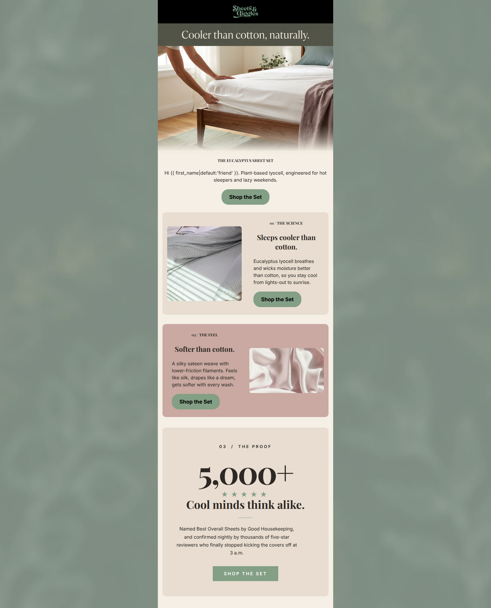
“Cooler than cotton, naturally.”
Design Score
86/100This is a highly effective, beautifully structured email that nails the fundamentals of scannability and value communication. It excels in guiding the reader through a logical 'feature-benefit-proof' narrative with a relentless, clear call to action. The primary areas for improvement involve injecting more of the brand's signature humor into the surprisingly clinical copy, and addressing a minor visual contrast issue with the CTA on the mauve background.
Create Your Own
Generate professional email designs like this one in seconds with Kopi AI.
Email Details
- Subject Line
- Cooler than cotton, naturally.
- Brand
- Sheets & Giggles
- Industry
- Home & Garden
- Email Type
- Promotional
- Created
- May 19, 2026
Brand Colors
Email Copy
THE EUCALYPTUS SHEET SET
Hi friend. Plant-based lyocell, engineered for hot sleepers and lazy weekends.
→ Shop the Set
01 / THE SCIENCE
Sleeps cooler than cotton.
Eucalyptus lyocell breathes and wicks moisture better than cotton, so you stay cool from lights-out to sunrise.
→ Shop the Set
02 / THE FEEL
Softer than cotton.
A silky sateen weave with lower-friction filaments. Feels like silk, drapes like a dream, gets softer with every wash.
→ Shop the Set
Why This Email Works
This is a highly effective, beautifully structured email that nails the fundamentals of scannability and value communication. It excels in guiding the reader through a logical 'feature-benefit-proof' narrative with a relentless, clear call to action. The primary areas for improvement involve injecting more of the brand's signature humor into the surprisingly clinical copy, and addressing a minor visual contrast issue with the CTA on the mauve background.
Hero (top/initial part) Impact
85/100- Immediate focus on the strongest benefit (cooling).
- Aspirational, on-brand imagery that sets a tranquil mood.
- Clear, immediate primary CTA above the fold.
Content Structure & Flow
92/100- Excellent use of numbered sections to indicate a quick, scannable read.
- Logical progression from functional features to emotional benefits to social proof.
- Consistent rhythm of image, text, and action.
Visual Hierarchy & Layout
82/100- Strong Z-pattern layout in the body sections guides the eye naturally.
- Generous negative space, particularly in the final proof card, draws focus to key elements.
- Clear typographic hierarchy (Kicker -> Heading -> Body).
Call-to-Action Strength
95/100- Relentless focus on a single destination URL.
- Consistent, clear, and expectation-setting button copy.
- Excellent repetition; placing a CTA after each value prop removes the need for the user to scroll back up.
Message Clarity & Tone
75/100- No ambiguity about what the product is or why it's superior to cotton.
- Directly addresses the 'hot sleeper' pain point.
Readability & Scannability
96/100- Short, punchy headlines that do the heavy lifting.
- Bite-sized body copy limited to one or two sentences.
- Effective use of kickers (01, 02) to guide the eye.
Offer & Value Proposition
85/100- Strong reliance on powerful social proof (5,000+ reviews, Good Housekeeping) to validate the claims.
- Clear differentiation from the standard (cotton).
Copy Conciseness & Word Economy
90/100- No throat-clearing or filler adjectives ('revolutionary', 'amazing').
- Rhythmic and economic sentences ('Feels like silk, drapes like a dream...').
Quick Wins
- Remove the dynamic greeting ('Hi {{ first_name }}') from the hero copy to immediately focus on the product benefit.
- Increase the contrast of the CTA button in the '02 / THE FEEL' section so it stands out against the mauve background.
- Ensure 'Free Shipping Over $100' is mentioned somewhere near the final CTA or in a subtle footer banner to remove purchase friction.



Create Professional Email Designs
Generate beautiful, on-brand email designs in seconds. Just enter your brand URL and let AI do the rest.