Media & Entertainment Newsletter Email Template
“Cada mes que rentas, pierdes patrimonio”
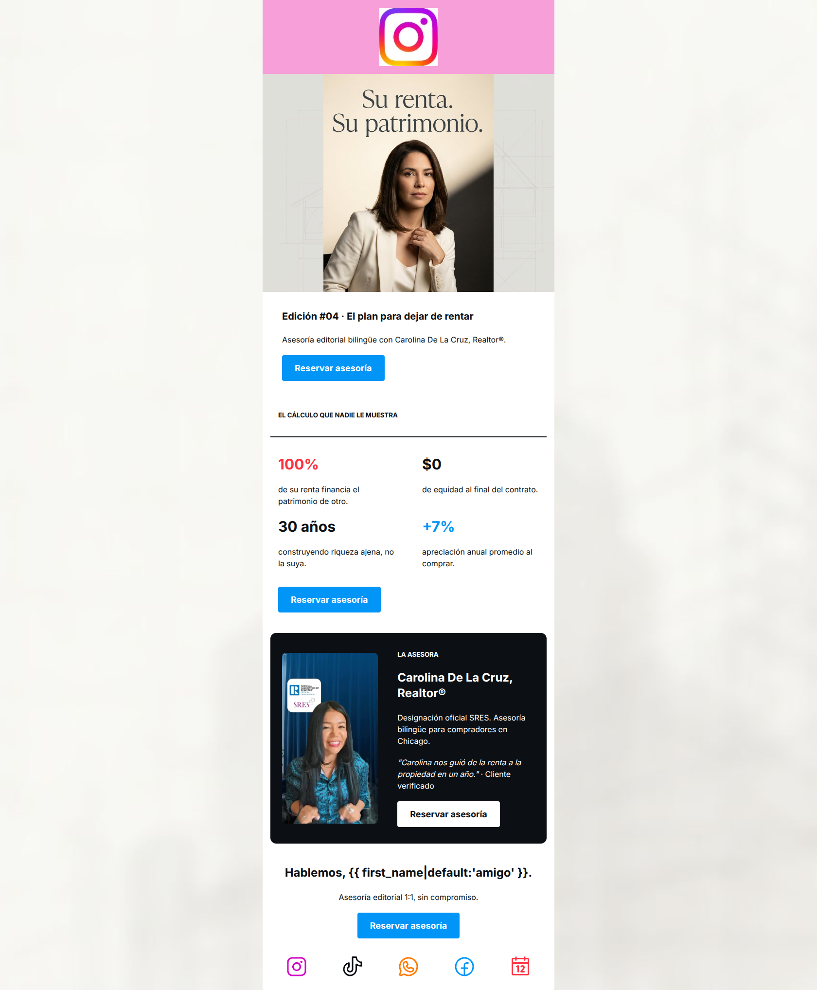
Design Score
89/100This is a highly effective, top-tier lead generation email. It successfully employs a stark, numbers-driven approach to agitate a specific pain point (the sunk cost of renting) and positions the sender as the authoritative solution. The structural flow from 'hook' to 'logical proof' to 'social proof' is excellent. The primary areas for improvement involve reducing visual friction at the bottom of the email and tightening up minor inconsistencies in tone and terminology to maximize click-through rate.
Create Your Own
Generate professional email designs like this one in seconds with Kopi AI.
Email Details
- Subject Line
- Cada mes que rentas, pierdes patrimonio
- Brand
- Industry
- Media & Entertainment
- Email Type
- Newsletter
- Created
- May 25, 2026
Brand Colors
Email Copy
Edición #04 · El plan para dejar de rentar
Asesoría editorial bilingüe con Carolina De La Cruz, Realtor®.
→ Reservar asesoría
EL CÁLCULO QUE NADIE LE MUESTRA
100%
de su renta financia el patrimonio de otro.
$0
de equidad al final del contrato.
30 años
construyendo riqueza ajena, no la suya.
+7%
apreciación anual promedio al comprar.
→ Reservar asesoría
LA ASESORA
Carolina De La Cruz, Realtor®
Designación oficial SRES. Asesoría bilingüe para compradores en Chicago.
"Carolina nos guió de la renta a la propiedad en un año." · Cliente verificado
→ Reservar asesoría
Hablemos, amigo.
Asesoría editorial 1:1, sin compromiso.
→ Reservar asesoría
Why This Email Works
This is a highly effective, top-tier lead generation email. It successfully employs a stark, numbers-driven approach to agitate a specific pain point (the sunk cost of renting) and positions the sender as the authoritative solution. The structural flow from 'hook' to 'logical proof' to 'social proof' is excellent. The primary areas for improvement involve reducing visual friction at the bottom of the email and tightening up minor inconsistencies in tone and terminology to maximize click-through rate.
Hero (top/initial part) Impact
85/100- High-quality, sophisticated image establishes immediate professional authority.
- The headline 'El plan para dejar de rentar' clearly and immediately addresses a high-intent pain point.
- The primary CTA is placed above the fold, providing an immediate conversion path for high-intent readers.
Content Structure & Flow
92/100- Excellent progression from identifying the problem (renting) to presenting the logical math, and finally introducing the expert.
- The use of a dark-mode card for the author bio effectively segments the content and signals a shift from 'the problem' to 'the person'.
- Pacing is rapid; the email does not dwell on any single point longer than necessary.
Visual Hierarchy & Layout
80/100- Strong use of a 2x2 grid to make statistical data instantly digestible.
- Excellent use of high-contrast color (#FF3040 for the negative stat, #0095F6 for the positive) to guide the reader's emotional interpretation of the numbers.
- The dark bio card creates a strong visual anchor that draws attention to the social proof.
Call-to-Action Strength
98/100- Perfect consistency: all buttons use the exact same 'Reservar asesoría' copy and point to the same Calendly destination.
- High color contrast ensures every button pops against both light and dark backgrounds.
- Excellent placement frequency (4 buttons) strategically distributed after key persuasive elements.
Message Clarity & Tone
86/100- Highly specific targeting ('bilingüe', 'Chicago') immediately qualifies the audience and builds trust.
- The financial pain of renting is communicated brutally and effectively ('100% de su renta financia el patrimonio de otro').
- The tone positions the sender as a peer and advisor rather than a desperate salesperson.
Readability & Scannability
96/100- The stats section relies on visual data mapping rather than bullet points, drastically reducing cognitive load.
- Generous font sizes and line heights make the body text comfortable to read on mobile devices.
- The dark background card uses a lighter weight text that remains perfectly legible against the high-contrast background.
Offer & Value Proposition
88/100- The value proposition is explicitly quantified in the '30 years' vs '+7%' section, moving the argument from emotional to logical.
- Features a verifiable, highly specific customer testimonial ('...de la renta a la propiedad en un año') to back up the core claim.
- The offer is a concrete next step (booking a consultation) rather than a vague 'learn more'.
Personalization & Audience Fit
82/100- Specifically calling out 'Chicago' and 'bilingüe' creates an immediate connection with the intended local demographic.
- The copy predominantly uses the formal 'su' (your), which respects the cultural nuance and professional nature of a major financial decision for this demographic.
Copy Conciseness & Word Economy
95/100- Zero walls of text; relies entirely on punchy, single-sentence statements.
- The testimonial is ruthlessly edited to feature only the specific transformation (rent to own in one year), omitting unnecessary narrative.
- Data is used in place of adjectives to convey value.
Quick Wins
- Desaturate and shrink the bottom row of social icons to reduce visual competition with the final CTA.
- Add 'sin compromiso' (no obligation) beneath the first CTA button to reduce initial click friction.
- Change the dynamic tag fallback from 'amigo' to a blank space or a more professional term to match the email's formal tone.


Create Professional Email Designs
Generate beautiful, on-brand email designs in seconds. Just enter your brand URL and let AI do the rest.