Fashion & Apparel Welcome Email Template
“Boas-vindas à ACE: do movimento à pausa”
Design Score
84/100A highly effective, on-brand welcome email that immediately establishes ACE's minimalist aesthetic and core value proposition. The structural flow is logical, moving from a strong lifestyle hero down to specific fabric technologies and social proof. The disciplined repetition of a single primary CTA is excellent for driving clicks. The main areas for improvement are visual contrast on the first button and refining how the welcome message is introduced.
Create Your Own
Generate professional email designs like this one in seconds with Kopi AI.
Email Details
- Subject Line
- Boas-vindas à ACE: do movimento à pausa
- Brand
- ACE
- Industry
- Fashion & Apparel
- Email Type
- Welcome
- Created
- July 10, 2026
Brand Colors
Email Copy
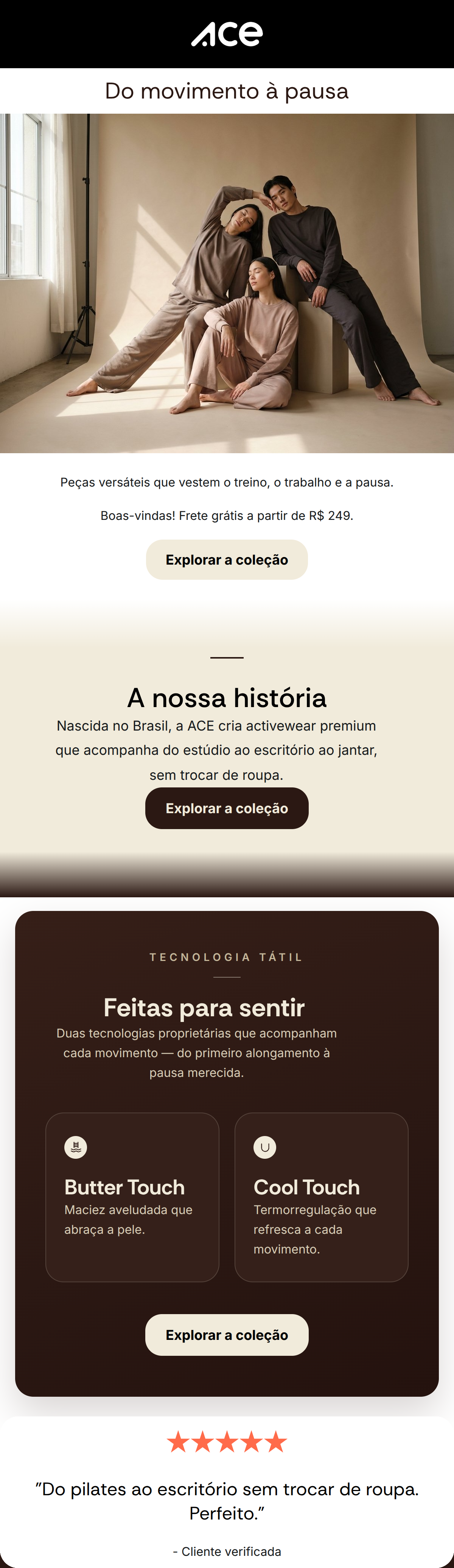
Preview text: Peças versáteis que vestem o treino, o trabalho e a pausa. Conheça a nossa história.
Do movimento à pausa
Peças versáteis que vestem o treino, o trabalho e a pausa.
Boas-vindas! Frete grátis a partir de R$ 249.
→ Explorar a coleção
★★★★★
"Do pilates ao escritório sem trocar de roupa. Perfeito."
- Cliente verificada
Why This Email Works
A highly effective, on-brand welcome email that immediately establishes ACE's minimalist aesthetic and core value proposition. The structural flow is logical, moving from a strong lifestyle hero down to specific fabric technologies and social proof. The disciplined repetition of a single primary CTA is excellent for driving clicks. The main areas for improvement are visual contrast on the first button and refining how the welcome message is introduced.
Hero Impact
85/100- Excellent use of high-quality, on-brand imagery that demonstrates the 'movement to pause' philosophy without aggressive sports cues.
- The H1 'Do movimento à pausa' instantly communicates the brand's core ethos.
Content Structure & Flow
82/100- Logical narrative progression that builds trust sequentially.
- Distinct sections break up the content, preventing the email from feeling like a wall of text.
Visual Hierarchy & Layout
75/100- The two-column grid for the 'Feitas para sentir' section is an excellent way to display product features efficiently.
- Typography sizing creates a clear distinction between headings and body copy.
Call-to-Action Strength
88/100- Flawless consistency in CTA copy ('Explorar a coleção') and destination, leaving zero ambiguity for the user.
- Placing a CTA in almost every discrete section maximizes the opportunity for engagement.
Message Clarity & Tone
85/100- Focuses entirely on the customer outcome (versatility) rather than just listing product features.
- Maintains a premium, non-pushy tone throughout.
Readability & Scannability
90/100- Bite-sized copy blocks, especially in the technology feature cards.
- Clear, bold headings act as signposts for skimmers.
Offer & Value Proposition
80/100- The free shipping threshold is clearly stated early in the email.
- The unique selling proposition of 'Butter Touch' and 'Cool Touch' is explained in simple, benefit-driven terms.
Personalization & Audience Fit
85/100- The imagery and copy perfectly align with the target audience's desire for an elevated, frictionless lifestyle.
- Choosing a testimonial that specifically mentions 'Do pilates ao escritório' (From pilates to the office) is a brilliant audience match.
Copy Conciseness & Word Economy
88/100- Every sentence earns its place and drives the narrative forward.
- The feature descriptions ('Maciez aveludada...', 'Termorregulação...') are masterclasses in concise benefit writing.
Quick Wins
- Change the background color of the very first 'Explorar a coleção' button to #2B1813 so it stands out against the white background.
- Move the 'Boas-vindas!' text out of the body paragraph and make it a distinct sub-headline at the top.
- Standardize all CTA buttons to use the same dark background color for immediate visual recognition.




Create Professional Email Designs
Generate beautiful, on-brand email designs in seconds. Just enter your brand URL and let AI do the rest.