Other Promotional Email Template
“Arrive in Paris with your rental file ready”
Design Score
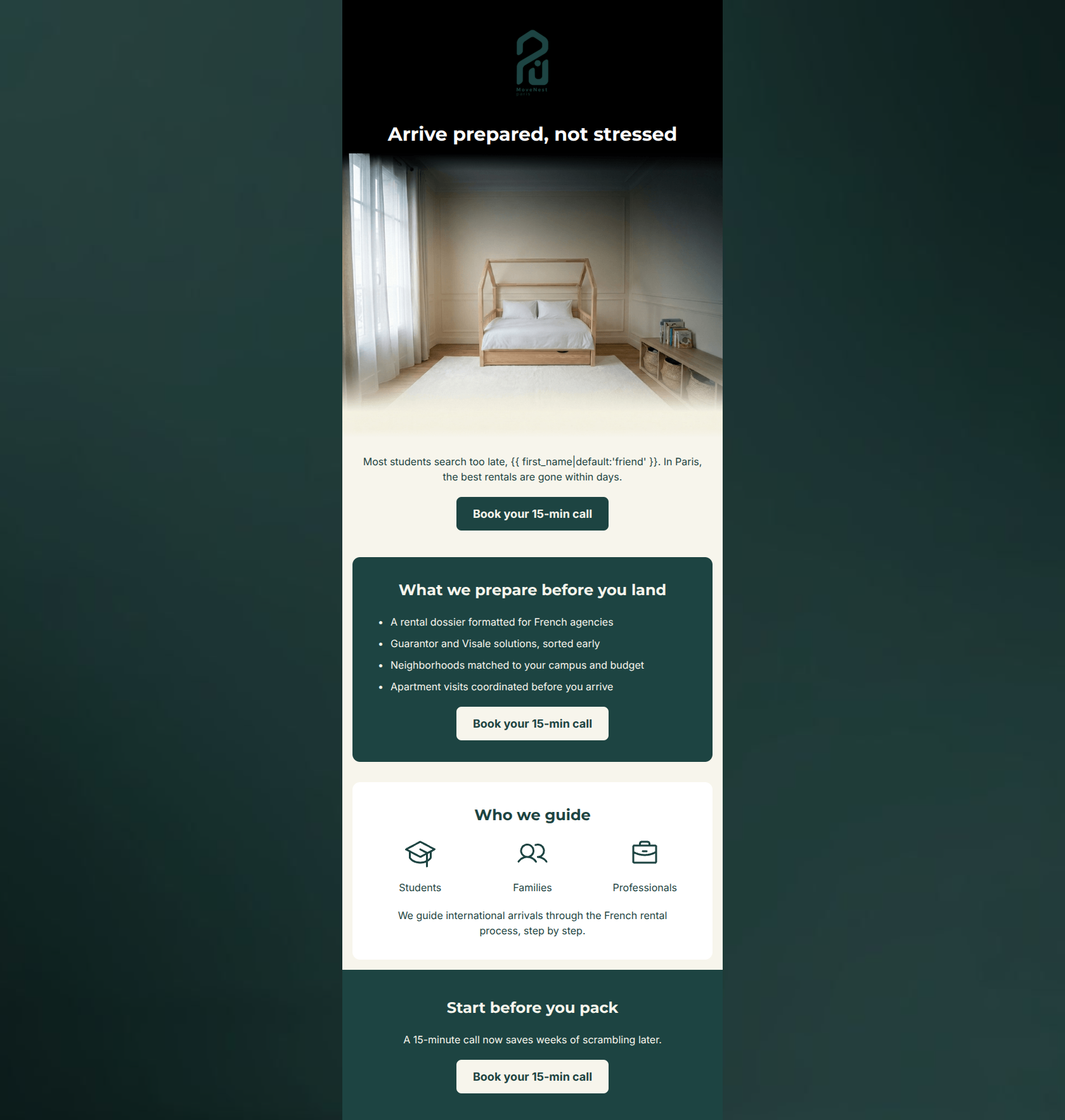
85/100This is a strong, highly readable email that effectively communicates the brand's value proposition and employs excellent word economy. The inverted pyramid structure quickly establishes the problem (late searches) and the solution (MoveNest's preparation), driving toward a beautifully consistent, repeated call-to-action. However, the email is held back by a jarring visual disconnect in the hero section (an off-brand black background and an image that doesn't match its alt-text or target audience) and a mid-email pivot that dilutes a highly personalized student message with generic mentions of families and professionals.
Create Your Own
Generate professional email designs like this one in seconds with Kopi AI.
Email Details
- Subject Line
- Arrive in Paris with your rental file ready
- Brand
- MoveNest Paris
- Industry
- Other
- Email Type
- Promotional
- Created
- June 30, 2026
Brand Colors
Email Copy
Arrive prepared, not stressed
Most students search too late, friend. In Paris, the best rentals are gone within days.
→ Book your 15-min call
What we prepare before you land
- A rental dossier formatted for French agencies
- Guarantor and Visale solutions, sorted early
- Neighborhoods matched to your campus and budget
- Apartment visits coordinated before you arrive
→ Book your 15-min call
Who we guide
Students
Families
Professionals
We guide international arrivals through the French rental process, step by step.
Start before you pack
A 15-minute call now saves weeks of scrambling later.
→ Book your 15-min call
Why This Email Works
This is a strong, highly readable email that effectively communicates the brand's value proposition and employs excellent word economy. The inverted pyramid structure quickly establishes the problem (late searches) and the solution (MoveNest's preparation), driving toward a beautifully consistent, repeated call-to-action. However, the email is held back by a jarring visual disconnect in the hero section (an off-brand black background and an image that doesn't match its alt-text or target audience) and a mid-email pivot that dilutes a highly personalized student message with generic mentions of families and professionals.
Hero (top/initial part) Impact
65/100- Benefit-driven headline that immediately addresses a core customer pain point (stress).
- Clear, highly legible typography that stands out immediately.
Content Structure & Flow
80/100- Excellent use of the problem-agitation-solution copywriting framework.
- Smooth transitions between sections, leading the eye naturally down to the next CTA.
Visual Hierarchy & Layout
85/100- Strong color blocking that segments distinct thoughts and reduces cognitive load.
- Excellent use of negative space around headlines and CTAs.
Call-to-Action Strength
95/100- Consistent CTA copy that leaves zero ambiguity about the next step.
- High-contrast button colors ensure the CTA pops against both light and dark backgrounds.
- Perfect frequency and placement (top, middle, and bottom of the scroll).
Message Clarity & Tone
90/100- Reassuring and expert tone ('A 15-minute call now saves weeks of scrambling later').
- Focuses heavily on 'you' and 'your' rather than 'we' and 'our'.
Readability & Scannability
95/100- Use of bullet points for the core value proposition.
- Short, punchy sentences that respect the reader's time.
- High text-to-background contrast throughout the body.
Offer & Value Proposition
92/100- Translates generic relocation services into specific, tangible deliverables.
- Clearly outlines the 'cost' of inaction (missing out on the best rentals, scrambling later).
Personalization & Audience Fit
70/100- Strong initial hook targeting a specific demographic's unique pain point (student housing rush).
- Use of dynamic first-name personalization in the opening line.
Copy Conciseness & Word Economy
95/100- Zero filler words; highly distilled messaging.
- Headlines do the heavy lifting, allowing the body copy to remain brief.
Quick Wins
- Change the hero background color from #000000 to #1D4442.
- Remove the 'Who we guide' section entirely to keep the email strictly focused on the student value proposition.
- Swap the hero image for an aspirational lifestyle image of a student or a premium Parisian neighborhood that matches the brand's high-end aesthetic.



Create Professional Email Designs
Generate beautiful, on-brand email designs in seconds. Just enter your brand URL and let AI do the rest.