Other Marketing Email Template
“Action Required: Please complete your recruitment”
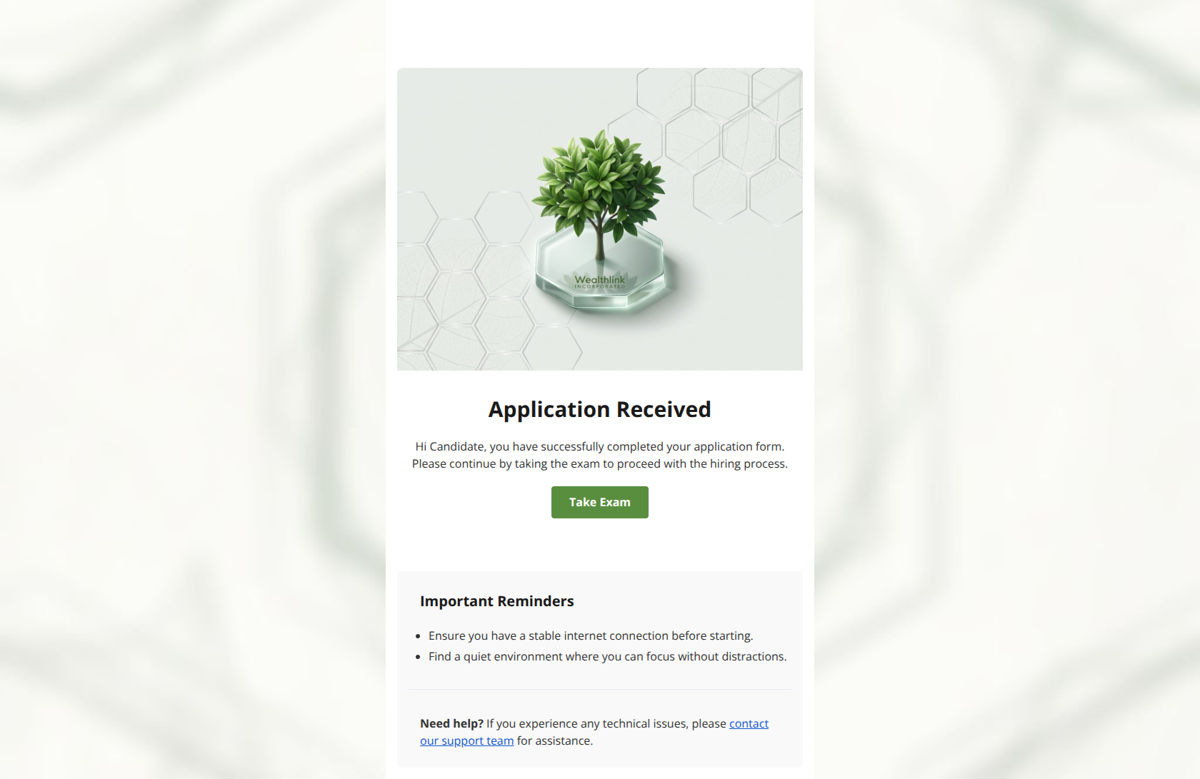
Design Score
77/100This email is visually polished and clearly communicates a status update, but it lacks the persuasive context needed to drive immediate action. While the layout is clean and distraction-free, the passive headline and lack of time-commitment expectations (e.g., "takes 15 mins") create unnecessary friction for anxious applicants.
Create Your Own
Generate professional email designs like this one in seconds with Kopi AI.
Email Details
- Subject Line
- Action Required: Please complete your recruitment
- Brand
- Wealthlink
- Industry
- Other
- Email Type
- Marketing
- Created
- February 4, 2026
Brand Colors
Email Copy
Application Received
Hi Candidate, you have successfully completed your application form. Please continue by taking the exam to proceed with the hiring process.
→ Take Exam
Important Reminders
- Ensure you have a stable internet connection before starting.
- Find a quiet environment where you can focus without distractions.
Need help? If you experience any technical issues, please contact our support team for assistance.
Why This Email Works
This email is visually polished and clearly communicates a status update, but it lacks the persuasive context needed to drive immediate action. While the layout is clean and distraction-free, the passive headline and lack of time-commitment expectations (e.g., "takes 15 mins") create unnecessary friction for anxious applicants.
Hero (top/initial part) Impact
75/100- High-quality 3D asset reinforces the "Nature Corporate" brand identity.
- Clean integration of the logo within the hero graphic.
Content Structure & Flow
85/100- Linear, single-column layout prevents confusion.
- Clear separation between the main action card and the secondary support card.
Visual Hierarchy & Layout
90/100- The green CTA button pops clearly against the white card.
- Secondary information is appropriately de-emphasized in a grey card.
Call-to-Action Strength
80/100- Button design follows brand color guidelines perfectly.
- Isolated placement draws attention effectively.
Message Clarity & Tone
70/100- Instructions are unambiguous.
- Language is simple and jargon-free.
Readability & Scannability
95/100- Bullet points used effectively for the reminders section.
- Generous line-height improves legibility.
Offer & Value Proposition
60/100- Clearly states that the exam is the gateway to the "hiring process."
Personalization & Audience Fit
50/100- The "Important Reminders" section anticipates user anxiety about technical requirements.
Quick Wins
- Change the headline to "Action Required: Complete Your Skills Exam" to drive urgency.
- Add a sentence stating the estimated duration of the exam (e.g., "Takes about 15 mins") to reduce click anxiety.
- Replace the generic "Hi Candidate" greeting with the applicant's real first name.
- Update the CTA text to "Start My Exam" for a slightly more personal ownership of the action.

Create Professional Email Designs
Generate beautiful, on-brand email designs in seconds. Just enter your brand URL and let AI do the rest.