Coffee & Tea Product Launch Email Template
“A study in contrast: Chocolate & Orange”
Design Score
84/100This email is a strong, on-brand execution that excels in visual storytelling and clean layout. However, it relies too heavily on product recognition (naming the farmer) rather than the sensory benefit in the primary headline, and the complete absence of pricing information adds unnecessary friction for a transactional email.
Create Your Own
Generate professional email designs like this one in seconds with Kopi AI.
Email Details
- Subject Line
- A study in contrast: Chocolate & Orange
- Brand
- Blue Bottle Coffee
- Industry
- Coffee & Tea
- Email Type
- Product Launch
- Created
- January 12, 2026
Brand Colors
Email Copy
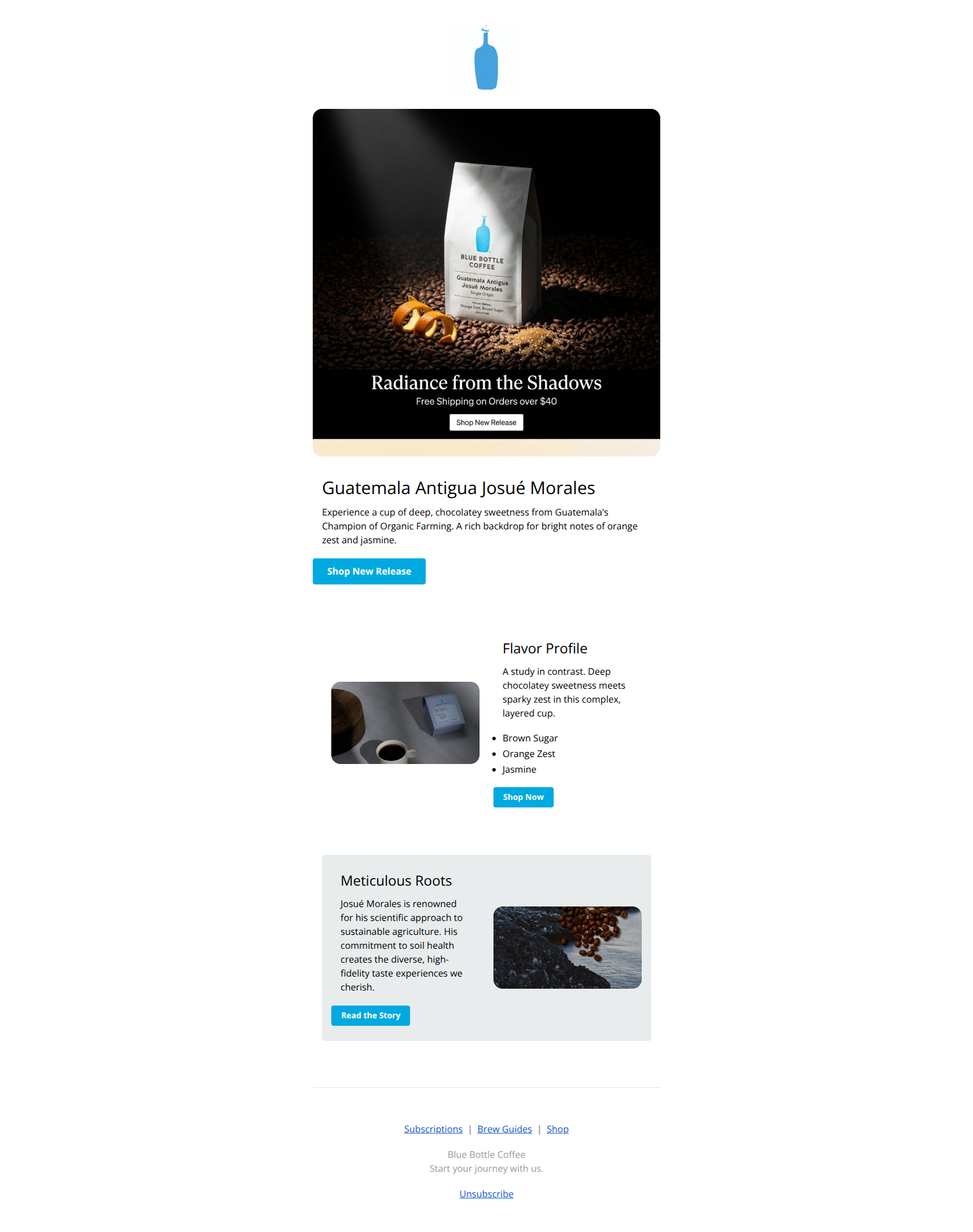
Guatemala Antigua Josué Morales
Experience a cup of deep, chocolatey sweetness from Guatemala’s Champion of Organic Farming. A rich backdrop for bright notes of orange zest and jasmine.
→ Shop New Release
Flavor Profile
A study in contrast. Deep chocolatey sweetness meets sparky zest in this complex, layered cup.
- Brown Sugar
- Orange Zest
- Jasmine
→ Shop Now
Meticulous Roots
Josué Morales is renowned for his scientific approach to sustainable agriculture. His commitment to soil health creates the diverse, high-fidelity taste experiences we cherish.
→ Read the Story
Subscriptions | Brew Guides | Shop
Blue Bottle Coffee Start your journey with us.
Unsubscribe
Why This Email Works
This email is a strong, on-brand execution that excels in visual storytelling and clean layout. However, it relies too heavily on product recognition (naming the farmer) rather than the sensory benefit in the primary headline, and the complete absence of pricing information adds unnecessary friction for a transactional email.
Hero (top/initial part) Impact
80/100- High-fidelity product photography that hints at flavor notes.
- Clear, isolated primary CTA button immediately following the hero content.
Content Structure & Flow
88/100- Zig-zag layout (alternating image/text) keeps the eye moving down the page.
- Distinct sections allow for skimming without losing the narrative.
Visual Hierarchy & Layout
85/100- Ample whitespace prevents the content from feeling cramped.
- Strong contrast between the blue CTA buttons and the neutral background.
Call-to-Action Strength
80/100- Primary brand color (#00A9E0) is used exclusively for interactive elements, making the click path obvious.
- Multiple entry points to the same product.
Message Clarity & Tone
90/100- Evocative language ('Deep chocolatey sweetness meets sparky zest') paints a vivid sensory picture.
- Consistent use of brand voice throughout.
Readability & Scannability
92/100- High-contrast black text on white/grey backgrounds.
- Short, punchy sentences.
Offer & Value Proposition
75/100- Clear 'Free Shipping' threshold mention in the hero image (though it is small).
Personalization & Audience Fit
70/100- Content is highly relevant to the specialty coffee enthusiast demographic.
Quick Wins
- Add the price ($) to the 'Flavor Profile' text block to qualify clicks and set expectations.
- Bold the flavor notes (Brown Sugar, Orange Zest, Jasmine) so they stand out in the text block.
- Change the headline 'Guatemala Antigua Josué Morales' to 'New: Guatemala Antigua' to reduce cognitive load—put the producer's full name in the subhead.
- Remove the small text and button from the hero image file itself to clean up the duplication with the HTML text below.


Create Professional Email Designs
Generate beautiful, on-brand email designs in seconds. Just enter your brand URL and let AI do the rest.