Health & Wellness Promotional Email Template
“A 65% off secret to sleeping through the night”
Design Score
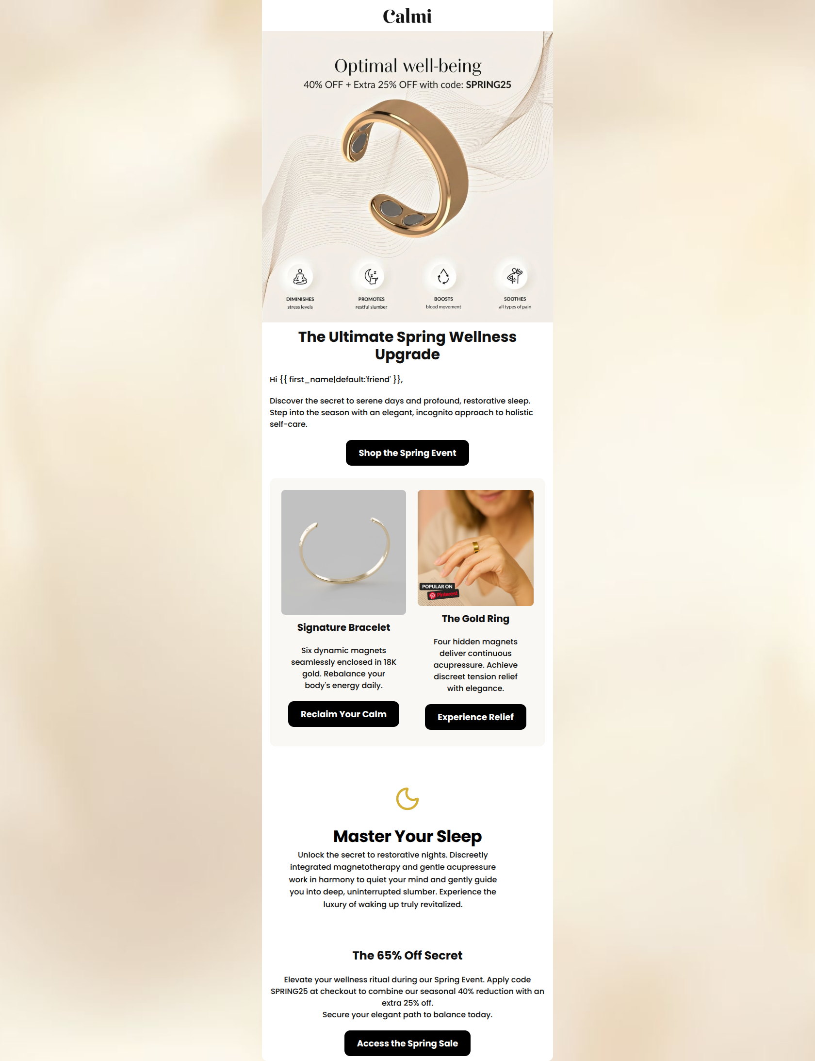
80/100This is a solid promotional email that effectively communicates a strong offer and clearly articulates the brand's unique value proposition (incognito wellness). The hero graphic is particularly strong, utilizing clear iconography to explain the benefits at a glance. However, the email falls short of a truly premium, 'editorial' aesthetic due to inconsistent product photography, distracting overlays, and heavy typography that clashes with the brand's sophisticated identity. Additionally, the messaging around the stacked discount math could potentially erode trust with a discerning audience.
Create Your Own
Generate professional email designs like this one in seconds with Kopi AI.
Email Details
- Subject Line
- A 65% off secret to sleeping through the night
- Brand
- Calmi
- Industry
- Health & Wellness
- Email Type
- Promotional
- Created
- March 23, 2026
Brand Colors
Email Copy
The Ultimate Spring Wellness Upgrade
Hi friend,
Discover the secret to serene days and profound, restorative sleep. Step into the season with an elegant, incognito approach to holistic self-care.
→ Shop the Spring Event
Signature Bracelet
Six dynamic magnets seamlessly enclosed in 18K gold. Rebalance your body's energy daily.
→ Reclaim Your Calm
The Gold Ring
Four hidden magnets deliver continuous acupressure. Achieve discreet tension relief with elegance.
→ Experience Relief
The 65% Off Secret
Elevate your wellness ritual during our Spring Event. Apply code SPRING25 at checkout to combine our seasonal 40% reduction with an extra 25% off. Secure your elegant path to balance today.
→ Access the Spring Sale
Why This Email Works
This is a solid promotional email that effectively communicates a strong offer and clearly articulates the brand's unique value proposition (incognito wellness). The hero graphic is particularly strong, utilizing clear iconography to explain the benefits at a glance. However, the email falls short of a truly premium, 'editorial' aesthetic due to inconsistent product photography, distracting overlays, and heavy typography that clashes with the brand's sophisticated identity. Additionally, the messaging around the stacked discount math could potentially erode trust with a discerning audience.
Hero Impact
82/100- Excellent use of iconography to clearly communicate the four main benefits of the product.
- The primary offer (40% + 25% off) is immediately visible without scrolling.
Content Structure & Flow
85/100- Logical progression from high-level brand offer to specific product examples.
- The closing section smartly reiterates the exact mechanics of the sale (using the code) right above the final CTA.
Visual Hierarchy & Layout
65/100- Ample whitespace throughout the email allows individual sections to breathe.
- The centered, single-column layout on mobile (and symmetrical two-column on desktop) creates an easy, predictable scanning path.
Call-to-Action Strength
88/100- High-contrast black buttons stand out sharply against the lighter backgrounds, easily passing the 'squint test'.
- The buttons feature generous padding, making them highly clickable.
- CTA copy varies contextually ('Shop the Event', 'Access the Sale') keeping the language fresh rather than repeating 'Buy Now'.
Message Clarity & Tone
75/100- The copy perfectly captures the brand's core differentiator: 'incognito approach to holistic self-care' and 'discreet tension relief'.
- The language is deeply you-centric, focusing on the reader's outcomes ('rebalance your body', 'master your sleep').
Readability & Scannability
92/100- Excellent dark text on light backgrounds ensures maximum legibility.
- Copy is broken up into highly scannable chunks of 2-3 sentences max.
Offer & Value Proposition
88/100- The offer is highly aggressive and front-and-center.
- The functional mechanics of the product (magnets, acupressure) are clearly linked to the emotional benefits (sleep, stress relief).
Personalization & Audience Fit
84/100- The imagery (both the product and the sleep/moon iconography) aligns well with a stressed, busy demographic seeking tranquility.
- The positioning of the jewelry as an 'upgrade' to wellness rather than a medical intervention perfectly matches the audience's psychographics.
Quick Wins
- Remove the 'Popular on Pinterest' overlay from the ring image to restore a premium feel.
- Change the heavy, blocky headline font to an elegant serif typeface to match the brand guidelines.
- Verify the math on 'The 65% Off Secret' to ensure you aren't misleading customers about stacked sequential discounts vs. additive discounts.

Create Professional Email Designs
Generate beautiful, on-brand email designs in seconds. Just enter your brand URL and let AI do the rest.