Health & Wellness Newsletter Email Template
“86% less bloating. Here's how.”
Design Score
84/100A visually striking and scientifically authoritative email that effectively leverages the brand's stark aesthetic and strong clinical claims. The repeated, consistent call-to-action and highly scannable 'Clinical Results' section are standout features that drive a singular conversion goal. However, the hero section relies too heavily on vague 'drop' language and filler copy, missing a critical opportunity to immediately clarify the product offer and its primary benefit.
Create Your Own
Generate professional email designs like this one in seconds with Kopi AI.
Email Details
- Subject Line
- 86% less bloating. Here's how.
- Brand
- ARMRA [eval-prod 2026-04-25]
- Industry
- Health & Wellness
- Email Type
- Newsletter
- Created
- April 25, 2026
Brand Colors
Email Copy
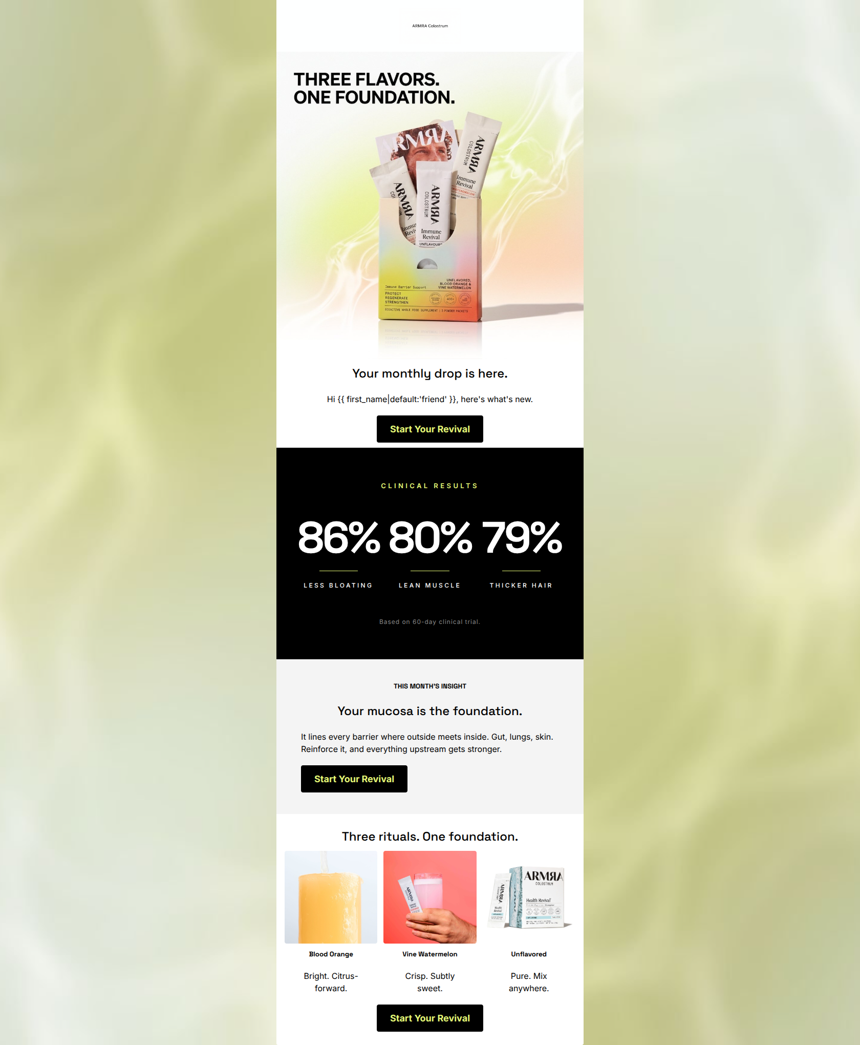
Your monthly drop is here.
Hi friend, here's what's new.
→ Start Your Revival
THIS MONTH'S INSIGHT
Your mucosa is the foundation.
It lines every barrier where outside meets inside. Gut, lungs, skin. Reinforce it, and everything upstream gets stronger.
→ Start Your Revival
Three rituals. One foundation.
Blood Orange
Bright. Citrus-forward.
Vine Watermelon
Crisp. Subtly sweet.
Unflavored
Pure. Mix anywhere.
→ Start Your Revival
Why This Email Works
A visually striking and scientifically authoritative email that effectively leverages the brand's stark aesthetic and strong clinical claims. The repeated, consistent call-to-action and highly scannable 'Clinical Results' section are standout features that drive a singular conversion goal. However, the hero section relies too heavily on vague 'drop' language and filler copy, missing a critical opportunity to immediately clarify the product offer and its primary benefit.
Hero (top/initial part) Impact
65/100- Vibrant, high-quality product imagery that pops against the light background.
- Clear, immediate placement of the primary CTA above the fold.
Content Structure & Flow
85/100- Logical progression from high-level announcement down to specific product flavors.
- Excellent use of distinct background colors to clearly separate different conceptual sections.
Visual Hierarchy & Layout
88/100- The stark black-and-white contrast for the clinical data creates massive visual impact.
- The three-column product grid at the bottom is perfectly balanced and easy to digest.
Call-to-Action Strength
95/100- Consistent use of the exact same CTA copy ('Start Your Revival') across all buttons.
- High-contrast button styling (black with chartreuse text) makes the action undeniably prominent.
Message Clarity & Tone
82/100- Strong use of authoritative, educational language in the insight section.
- Clinical results labels (LESS BLOATING, LEAN MUSCLE) are direct and confidently stated.
Readability & Scannability
92/100- Massive, highly legible typography for the primary clinical proof points.
- Ultra-short phrasing in the product grid ('Bright. Citrus-forward.') minimizes cognitive load.
Offer & Value Proposition
78/100- Benefits are quantified (86%, 80%, 79%) and prominently featured.
- The 'Three rituals. One foundation.' concept neatly ties the different flavors together.
Personalization & Audience Fit
85/100- Selected clinical stats align perfectly with the audience's desire for holistic optimization.
- The aesthetic deeply resonates with a premium, science-forward demographic.
Copy Conciseness & Word Economy
90/100- Zero filler in the product grid; descriptions are distilled to their absolute essence.
- The clinical section relies on numbers and two-word labels rather than dense paragraphs.
Quick Wins
- Delete 'here's what's new' from the hero section to tighten the opening.
- Center-align the CTA button in the gray 'THIS MONTH'S INSIGHT' section to fix the broken visual axis.
- Bold the words 'Gut, lungs, skin' in the educational paragraph to improve scannability.
Create Professional Email Designs
Generate beautiful, on-brand email designs in seconds. Just enter your brand URL and let AI do the rest.