Fitness Promotional Email Template
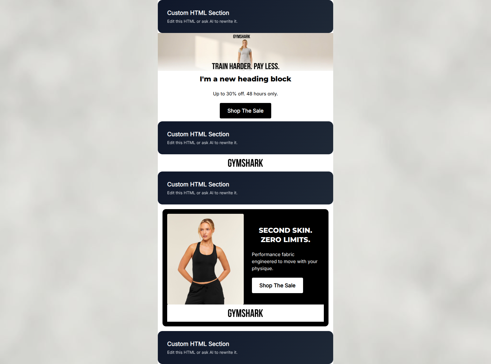
“48 Hours. Performance Wear. On Sale.”
Design Score
86/100This is a highly effective, punchy promotional email that perfectly captures the Gymshark brand voice and utilitarian aesthetic. The stark contrast, aggressive typography, and relentless focus on a single action make it a strong conversion driver. It successfully leverages urgency and clear value propositions. Minor refinements to visual hierarchy in the hero section and tightening some secondary copy could elevate it from great to outstanding.
Create Your Own
Generate professional email designs like this one in seconds with Kopi AI.
Email Details
- Subject Line
- 48 Hours. Performance Wear. On Sale.
- Brand
- Gymshark
- Industry
- Fitness
- Email Type
- Promotional
- Created
- May 6, 2026
Brand Colors
Email Copy
I'm a new heading block
→ Shop The Sale
Up to 30% off. 48 hours only.
SECOND SKIN. ZERO LIMITS.
Performance fabric engineered to move with your physique.
→ Shop The Sale
Why This Email Works
This is a highly effective, punchy promotional email that perfectly captures the Gymshark brand voice and utilitarian aesthetic. The stark contrast, aggressive typography, and relentless focus on a single action make it a strong conversion driver. It successfully leverages urgency and clear value propositions. Minor refinements to visual hierarchy in the hero section and tightening some secondary copy could elevate it from great to outstanding.
1. Hero (top/initial part) Impact
82/100- Strong, brand-aligned headline that speaks directly to the customer's mindset.
- Immediate introduction of the core offer.
2. Content Structure & Flow
88/100- Excellent use of the inverted pyramid principle within sections.
- Clear delineation of content using high-contrast background blocks.
3. Visual Hierarchy & Layout
84/100- Outstanding use of scale and contrast in the urgency banner typography.
- The black product card effectively breaks up the light background and draws focus to the lifestyle imagery.
4. Call-to-Action Strength
95/100- Absolute consistency in CTA copy and destination.
- High-contrast button styling ensures they pass the squint test with ease.
5. Message Clarity & Tone
92/100- Excellent translation of product features into customer-centric benefits.
- Tone is consistently energetic and direct throughout.
6. Readability & Scannability
90/100- Strong reliance on bold typography over dense paragraphs.
- Generous whitespace around key elements, particularly in the urgency section.
7. Offer & Value Proposition
85/100- Offer is stated immediately and reinforced with urgency.
- Friction-reducing shipping offer is clearly highlighted.
8. Personalization & Audience Fit
75/100- Visuals and copy deeply resonate with the audience's psychographic profile of discipline and performance.
9. Copy Conciseness & Word Economy
88/100- Headings do the heavy lifting, reducing the need for explanatory body copy.
- Zero filler words in the primary offer descriptions.
Quick Wins
- Remove the fourth (bottom) 'Shop The Sale' CTA to reduce visual clutter and adhere strictly to the 1-3 CTA rule.
- Trim the subcopy in the urgency banner to a single, punchy sentence to maintain the fast-paced rhythm of the email.
- Crop the hero image closer to the model to increase the immediate visual impact of the product.

Create Professional Email Designs
Generate beautiful, on-brand email designs in seconds. Just enter your brand URL and let AI do the rest.