Beauty & Skincare Promotional Email Template
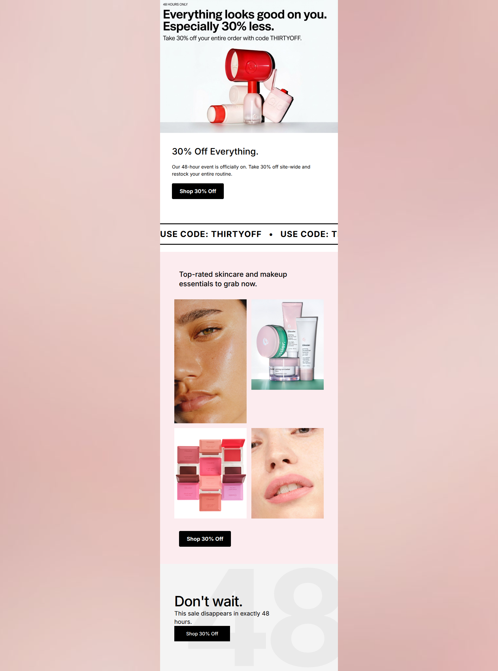
“30% off everything. 48 hours only.”
Design Score
85/100This is a strong, visually striking promotional email that perfectly nails Glossier's signature minimalist, editorial aesthetic and confident tone. The offer (30% off, 48 hours) is unmistakable, and the use of stark, high-contrast design ensures the primary message cannot be missed. However, while the top of the funnel is highly optimized, the mid-body product section leaves money on the table by relying on an un-shoppable, unlabelled image grid and highly repetitive CTA copy. Addressing these structural friction points will elevate this from a good aesthetic piece to a high-converting machine.
Create Your Own
Generate professional email designs like this one in seconds with Kopi AI.
Email Details
- Subject Line
- 30% off everything. 48 hours only.
- Brand
- Glossier [eval-prod 2026-03-22]
- Industry
- Beauty & Skincare
- Email Type
- Promotional
- Created
- March 22, 2026
Brand Colors
Email Copy
30% Off Everything.
Our 48-hour event is officially on. Take 30% off site-wide and restock your entire routine.
→ Shop 30% Off
Top-rated skincare and makeup essentials to grab now.
→ Shop 30% Off
Why This Email Works
This is a strong, visually striking promotional email that perfectly nails Glossier's signature minimalist, editorial aesthetic and confident tone. The offer (30% off, 48 hours) is unmistakable, and the use of stark, high-contrast design ensures the primary message cannot be missed. However, while the top of the funnel is highly optimized, the mid-body product section leaves money on the table by relying on an un-shoppable, unlabelled image grid and highly repetitive CTA copy. Addressing these structural friction points will elevate this from a good aesthetic piece to a high-converting machine.
Hero Impact
92/100- Flawless on-brand copywriting that makes the customer feel good before selling to them.
- Immediate clarity of the offer and the promo code.
- High-contrast visual design draws the eye straight down the page.
Content Structure & Flow
75/100- Excellent use of the ticker-tape banner to break up the sections while reinforcing the promo code.
- Clear, linear progression from introduction to urgency.
- Adequate spacing prevents the layout from feeling cramped.
Visual Hierarchy & Layout
88/100- Outstanding use of negative space and color blocking to separate sections.
- The black CTA buttons provide the ultimate contrast, making the primary action unmissable.
- The subtle '48' graphic in the background of the final module creatively reinforces urgency without cluttering the foreground.
Call-to-Action Strength
72/100- Stark black buttons with white text guarantee the highest possible visibility and contrast.
- Buttons are clearly isolated from other elements, making them easy targets for interaction.
- The action ('Shop') is clear and direct.
Message Clarity & Tone
96/100- Tone is perfectly calibrated for the target Millennial/Gen Z audience: effortless and positive.
- The mechanics of the sale (what you get, the code, the deadline) are communicated with zero ambiguity.
- No unnecessary fluff or jargon; it gets straight to the point.
Readability & Scannability
90/100- Excellent typographic contrast between headers and body copy.
- Left-aligned text creates a strong, readable axis for the eye to follow down the page.
- Bite-sized sentences minimize cognitive load.
Offer & Value Proposition
94/100- The value proposition is mathematically simple to grasp.
- The urgency is real and explicit ('disappears in exactly 48 hours').
- The framing ('restock your entire routine') shifts the mindset from impulsive buying to practical replenishment.
Personalization & Audience Fit
80/100- The visual imagery (dewy skin, vibrant but sheer color) perfectly aligns with what the customer desires.
- The minimalist, 'cool girl' aesthetic speaks directly to the brand's positioning.
Quick Wins
- Vary the CTA copy. Change the second button to 'Shop Bestsellers' or 'Restock Your Routine' to contextualize the click.
- Increase the top padding on the second CTA button to visually detach it slightly from the image grid.
- Add a brief line regarding exclusions (if any) to manage expectations before checkout.


Create Professional Email Designs
Generate beautiful, on-brand email designs in seconds. Just enter your brand URL and let AI do the rest.