Fitness Promotional Email Template
“20% off training essentials. Code TRAIN20.”
Design Score
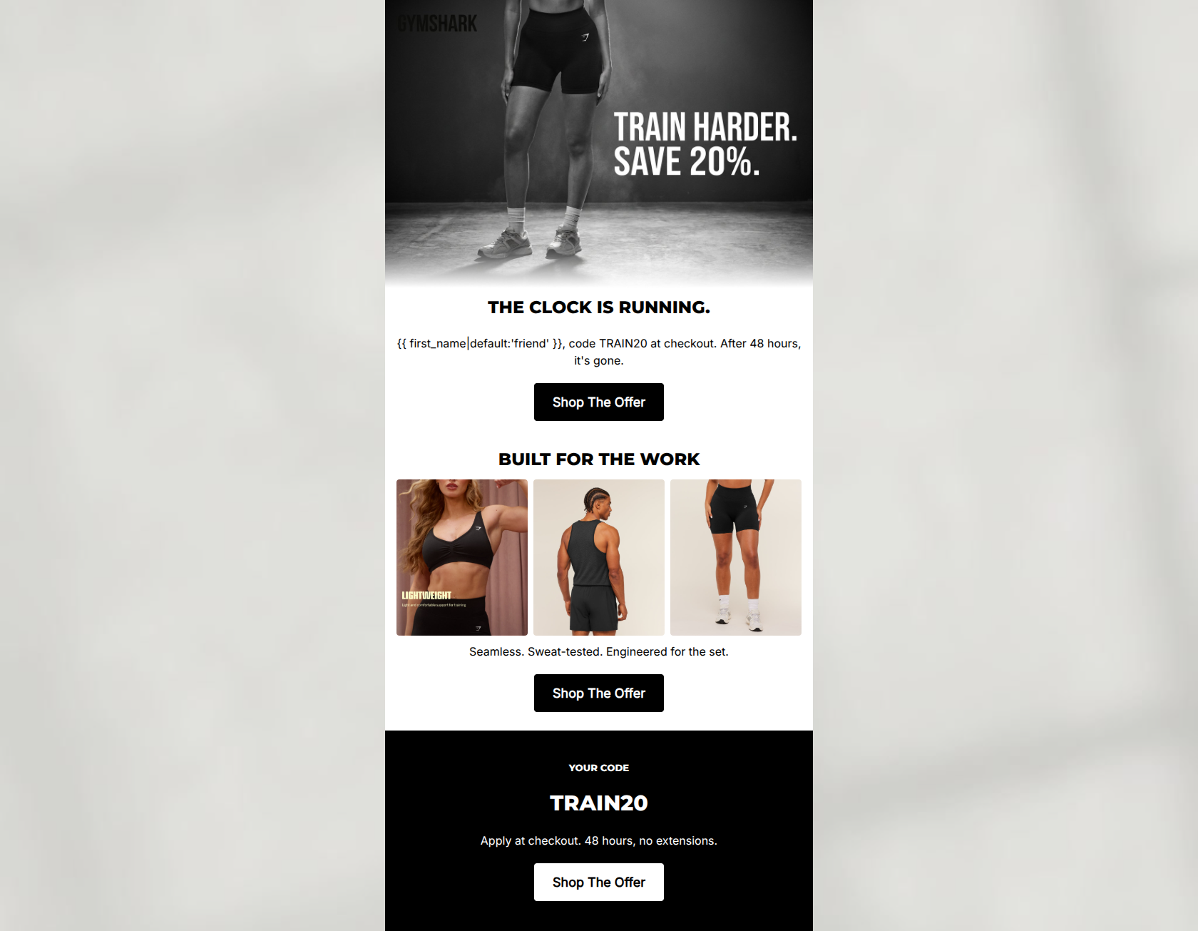
83/100This email effectively leverages Gymshark's signature stark, no-nonsense aesthetic to drive a time-sensitive promotion. The stark black-and-white visual hierarchy, coupled with perfectly consistent Call-to-Action repetition, creates a highly scannable and frictionless path to click. However, the extreme brevity of the copy creates a significant conversion blocker: the email fails to specify what the 20% discount applies to. Since the button URLs point to 'new releases,' users expecting a sitewide discount may experience friction and abandon their carts. Refining the offer clarity while maintaining the aggressive, disciplined tone will elevate this campaign from good to outstanding.
Create Your Own
Generate professional email designs like this one in seconds with Kopi AI.
Email Details
- Subject Line
- 20% off training essentials. Code TRAIN20.
- Brand
- Gymshark
- Industry
- Fitness
- Email Type
- Promotional
- Created
- May 6, 2026
Brand Colors
Email Copy
THE CLOCK IS RUNNING.
friend, code TRAIN20 at checkout. After 48 hours, it's gone.
→ Shop The Offer
BUILT FOR THE WORK
Seamless. Sweat-tested. Engineered for the set.
→ Shop The Offer
YOUR CODE
TRAIN20
Apply at checkout. 48 hours, no extensions.
→ Shop The Offer
Why This Email Works
This email effectively leverages Gymshark's signature stark, no-nonsense aesthetic to drive a time-sensitive promotion. The stark black-and-white visual hierarchy, coupled with perfectly consistent Call-to-Action repetition, creates a highly scannable and frictionless path to click. However, the extreme brevity of the copy creates a significant conversion blocker: the email fails to specify what the 20% discount applies to. Since the button URLs point to 'new releases,' users expecting a sitewide discount may experience friction and abandon their carts. Refining the offer clarity while maintaining the aggressive, disciplined tone will elevate this campaign from good to outstanding.
Hero (top/initial part) Impact
85/100- Strong use of in-image typography that aligns perfectly with Gymshark's gritty aesthetic.
- Immediate introduction of the value proposition (20% off) and urgency (48 hours).
- Clear, high-contrast primary CTA placed above the fold.
Content Structure & Flow
82/100- Excellent pacing; the user is never more than a quick scroll away from a CTA.
- The final black block serves as an excellent 'footer anchor' that summarizes the deal perfectly for skimmers.
Visual Hierarchy & Layout
75/100- The black background on the final section creates a striking visual break that naturally draws the eye to the promo code.
- Excellent use of negative space around the text blocks to prevent visual clutter.
Call-to-Action Strength
95/100- Perfect consistency in destination URLs across all buttons.
- Ideal CTA frequency for an email of this length.
- High-contrast button design makes the next step unmistakable.
Message Clarity & Tone
85/100- Authentic, no-nonsense brand voice.
- Creates genuine urgency without sounding desperate ('48 hours, no extensions').
Readability & Scannability
92/100- No walls of text; every paragraph is one or two lines max.
- Clear hierarchy between H1, H2, and body text.
Offer & Value Proposition
70/100- The promo code itself (TRAIN20) is memorable and relevant to the brand.
- The time constraint (48 hours) is highly motivating.
Personalization & Audience Fit
78/100- Basic first-name personalization is included seamlessly.
- The overall aesthetic deeply matches the target audience's psychographics.
Copy Conciseness & Word Economy
88/100- Zero filler words or throat-clearing introductions.
- Rhythmic, punchy product descriptions.
Quick Wins
- Add 'on New Releases' (or the applicable collection) next to the 20% off mentions to set accurate click expectations.
- Swap the middle product grid images so all three share the same background lighting and style, removing the editorial text overlay from the leftmost image.
Create Professional Email Designs
Generate beautiful, on-brand email designs in seconds. Just enter your brand URL and let AI do the rest.