Fitness Promotional Email Template
“20% off training essentials. 48 hours.”
Design Score
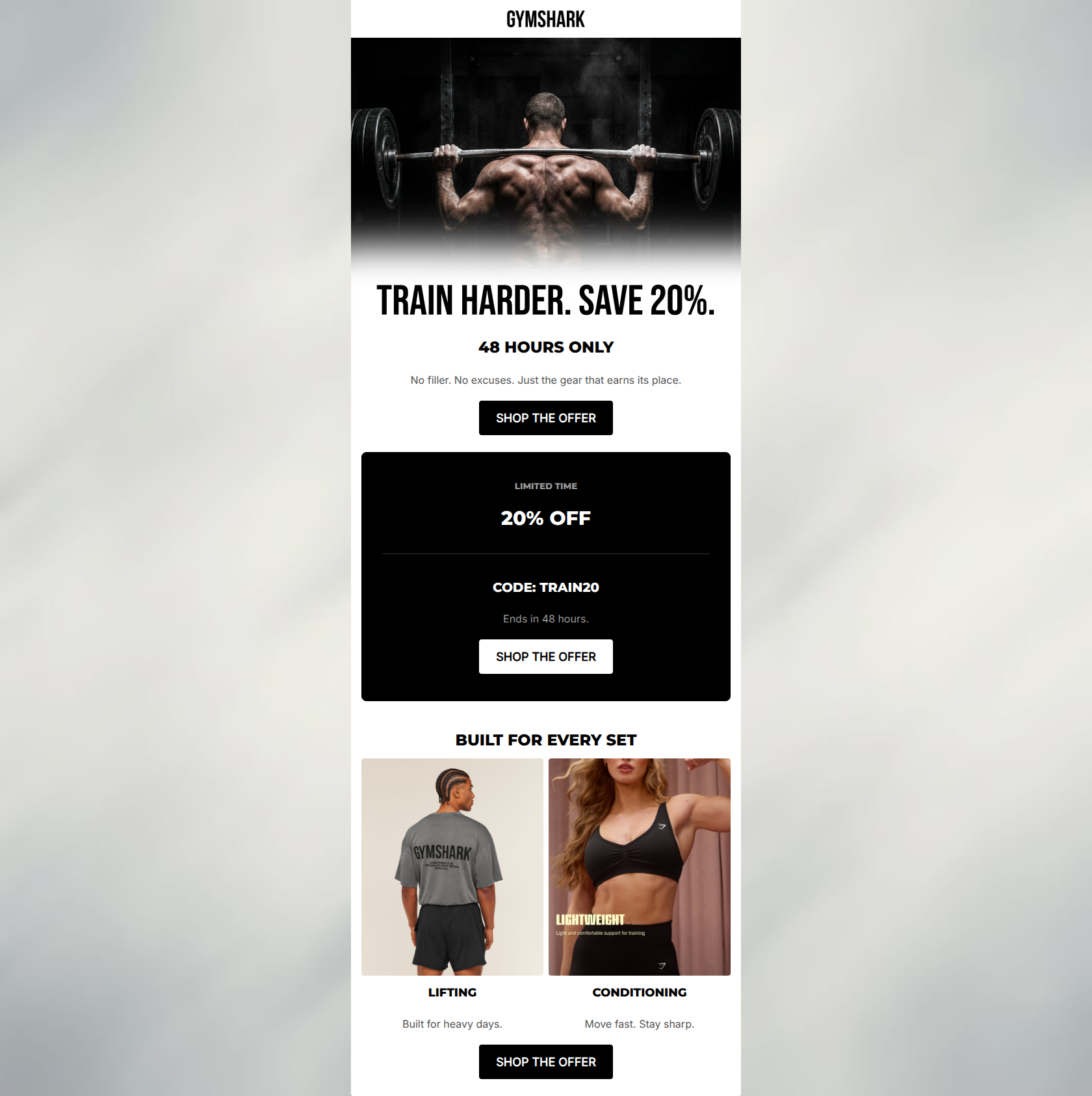
90/100This is an exceptionally strong promotional email that perfectly executes Gymshark's uncompromising, utilitarian brand voice. The visual aesthetic is highly cohesive, relying on gritty monochromatic imagery and high-contrast blocks to drive attention directly to the 20% off offer. The email follows best practices for scannability and CTA consistency, making the path to conversion frictionless. The only minor areas for improvement involve clarifying the exact scope of the offer and tightening up minor repetitive urgency copy.
Create Your Own
Generate professional email designs like this one in seconds with Kopi AI.
Email Details
- Subject Line
- 20% off training essentials. 48 hours.
- Brand
- Gymshark
- Industry
- Fitness
- Email Type
- Promotional
- Created
- May 6, 2026
Brand Colors
Email Copy
48 HOURS ONLY
No filler. No excuses. Just the gear that earns its place.
→ SHOP THE OFFER
LIMITED TIME
20% OFF
CODE: TRAIN20
Ends in 48 hours.
→ SHOP THE OFFER
BUILT FOR EVERY SET
LIFTING
Built for heavy days.
CONDITIONING
Move fast. Stay sharp.
→ SHOP THE OFFER
Why This Email Works
This is an exceptionally strong promotional email that perfectly executes Gymshark's uncompromising, utilitarian brand voice. The visual aesthetic is highly cohesive, relying on gritty monochromatic imagery and high-contrast blocks to drive attention directly to the 20% off offer. The email follows best practices for scannability and CTA consistency, making the path to conversion frictionless. The only minor areas for improvement involve clarifying the exact scope of the offer and tightening up minor repetitive urgency copy.
Hero (top/initial part) Impact
92/100- Highly engaging, on-brand hero imagery.
- Immediate introduction of urgency ('48 HOURS ONLY').
- Subcopy ('No filler. No excuses.') perfectly matches the target audience's psychographics.
Content Structure & Flow
88/100- Logical inverted pyramid flow funneling down to the CTAs.
- Clear visual separation between the offer block and the product categories.
Visual Hierarchy & Layout
92/100- Excellent use of high-contrast black and white to drive attention.
- Clean, symmetrical 2-column layout for the product categories.
Call-to-Action Strength
98/100- Consistent button copy across all touchpoints.
- All buttons drive to the same primary destination URL.
- High-contrast button styling (black on white, white on black) makes them unmissable.
Message Clarity & Tone
95/100- Authentic, motivating brand voice.
- Short, punchy sentences that match the intensity of the imagery.
Readability & Scannability
90/100- Minimal text overhead reduces cognitive load.
- Strong typographic hierarchy (H1 for offer, H2 for sections).
Offer & Value Proposition
85/100- Clear, tangible discount.
- Memorable promo code ('TRAIN20').
- Strong urgency mechanics.
Personalization & Audience Fit
90/100- Imagery perfectly reflects the target customer's aspirations.
- Language resonates with hardcore fitness culture.
Copy Conciseness & Word Economy
95/100- Zero filler language.
- Benefit-driven microcopy ('Built for heavy days').
Quick Wins
- Clarify the scope of the 20% off offer (e.g., 'Sitewide' or 'Training Gear Only') to set accurate expectations before the click.
- Remove 'Ends in 48 hours' from the black promo block to eliminate redundancy with the hero headline.
Create Professional Email Designs
Generate beautiful, on-brand email designs in seconds. Just enter your brand URL and let AI do the rest.