Pets Promotional Email Template
“20% off their best summer yet”
Design Score
80/100This email effectively leverages Dog Years' premium, natural brand positioning. The structure builds a compelling narrative, moving from a strong hero offer through to unique ingredient benefits and authentic social proof. However, a significant UX friction point severely limits its conversion potential: the promotional code is buried in the footer, divorcing the 'how' from the 'what' in the hero section. High-intent users who click early will face full prices and likely bounce. Fixing this offer visibility and tightening the cross-sell section will elevate this from a competent campaign to a highly effective revenue driver. Color & Contrast Notes: The brand palette is used exceptionally well to create visual hierarchy. The dark green (#1A3628) and light sage (#CDE0D2) contrast beautifully, ensuring the white text and CTAs stand out immediately. The design passes the squint test easily and directs attention exactly where it belongs.
Create Your Own
Generate professional email designs like this one in seconds with Kopi AI.
Email Details
- Subject Line
- 20% off their best summer yet
- Brand
- Dog Years
- Industry
- Pets
- Email Type
- Promotional
- Created
- March 30, 2026
Brand Colors
Email Copy
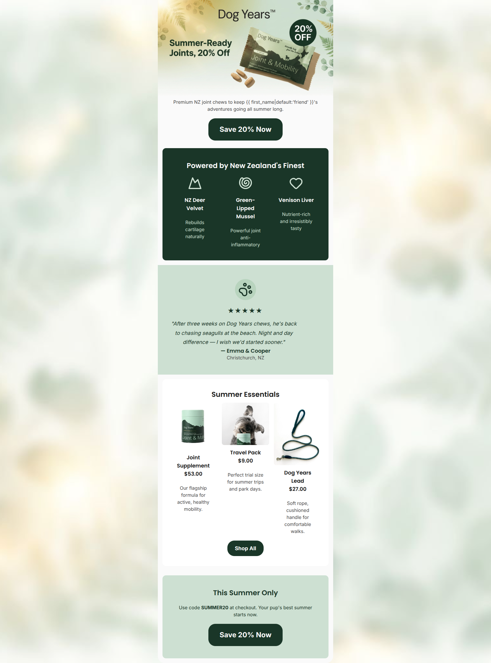
Premium NZ joint chews to keep friend's adventures going all summer long.
→ Save 20% Now
Powered by New Zealand's Finest
NZ Deer Velvet
Rebuilds cartilage naturally
Green-Lipped Mussel
Powerful joint anti-inflammatory
Venison Liver
Nutrient-rich and irresistibly tasty
Summer Essentials
Joint Supplement $53.00
Our flagship formula for active, healthy mobility.
Travel Pack $9.00
Perfect trial size for summer trips and park days.
Dog Years Lead $27.00
Soft rope, cushioned handle for comfortable walks.
→ Shop All
This Summer Only
Use code SUMMER20 at checkout. Your pup's best summer starts now.
→ Save 20% Now
Why This Email Works
This email effectively leverages Dog Years' premium, natural brand positioning. The structure builds a compelling narrative, moving from a strong hero offer through to unique ingredient benefits and authentic social proof. However, a significant UX friction point severely limits its conversion potential: the promotional code is buried in the footer, divorcing the 'how' from the 'what' in the hero section. High-intent users who click early will face full prices and likely bounce. Fixing this offer visibility and tightening the cross-sell section will elevate this from a competent campaign to a highly effective revenue driver. Color & Contrast Notes: The brand palette is used exceptionally well to create visual hierarchy. The dark green (#1A3628) and light sage (#CDE0D2) contrast beautifully, ensuring the white text and CTAs stand out immediately. The design passes the squint test easily and directs attention exactly where it belongs.
Hero Impact
80/100- Immediate visual connection to the specific product being promoted.
- High-contrast, action-oriented primary CTA.
Content Structure & Flow
82/100- Excellent use of an inverted pyramid structure in the first half.
- Distinct color blocking effectively separates the 'why' from the 'proof'.
Visual Hierarchy & Layout
88/100- Exceptional use of color blocking to create distinct, scannable sections.
- The visual weight heavily favors the primary conversion elements.
Call-to-Action Strength
78/100- Primary CTAs are highly visible and use excellent color contrast.
- Button copy focuses on the benefit ('Save 20%') rather than a generic action ('Click Here').
Message Clarity & Tone
85/100- Empathetic, benefit-focused tone that speaks directly to the core desires of the target audience.
- Clear articulation of the unique selling proposition (NZ sourcing).
Readability & Scannability
86/100- Iconography and short phrases make the technical ingredient section highly digestible.
- The testimonial is formatted clearly with bold attribution, making it easy to skim.
Offer & Value Proposition
60/100- A 20% discount is a compelling, strong incentive for a premium product.
- Tying the offer to the 'Summer' theme provides a logical, urgent reason to buy now.
Personalization & Audience Fit
82/100- Imagery and copy align perfectly with the target audience's desire for active, healthy pets.
- Effectively leverages the 'Made in NZ' differentiator to appeal to premium buyers.
Copy Conciseness & Word Economy
80/100- The ingredient section effectively uses 3-5 word phrases to communicate complex benefits.
- The testimonial is punchy and focuses entirely on the desired outcome.
Quick Wins
- Move the promo code 'SUMMER20' to the hero section immediately below the primary CTA.
- Fix the personalization fallback from 'friend's' to 'your dog's'.
- Change the 'Shop All' button copy to 'Shop Joint Care'.


Create Professional Email Designs
Generate beautiful, on-brand email designs in seconds. Just enter your brand URL and let AI do the rest.