Health & Wellness Promotional Email Template
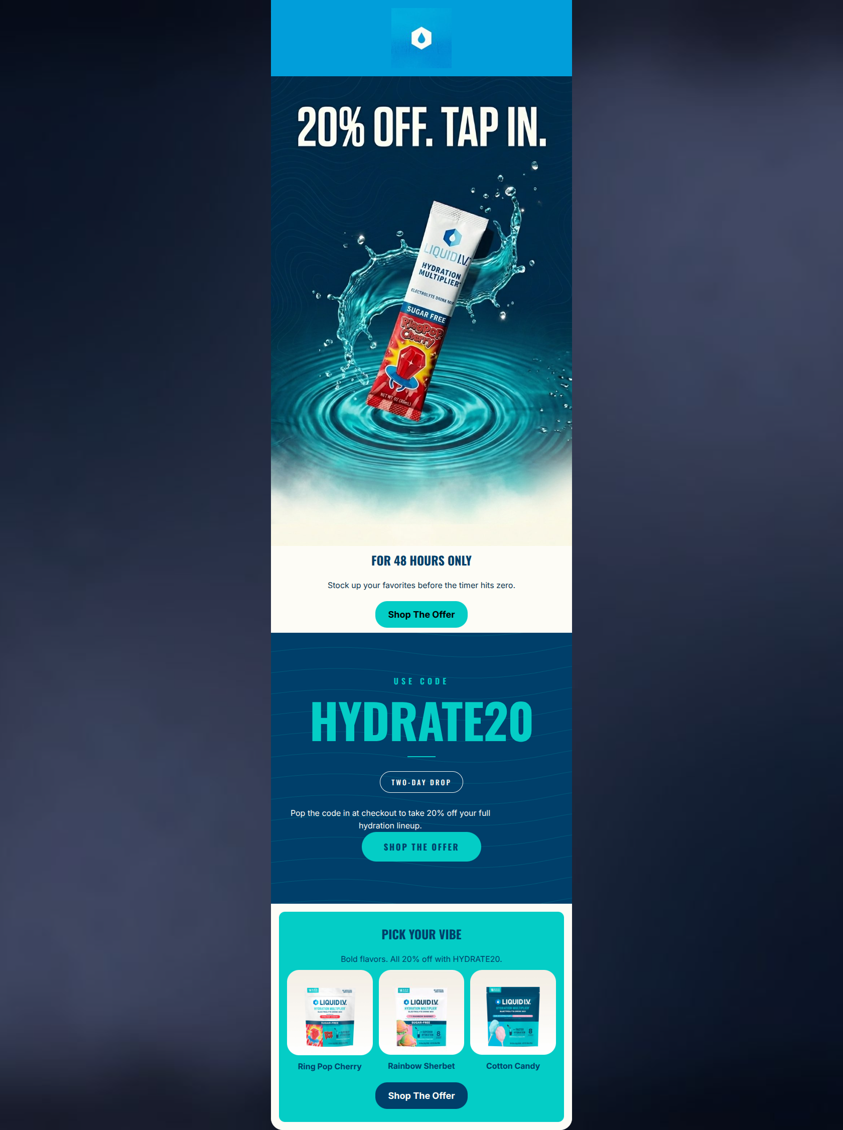
“20% Off Hydration Favorites. 48 Hours.”
Design Score
85/100This is a strong, high-impact promotional email that immediately commands attention with a visually striking hero and an unmistakable offer. The brand's energetic, confident tone is perfectly executed through bold typography and dynamic imagery. The email successfully follows the rule of CTA repetition, driving users toward a single clear goal. The primary areas for refinement involve reducing repetitive copy regarding the 20% discount and tightening the mid-body structure to reduce scroll friction before reaching the product grid.
Create Your Own
Generate professional email designs like this one in seconds with Kopi AI.
Email Details
- Subject Line
- 20% Off Hydration Favorites. 48 Hours.
- Brand
- Liquid I.V.
- Industry
- Health & Wellness
- Email Type
- Promotional
- Created
- May 6, 2026
Brand Colors
Email Copy
FOR 48 HOURS ONLY
Stock up your favorites before the timer hits zero.
→ Shop The Offer
PICK YOUR VIBE
Bold flavors. All 20% off with HYDRATE20.
Ring Pop Cherry
Rainbow Sherbet
Cotton Candy
→ Shop The Offer
Why This Email Works
This is a strong, high-impact promotional email that immediately commands attention with a visually striking hero and an unmistakable offer. The brand's energetic, confident tone is perfectly executed through bold typography and dynamic imagery. The email successfully follows the rule of CTA repetition, driving users toward a single clear goal. The primary areas for refinement involve reducing repetitive copy regarding the 20% discount and tightening the mid-body structure to reduce scroll friction before reaching the product grid.
Hero (top/initial part) Impact
92/100- Immediate, unmistakable communication of the core offer.
- Striking, dynamic lifestyle/product imagery that creates visual excitement.
- Excellent use of contrast (white text on deep navy) for maximum legibility.
Content Structure & Flow
75/100- Clear progression from broad offer to specific product applications.
- The distinct teal product grid effectively breaks up the vertical flow and signals a new type of content.
Visual Hierarchy & Layout
82/100- Excellent use of scale to emphasize the promo code.
- Clear distinct visual zones (Navy hero, Navy texture mid, Teal product grid).
Call-to-Action Strength
88/100- Strict adherence to a single primary action/destination.
- Consistent and clear button copy ('Shop The Offer').
- Adequate repetition of the CTA throughout the scroll depth.
Message Clarity & Tone
90/100- Confident, authoritative, and active brand voice.
- The offer mechanics (use this code) are blatantly clear.
Readability & Scannability
85/100- Excellent use of large, condensed display fonts for scannability.
- High contrast between primary text and backgrounds in the hero and product grid.
Offer & Value Proposition
88/100- Strong, clear financial incentive.
- Explicitly defined urgency window ('48 Hours Only', 'Two-Day Drop').
- Highlighting sugar-free specific flavors targets a key audience segment.
Personalization & Audience Fit
85/100- Aesthetic and tone directly match the psychographic profile of an active, on-the-go demographic.
Copy Conciseness & Word Economy
78/100- Avoids long paragraphs or 'wall of text' layouts.
- Action-oriented verbs are used effectively.
Quick Wins
- Unify the CTA button styling: make the final 'Shop The Offer' button Teal with Navy text to match the others, creating a cohesive visual cue for clicking.
- Trim the repetitive '20% off' mentions in the sub-copy. The massive headlines do enough heavy lifting.
- Increase the font weight slightly on the 'Pop the code in at checkout...' text to improve its readability against the textured navy background.

Create Professional Email Designs
Generate beautiful, on-brand email designs in seconds. Just enter your brand URL and let AI do the rest.