Fitness Promotional Email Template
“20% off. 48 hours. Go.”
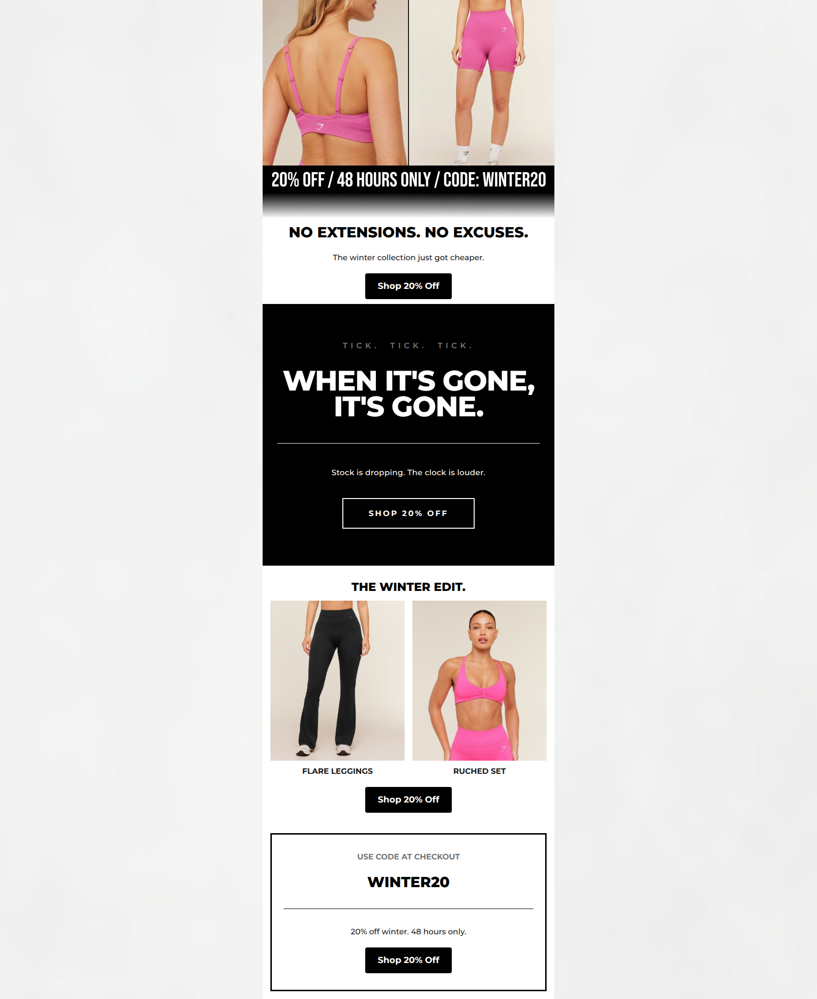
Design Score
89/100This is a highly effective, brand-aligned promotional email that masterfully executes Gymshark's 'digital brutalism' aesthetic. It leverages stark contrast, bold typography, and uncompromising copy to drive urgency for a 48-hour flash sale. By repeating a single, clear CTA ('Shop 20% Off') and prominently displaying the promo code in high-visibility blocks, the email minimizes cognitive load and creates a frictionless path to the website. While the copy is wonderfully concise, slight tweaks to phrasing and contrast could elevate it even further.
Create Your Own
Generate professional email designs like this one in seconds with Kopi AI.
Email Details
- Subject Line
- 20% off. 48 hours. Go.
- Brand
- Gymshark
- Industry
- Fitness
- Email Type
- Promotional
- Created
- May 17, 2026
Brand Colors
Email Copy
NO EXTENSIONS. NO EXCUSES.
The winter collection just got cheaper.
→ Shop 20% Off
THE WINTER EDIT.
FLARE LEGGINGS
RUCHED SET
→ Shop 20% Off
USE CODE AT CHECKOUT
WINTER20
20% off winter. 48 hours only.
→ Shop 20% Off
Why This Email Works
This is a highly effective, brand-aligned promotional email that masterfully executes Gymshark's 'digital brutalism' aesthetic. It leverages stark contrast, bold typography, and uncompromising copy to drive urgency for a 48-hour flash sale. By repeating a single, clear CTA ('Shop 20% Off') and prominently displaying the promo code in high-visibility blocks, the email minimizes cognitive load and creates a frictionless path to the website. While the copy is wonderfully concise, slight tweaks to phrasing and contrast could elevate it even further.
Hero Impact
90/100- Unambiguous, immediate presentation of the core offer.
- Bold, uncompromising headline perfectly matches the brand tone.
Content Structure & Flow
85/100- Clear, alternating visual rhythm prevents fatigue.
- Logical progression from a high-level announcement to specific, actionable products.
Visual Hierarchy & Layout
88/100- Excellent use of brand-aligned brutalist design principles.
- Stark contrast effectively highlights key conversion information.
- Strong use of borders to create a distinct, recognizable 'coupon' section.
Call-to-Action Strength
95/100- Unwavering focus on a single conversion goal.
- High-contrast button design stands out clearly against the background.
- Effective, frictionless repetition of the primary action.
Message Clarity & Tone
92/100- Tone is perfectly aligned with the brand's authoritative, athletic voice.
- Unambiguous communication of sale rules, codes, and timelines.
Readability & Scannability
90/100- Large, easily digestible headings instantly draw the eye.
- Zero unnecessary filler copy to wade through.
Offer & Value Proposition
85/100- High urgency created by the strict 48-hour timeline.
- Clear, compelling discount amount prominently displayed throughout.
Personalization & Audience Fit
80/100- Visually resonates deeply with the target demographic's known aesthetic preferences.
- Highlights trending, recognizable styles relevant to the core audience.
Copy Conciseness & Word Economy
95/100- Zero filler or unnecessary exposition.
- Highly distilled messaging that perfectly respects the inverted pyramid principle.
Quick Wins
- Replace the word 'cheaper' in the hero subcopy with a phrase that maintains the directness without diminishing the brand's premium positioning (e.g., 'Your winter rotation, now 20% off').
- Lighten the dark gray '#767676' text ('TICK. TICK. TICK.') slightly to ensure optimal accessibility and readability against the solid black background.
- Ensure the transparent CTA button in the black section retains enough visual weight; consider increasing the white border thickness slightly to match the boldness of the surrounding typography.



Create Professional Email Designs
Generate beautiful, on-brand email designs in seconds. Just enter your brand URL and let AI do the rest.