Other Promotional Email Template
“<<Имя>>, высокий балл уже есть — осталось подать согласие”
Design Score
86/100This is a highly effective, structured, and reassuring lifecycle email that perfectly aligns with the institution's authoritative yet mentor-like brand voice. The use of dynamic personalization to reflect the applicant's current status (program, score, deadlines) removes friction and immediately establishes relevance. The visual layout—specifically the progress tracker and the clear 1-2-3 next steps—guides the reader naturally toward the primary conversion goal. However, the presence of visually prominent secondary off-ramps (a top-header link and a large secondary button at the bottom) slightly dilutes the focus and prevents the email from achieving a top-tier score.
Create Your Own
Generate professional email designs like this one in seconds with Kopi AI.
Email Details
- Subject Line
- <<Имя>>, высокий балл уже есть — осталось подать согласие
- Brand
- Ульяновский государственный технический университет (УлГТУ)
- Industry
- Other
- Email Type
- Promotional
- Created
- July 9, 2026
Brand Colors
Email Copy
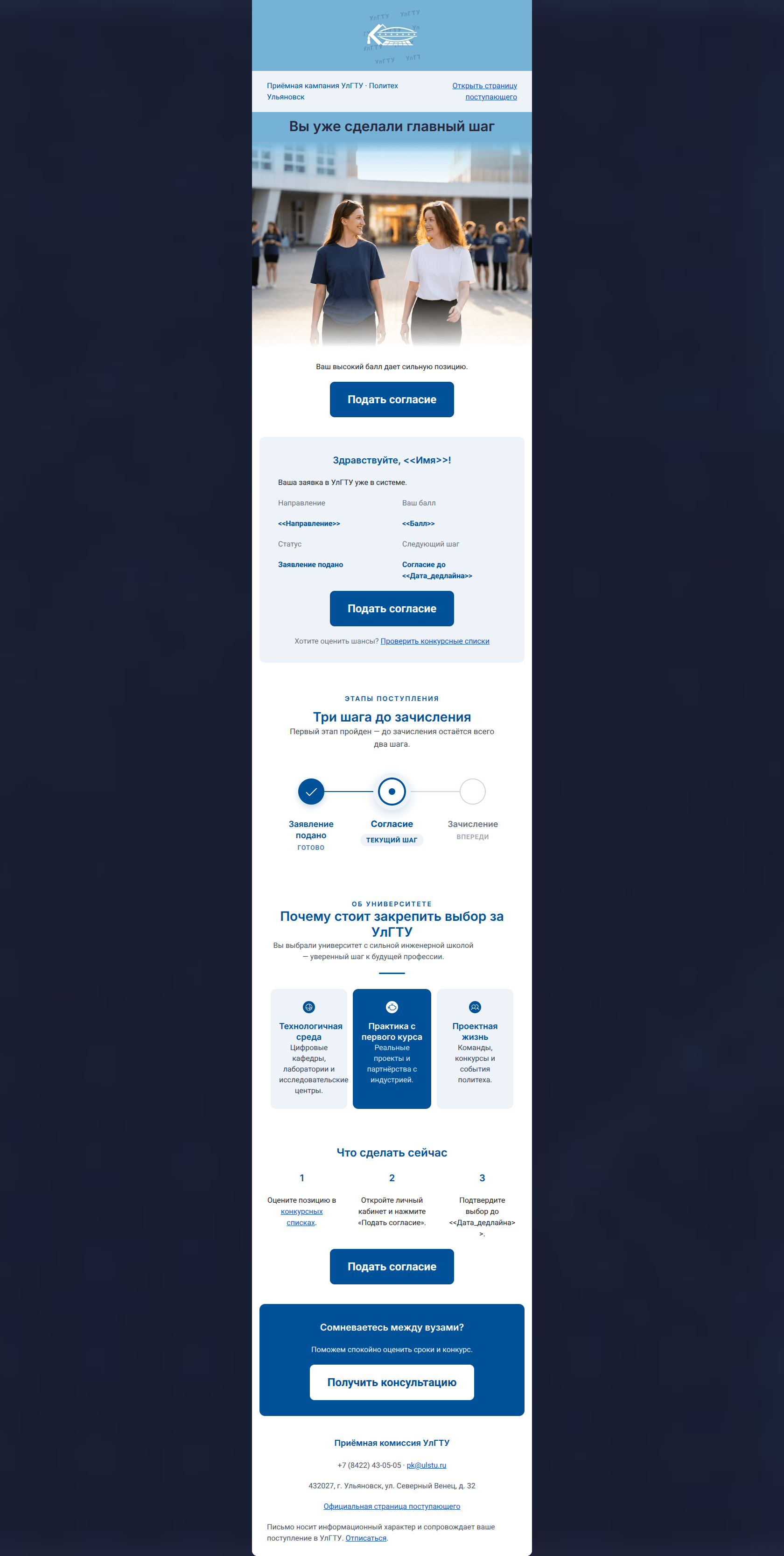
Приёмная кампания УлГТУ · Политех Ульяновск
Открыть страницу поступающего
Вы уже сделали главный шаг
Ваш высокий балл дает сильную позицию.
→ Подать согласие
Здравствуйте, >!
Ваша заявка в УлГТУ уже в системе.
Направление
>
Ваш балл
>
Статус
Заявление подано
Следующий шаг
Согласие до >
→ Подать согласие
Хотите оценить шансы? >">Проверить конкурсные списки
Что сделать сейчас
1
Оцените позицию в >">конкурсных списках.
2
Откройте личный кабинет и нажмите «Подать согласие».
3
Подтвердите выбор до >.
→ Подать согласие
Сомневаетесь между вузами?
Поможем спокойно оценить сроки и конкурс.
→ Получить консультацию
Приёмная комиссия УлГТУ
+7 (8422) 43-05-05 · pk@ulstu.ru
432027, г. Ульяновск, ул. Северный Венец, д. 32
Официальная страница поступающего
Письмо носит информационный характер и сопровождает ваше поступление в УлГТУ. >">Отписаться.
Why This Email Works
This is a highly effective, structured, and reassuring lifecycle email that perfectly aligns with the institution's authoritative yet mentor-like brand voice. The use of dynamic personalization to reflect the applicant's current status (program, score, deadlines) removes friction and immediately establishes relevance. The visual layout—specifically the progress tracker and the clear 1-2-3 next steps—guides the reader naturally toward the primary conversion goal. However, the presence of visually prominent secondary off-ramps (a top-header link and a large secondary button at the bottom) slightly dilutes the focus and prevents the email from achieving a top-tier score.
Hero (top/initial part) Impact
85/100- Positive, reassuring headline that validates the user's previous action.
- Immediate placement of the primary CTA for frictionless conversion.
Content Structure & Flow
92/100- Logical progression from personalized data to institutional value proposition.
- The use of a 3-step 'What to do now' section perfectly bridges the gap between reading and acting.
Visual Hierarchy & Layout
88/100- Excellent use of whitespace to let the content breathe.
- Clear delineation of sections using alternating background colors (white to light blue).
Call-to-Action Strength
68/100- Consistent use of the exact same action phrase ('Подать согласие') for all primary buttons.
- Primary buttons feature high-contrast colors (white text on dark blue).
Message Clarity & Tone
88/100- Mentoring, encouraging tone that reassures the applicant.
- Direct and unambiguous language regarding deadlines and required actions.
Readability & Scannability
92/100- Heavy reliance on visual aids (progress tracker, icons, numbered lists) rather than walls of text.
- Excellent use of typographical hierarchy to separate headers, sub-headers, and body copy.
Offer & Value Proposition
85/100- The value proposition directly targets the audience's desire for practical, employable skills.
- Information is presented in easily digestible, bite-sized cards.
Personalization & Audience Fit
95/100- Comprehensive use of personalized data points.
- The personalized block serves as the anchor for the entire email, making the subsequent CTA feel like a logical requirement rather than a request.
Copy Conciseness & Word Economy
90/100- No throat-clearing openers or wasted space.
- Action-oriented verbs drive the 'What to do now' section.
Quick Wins
- Demote the 'Получить консультацию' button to a standard text link within the bottom section to remove visual competition with the primary CTA.
- Remove the 'Открыть страницу поступающего' link from the top pre-header row to prevent early exits.
- Verify that the 'Ваш высокий балл' copy is triggered only for applicants who meet a certain threshold, or change it to a universally applicable phrase like 'Ваша заявка рассмотрена'.



Create Professional Email Designs
Generate beautiful, on-brand email designs in seconds. Just enter your brand URL and let AI do the rest.