Food & Beverage Promotional Email Template
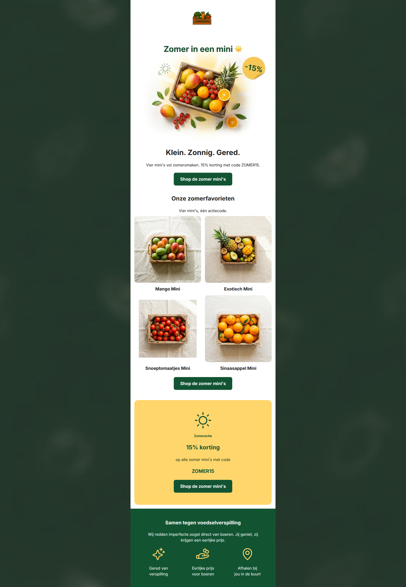
“☀️ Zomer in een mini — nu -15%”
Design Score
85/100This is a highly effective, beautifully designed promotional email that deeply understands its brand identity and target audience. The visual hierarchy is clean, the copywriting is punchy and mission-aligned ('Klein. Zonnig. Gered.'), and the primary CTA is correctly repeated throughout the design. The primary conversion leak is a destination mismatch: the CTA buttons link to the 'all' collection rather than the specific 'mini's' collection being advertised, forcing high-intent users to hunt for the products after clicking. Fixing this routing, highlighting the promo code better, and adding a touch of urgency will push this into top-tier performance.
Create Your Own
Generate professional email designs like this one in seconds with Kopi AI.
Email Details
- Subject Line
- ☀️ Zomer in een mini — nu -15%
- Brand
- Veggiebox
- Industry
- Food & Beverage
- Email Type
- Promotional
- Created
- May 19, 2026
Brand Colors
Email Copy
Klein. Zonnig. Gered.
Vier mini's vol zomersmaken. 15% korting met code ZOMER15.
→ Shop de zomer mini's
Onze zomerfavorieten
Vier mini's, één actiecode.
Mango Mini
Exotisch Mini
Snoeptomaatjes Mini
Sinaasappel Mini
→ Shop de zomer mini's
Zomeractie
15% korting
op alle zomer mini's met code
ZOMER15
→ Shop de zomer mini's
Samen tegen voedselverspilling
Wij redden imperfecte oogst direct van boeren. Jij geniet, zij krijgen een eerlijke prijs.
Gered van verspilling
Eerlijke prijs voor boeren
Afhalen bij jou in de buurt
Why This Email Works
This is a highly effective, beautifully designed promotional email that deeply understands its brand identity and target audience. The visual hierarchy is clean, the copywriting is punchy and mission-aligned ('Klein. Zonnig. Gered.'), and the primary CTA is correctly repeated throughout the design. The primary conversion leak is a destination mismatch: the CTA buttons link to the 'all' collection rather than the specific 'mini's' collection being advertised, forcing high-intent users to hunt for the products after clicking. Fixing this routing, highlighting the promo code better, and adding a touch of urgency will push this into top-tier performance.
Hero Impact
88/100- Brilliant, punchy headline ('Klein. Zonnig. Gered.') that ties product, season, and mission together.
- Clear visual hierarchy funneling attention downward from the image to the heading, text, and button.
Content Structure & Flow
90/100- Logical flow from broad offer to specific products to offer recap.
- The yellow promo block acts as a perfect pattern interrupt to re-engage scrollers before the final CTA.
Visual Hierarchy & Layout
82/100- Excellent use of the crisp white background to make the natural colors of the fruit pop.
- Clear separation of sections using background colors (white, yellow, green) prevents visual fatigue.
Call-to-Action Strength
75/100- Perfect reinforcement through repetition of the exact same CTA phrase.
- High-contrast dark green buttons stand out clearly against both the white and yellow backgrounds.
Message Clarity & Tone
95/100- Embodies the 'friendly, transparent, encouraging' brand voice flawlessly.
- Translates the 'anti-food waste' mission into a direct customer benefit: 'Jij geniet, zij krijgen een eerlijke prijs'.
Readability & Scannability
85/100- Bite-sized copy blocks reduce cognitive load.
- Strong typographic hierarchy in the yellow promo block ('Zomeractie' -> '15% korting' -> 'ZOMER15').
Offer & Value Proposition
82/100- The offer is easy to understand: 15% off a specific product category.
- The unique value proposition (rescuing harvest + local pickup) is heavily reinforced in the footer.
Personalization & Audience Fit
80/100- Imagery and messaging directly appeal to the target audience's desire for healthy, vibrant, and sustainable food.
- The 'Samen tegen voedselverspilling' framing makes the customer feel like a partner in the mission.
Copy Conciseness & Word Economy
92/100- Distilled, punchy sentences.
- Zero filler or corporate jargon.
Quick Wins
- Change the primary CTA URLs from '/collections/all' to the specific '/collections/de-mini-s' to match the promoted products.
- Bold the 'ZOMER15' text in the hero section to make the code immediately scannable.
- Add an expiration date for the discount code (e.g., 'Geldig t/m zondag') to create urgency.


Create Professional Email Designs
Generate beautiful, on-brand email designs in seconds. Just enter your brand URL and let AI do the rest.