Food & Beverage Promotional Email Template
“Zoete snoeptomaatjes, zo uit de hand 🍅”
Design Score
85/100This is a strong, highly focused promotional email that effectively leverages word economy, visual hierarchy, and CTA repetition. By stripping away filler text and aligning all primary buttons to a single action, the email creates a frictionless path to the product page. However, it leaves some conversion potential on the table by omitting volume/quantity context for the product and using slightly disconnected imagery in the final section. A few minor tweaks to audience personalization and visual alignment would push this into the top tier.
Create Your Own
Generate professional email designs like this one in seconds with Kopi AI.
Email Details
- Subject Line
- Zoete snoeptomaatjes, zo uit de hand 🍅
- Brand
- Veggiebox
- Industry
- Food & Beverage
- Email Type
- Promotional
- Created
- May 18, 2026
Brand Colors
Email Copy
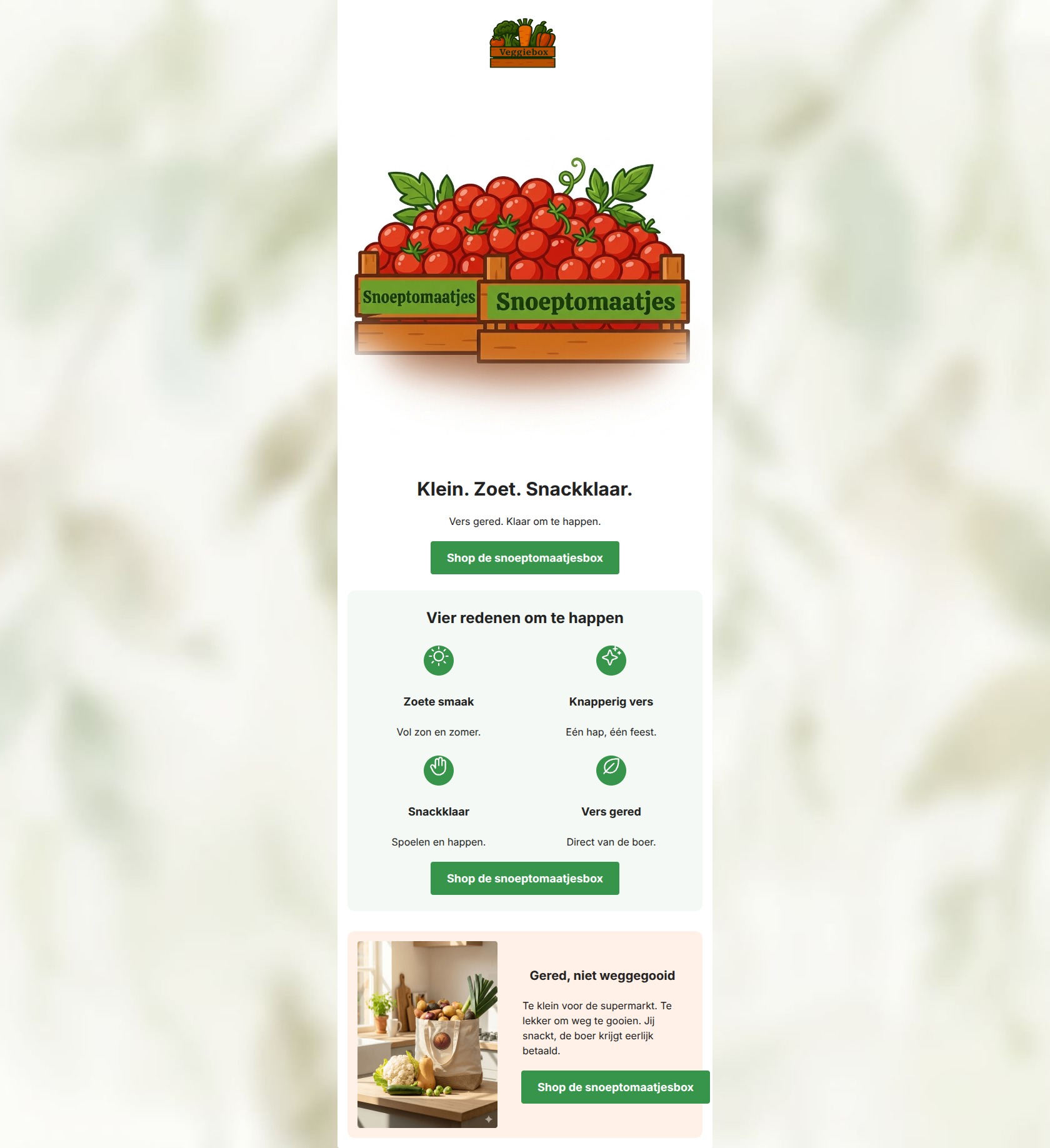
Klein. Zoet. Snackklaar.
Vers gered. Klaar om te happen.
→ Shop de snoeptomaatjesbox
Vier redenen om te happen
Zoete smaak
Vol zon en zomer.
Knapperig vers
Eén hap, één feest.
Snackklaar
Spoelen en happen.
Vers gered
Direct van de boer.
→ Shop de snoeptomaatjesbox
Gered, niet weggegooid
Te klein voor de supermarkt. Te lekker om weg te gooien. Jij snackt, de boer krijgt eerlijk betaald.
→ Shop de snoeptomaatjesbox
Why This Email Works
This is a strong, highly focused promotional email that effectively leverages word economy, visual hierarchy, and CTA repetition. By stripping away filler text and aligning all primary buttons to a single action, the email creates a frictionless path to the product page. However, it leaves some conversion potential on the table by omitting volume/quantity context for the product and using slightly disconnected imagery in the final section. A few minor tweaks to audience personalization and visual alignment would push this into the top tier.
1. Hero (top/initial part) Impact
88/100- The headline 'Klein. Zoet. Snackklaar.' is punchy, rhythmic, and immediately communicates the value.
- The CTA is positioned above the fold (on most devices) and contrasts beautifully against the light background.
2. Content Structure & Flow
85/100- Excellent pacing. The reader is never overwhelmed by too much information at once.
- The placement of the 'Our Story' / mission element at the bottom acts as a great secondary hook for users who need an emotional reason to convert.
3. Visual Hierarchy & Layout
82/100- The use of distinct background colors (white, pale green, pale orange) perfectly delineates the three sections without feeling chaotic.
- The 2x2 grid breaks up the vertical flow and makes the 'four reasons' effortless to scan.
4. Call-to-Action Strength
95/100- Repetition is a feature: the 'Shop de snoeptomaatjesbox' CTA appears three times, reinforcing the single goal.
- The color contrast of the buttons guarantees they are the most clickable elements in the layout.
5. Message Clarity & Tone
86/100- The line 'Jij snackt, de boer krijgt eerlijk betaald' is a masterclass in connecting a user benefit to an ethical mission in just eight words.
- No complex jargon or preachy environmental messaging; it keeps the focus on the joy of snacking.
6. Readability & Scannability
92/100- Dark text (#222222) on light backgrounds ensures maximum contrast and readability.
- Subheadings in the 2x2 grid ('Zoete smaak', 'Knapperig vers') make the benefits obvious without needing to read the body copy.
7. Offer & Value Proposition
80/100- The dual value proposition is clearly communicated: you get a great snack, and you do a good deed.
8. Personalization & Audience Fit
75/100- Directly addresses the eco-conscious family's desire for healthy, accessible snacks.
9. Copy Conciseness & Word Economy
96/100- Zero throat-clearing. The email gets straight to the point in the hero.
- The short, staccato sentences ('Spoelen en happen.') create a fast, engaging reading rhythm.
Quick Wins
- Add a tomato or leaf emoji to the hero or subject line to align with the brand's playful personality.
- Update the third section's image link to match the primary product CTA to avoid leaking intent.
- Add a small text indicator under the hero headline specifying the volume or size of the box.


Create Professional Email Designs
Generate beautiful, on-brand email designs in seconds. Just enter your brand URL and let AI do the rest.