Food & Beverage Promotional Email Template
“Zilveren Veggieredder: vandaag 15% op bio 🥑”
Design Score
82/100This is a strong, highly targeted promotional email that effectively leverages a loyalty tier ('Zilver') to drive urgency and conversions. The messaging is clear, the offer is compelling, and the cognitive load is reduced by doing the math for the customer in the product grid. The primary weaknesses are visual: poor contrast on the CTA buttons against colored backgrounds and the use of a cartoon illustration that contradicts the brand's 'documentary-style' photography guidelines.
Create Your Own
Generate professional email designs like this one in seconds with Kopi AI.
Email Details
- Subject Line
- Zilveren Veggieredder: vandaag 15% op bio 🥑
- Brand
- Veggiebox
- Industry
- Food & Beverage
- Email Type
- Promotional
- Created
- June 22, 2026
Brand Colors
Email Copy
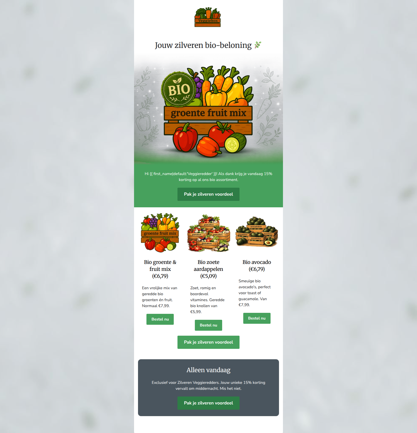
Jouw zilveren bio-beloning 🌿
Hi Veggieredder! Als dank krijg je vandaag 15% korting op al ons bio assortiment.
→ Pak je zilveren voordeel
Bio groente & fruit mix (€6,79)
Een vrolijke mix van geredde bio groenten én fruit. Normaal €7,99.
→ Bestel nu
Bio zoete aardappelen (€5,09)
Zoet, romig en boordevol vitamines. Geredde bio knollen van €5,99.
→ Bestel nu
Bio avocado (€6,79)
Smeuïge bio avocado's, perfect voor toast of guacamole. Van €7,99.
→ Bestel nu
→ Pak je zilveren voordeel
Alleen vandaag
Exclusief voor Zilveren Veggieredders. Jouw unieke 15% korting vervalt om middernacht. Mis het niet.
→ Pak je zilveren voordeel
Why This Email Works
This is a strong, highly targeted promotional email that effectively leverages a loyalty tier ('Zilver') to drive urgency and conversions. The messaging is clear, the offer is compelling, and the cognitive load is reduced by doing the math for the customer in the product grid. The primary weaknesses are visual: poor contrast on the CTA buttons against colored backgrounds and the use of a cartoon illustration that contradicts the brand's 'documentary-style' photography guidelines.
Hero Impact
65/100- H1 creates immediate intrigue.
- The hero image is clickable, providing an early escape hatch for high-intent users.
Content Structure & Flow
85/100- Excellent logical progression that builds a case for clicking.
- Product grid effectively grounds the abstract 15% discount into tangible savings.
Visual Hierarchy & Layout
60/100- Clear delineation of sections using background colors.
- Centered alignment in key blocks focuses the reader's eye.
Call-to-Action Strength
85/100- Perfect consistency in destination URL across all buttons.
- Consistent, action-oriented button copy ('Pak je zilveren voordeel') repeated strategically.
Message Clarity & Tone
90/100- Strong use of brand-specific terminology that fosters community.
- Clear, unambiguous explanation of the offer and its limitations.
Readability & Scannability
85/100- Excellent contrast between text and background in reading areas.
- Bite-sized copy blocks prevent reader fatigue.
Offer & Value Proposition
90/100- Explicitly showing the 'before and after' prices eliminates mental math.
- Tying the discount to a specific product category (bio) creates focus.
Personalization & Audience Fit
95/100- Effective use of the first-name dynamic tag.
- Leveraging a loyalty tier ('Zilver') increases the perceived value of the communication.
Copy Conciseness & Word Economy
88/100- No throat-clearing or unnecessary brand exposition.
- Adjectives used in the product grid are descriptive and appetizing without being bloated.
Quick Wins
- Change the background color of the CTA buttons in the colored blocks (green and dark grey) to a high-contrast color like white (with green text) to ensure they pop.
- Add the text '15% korting' to the H1 or immediately below it so the value proposition is visible above the fold.
- Trim 5-10 words from the product descriptions in the grid to maximize scannability.


Create Professional Email Designs
Generate beautiful, on-brand email designs in seconds. Just enter your brand URL and let AI do the rest.