Health & Wellness Product Launch Email Template
“Yours first: VIP early access is open”
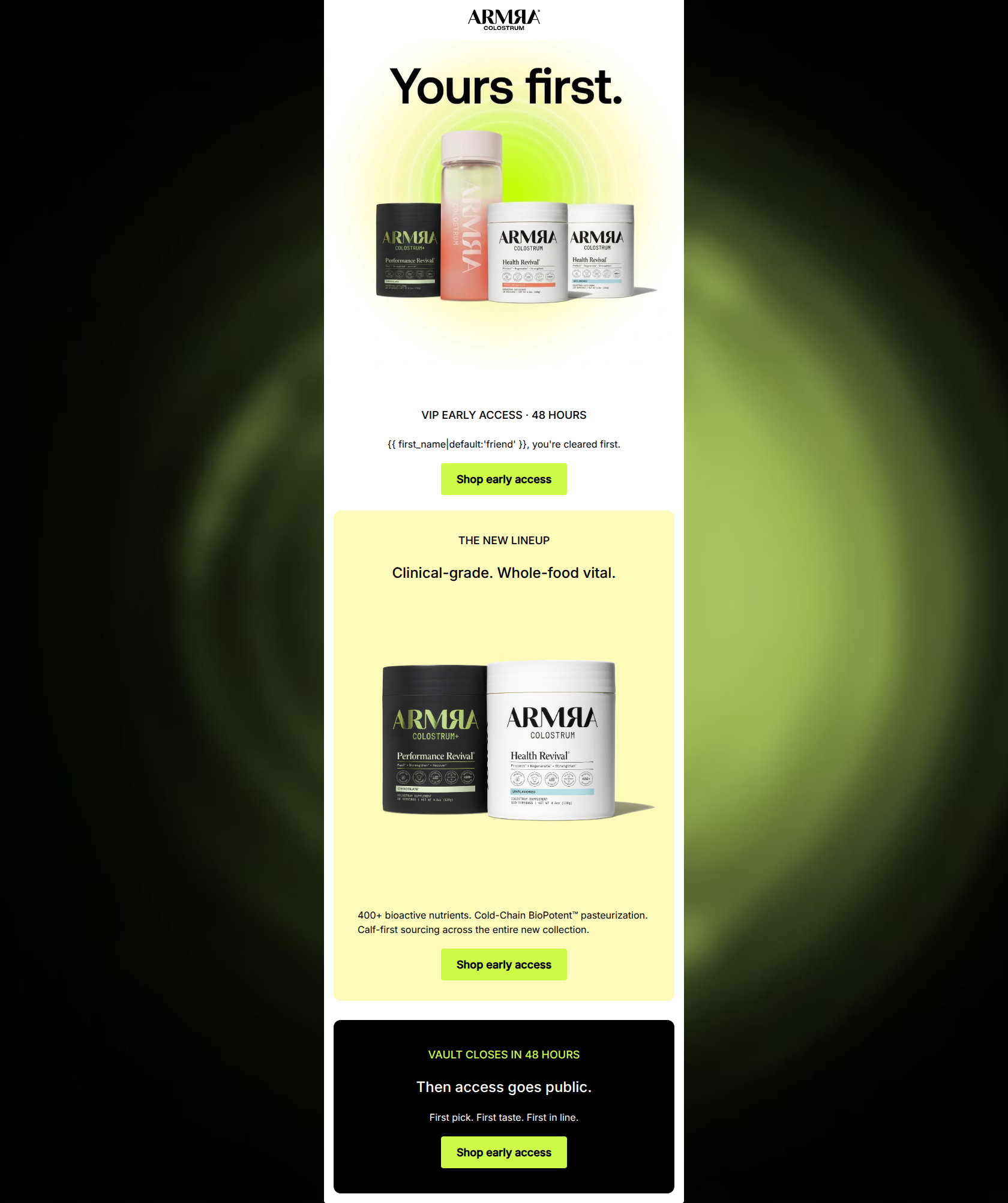
Design Score
89/100This is a masterclass in concise, high-impact email marketing that deeply respects the brand's premium, clinical positioning. The email effectively leverages exclusivity and urgency without resorting to cheap hype. The visual hierarchy is exceptionally strong, using contrasting background cards to guide the reader effortlessly toward a flawlessly executed, repetitive Call-to-Action strategy. While the word economy is fantastic, the email slightly over-relies on visual recognition and misses an opportunity to explicitly state what makes the 'new' lineup different. Overall, this is a top-tier execution.
Create Your Own
Generate professional email designs like this one in seconds with Kopi AI.
Email Details
- Subject Line
- Yours first: VIP early access is open
- Brand
- ARMRA [eval 2026-03-25]
- Industry
- Health & Wellness
- Email Type
- Product Launch
- Created
- April 24, 2026
Brand Colors
Email Copy
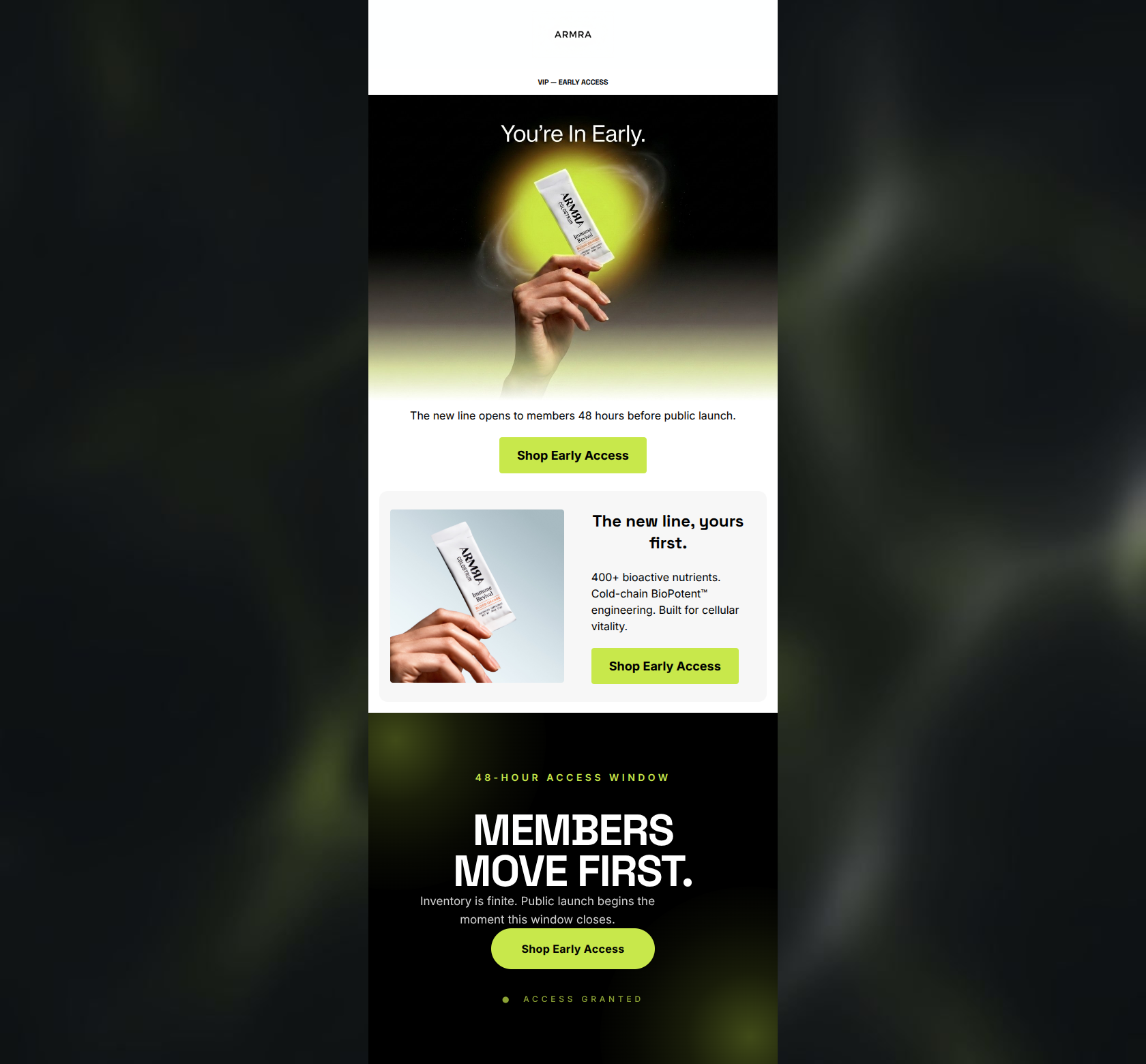
VIP EARLY ACCESS · 48 HOURS
friend, you're cleared first.
→ Shop early access
THE NEW LINEUP
Clinical-grade. Whole-food vital.
400+ bioactive nutrients. Cold-Chain BioPotent™ pasteurization. Calf-first sourcing across the entire new collection.
→ Shop early access
VAULT CLOSES IN 48 HOURS
Then access goes public.
First pick. First taste. First in line.
→ Shop early access
Why This Email Works
This is a masterclass in concise, high-impact email marketing that deeply respects the brand's premium, clinical positioning. The email effectively leverages exclusivity and urgency without resorting to cheap hype. The visual hierarchy is exceptionally strong, using contrasting background cards to guide the reader effortlessly toward a flawlessly executed, repetitive Call-to-Action strategy. While the word economy is fantastic, the email slightly over-relies on visual recognition and misses an opportunity to explicitly state what makes the 'new' lineup different. Overall, this is a top-tier execution.
Hero (top/initial part) Impact
85/100- Immediate establishment of exclusivity and urgency.
- Stunning, on-brand visual presentation of the product.
- Clear, high-contrast primary CTA above the fold.
Content Structure & Flow
88/100- Flawless progression from brand-level exclusivity to product-level detail.
- Zero unnecessary secondary sections or navigational clutter.
- Perfect pacing between text blocks and visual elements.
Visual Hierarchy & Layout
92/100- Excellent use of background blocking to separate narrative stages.
- The acid-green CTA buttons pop aggressively against all three background colors.
- Ample breathing room (padding/margins) around the product shots.
Call-to-Action Strength
100/100- Repetition of a single, clear primary action.
- No competing secondary verbs or 'learn more' distractions.
- Outstanding color contrast ensuring the button is the most prominent element in every section.
Message Clarity & Tone
86/100- Perfect alignment with the brand's 'expert mentor' and objective tone.
- Creates legitimate FOMO without sounding desperate.
- Uses precise terminology ('Whole-food vital') that resonates with the biohacker audience.
Readability & Scannability
85/100- Short, impactful sentences.
- Excellent use of font weights to distinguish headers from body copy.
- No intimidating walls of text.
Offer & Value Proposition
82/100- Maintains premium brand positioning by leaning on access rather than discounts.
- Reiterates foundational brand differentiators clearly.
Personalization & Audience Fit
87/100- Language directly appeals to the target audience's desire for elite, high-performance solutions.
- Personalization is integrated seamlessly into the exclusivity narrative.
Copy Conciseness & Word Economy
95/100- Zero filler words or throat-clearing introductions.
- Powerful, rhythmic triplets used in the closing section.
- High information density in very few words.
Quick Wins
- Change the liquid fallback from 'friend' to 'VIP' or 'Member' to better align with the premium brand tone.
- Center-align the paragraph text in the yellow 'New Lineup' section to match the central axis of the rest of the email.
- Remove the 1px black divider line beneath the hero section to smooth the visual transition.
Create Professional Email Designs
Generate beautiful, on-brand email designs in seconds. Just enter your brand URL and let AI do the rest.