Outdoor & Sports Welcome Email Template
“You're in. Welcome to the team.”
Design Score
80/100This is a visually polished, brand-aligned Welcome email that effectively communicates Nike's premium aesthetic and membership value. While the visual hierarchy and hero section are strong, the email suffers from a significant conversion leak in the middle section by prioritizing a service policy link over product exploration, and the secondary calls-to-action lack sufficient visual weight to drive clicks.
Create Your Own
Generate professional email designs like this one in seconds with Kopi AI.
Email Details
- Subject Line
- You're in. Welcome to the team.
- Brand
- Nike
- Industry
- Outdoor & Sports
- Email Type
- Welcome
- Created
- January 23, 2026
Brand Colors
Email Copy
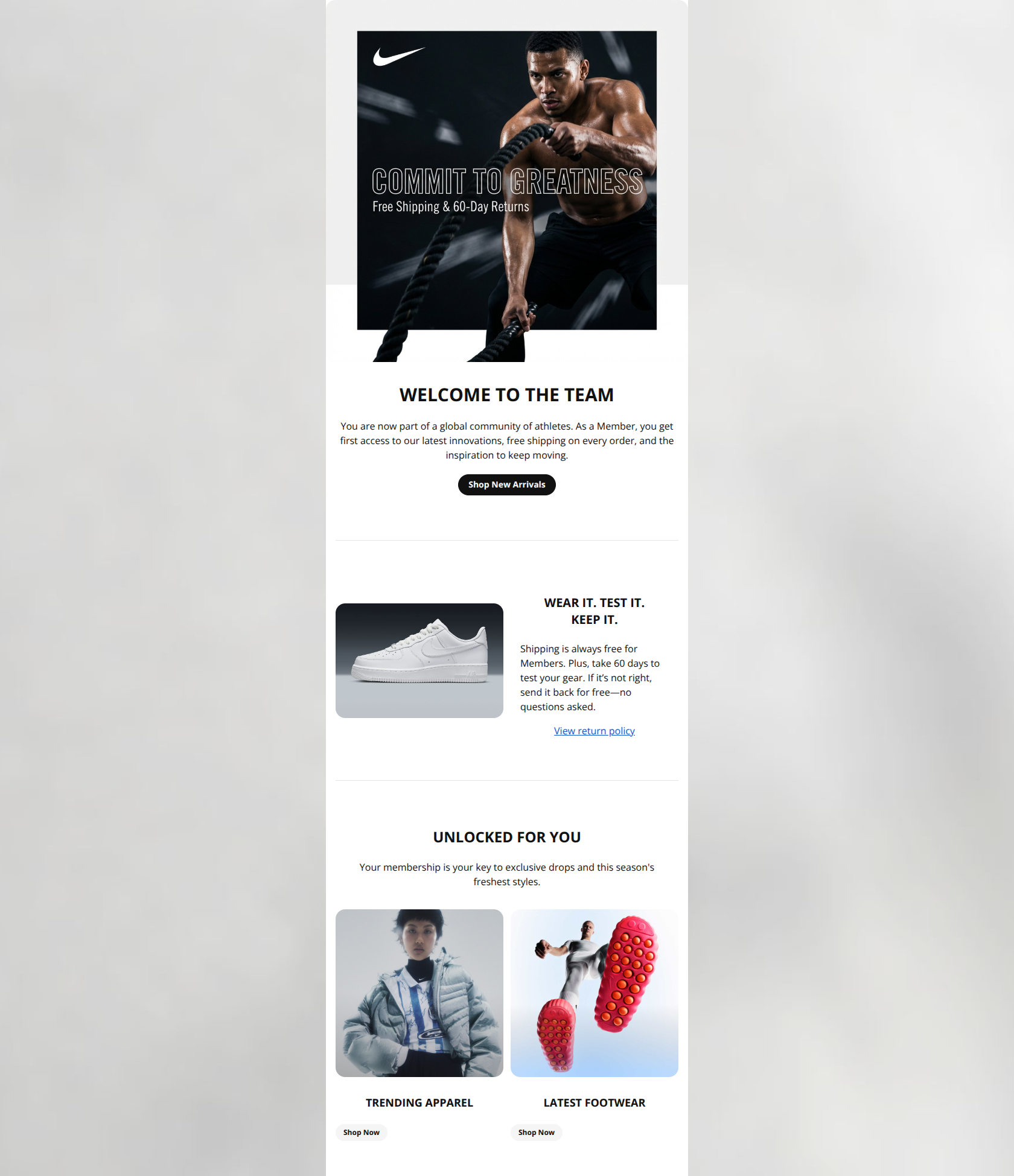
WELCOME TO THE TEAM
You are now part of a global community of athletes. As a Member, you get first access to our latest innovations, free shipping on every order, and the inspiration to keep moving.
→ Shop New Arrivals
WEAR IT. TEST IT. KEEP IT.
Shipping is always free for Members. Plus, take 60 days to test your gear. If it’s not right, send it back for free—no questions asked.
View return policy
UNLOCKED FOR YOU
Your membership is your key to exclusive drops and this season's freshest styles.
TRENDING APPAREL
→ Shop Now
LATEST FOOTWEAR
→ Shop Now
Why This Email Works
This is a visually polished, brand-aligned Welcome email that effectively communicates Nike's premium aesthetic and membership value. While the visual hierarchy and hero section are strong, the email suffers from a significant conversion leak in the middle section by prioritizing a service policy link over product exploration, and the secondary calls-to-action lack sufficient visual weight to drive clicks.
Hero (top/initial part) Impact
85/100- Strong emotional hook with 'COMMIT TO GREATNESS' imagery consistent with the 'Athletic Editorial' style.
- Clear transition from brand imagery to the primary H1 'WELCOME TO THE TEAM'.
Content Structure & Flow
75/100- Distinct sections separated by clean dividers make the email easy to parse.
- The progression from Brand -> Service -> Product is logical for a welcome email (though the weighting is off).
Visual Hierarchy & Layout
80/100- Clean, spacious layout that reduces cognitive load.
- Headings are bold and clearly establish the topic of each section.
Call-to-Action Strength
72/100- Primary CTA button uses high-contrast black background with white text.
- Button copy is legible and well-positioned.
Message Clarity & Tone
88/100- Excellent use of the 'Coach' persona in the copy ('Commit to Greatness', 'Welcome to the Team').
- Value propositions (Free shipping, 60-day test) are explained simply without jargon.
Readability & Scannability
85/100- High contrast text (black on white) ensures accessibility.
- Short, punchy paragraphs respect the reader's time.
Offer & Value Proposition
82/100- The '60-day trial' is a massive reassurance factor that is highlighted well.
- No confusing discount codes or math required.
Personalization & Audience Fit
70/100- Inclusive imagery that fits the global, diverse audience.
- Use of second-person pronouns ('Your membership', 'You are now part of').
Quick Wins
- Remove the hyperlink from 'View return policy' to stop leaking traffic to a non-commercial page.
- Change the background color of the secondary 'Shop Now' buttons to Black (or a dark outline) to improve contrast and clickability.
- Change the primary CTA text from 'Shop New Arrivals' to 'Shop Member Exclusives' to better align with the 'Welcome to the Team' narrative.
- Split the paragraph in the middle section into 2 bullet points for easier scanning.




Create Professional Email Designs
Generate beautiful, on-brand email designs in seconds. Just enter your brand URL and let AI do the rest.