Design Score
84/100This is a strong, highly on-brand welcome email that effectively utilizes Gymshark's minimalist, high-contrast aesthetic and authoritative tone. The word economy is exceptional, and the strict adherence to a single primary CTA destination reduces cognitive load. However, the email suffers from a structural disjoint: the hero copy promises a 'loaded' code, but the actual 10% offer is buried at the very bottom. Bridging this gap will significantly reduce friction and likely lift first-purchase conversions.
Create Your Own
Generate professional email designs like this one in seconds with Kopi AI.
Email Details
- Subject Line
- You're in. Take 10% off.
- Brand
- Gymshark
- Industry
- Fitness
- Email Type
- Welcome
- Created
- May 6, 2026
Brand Colors
Email Copy
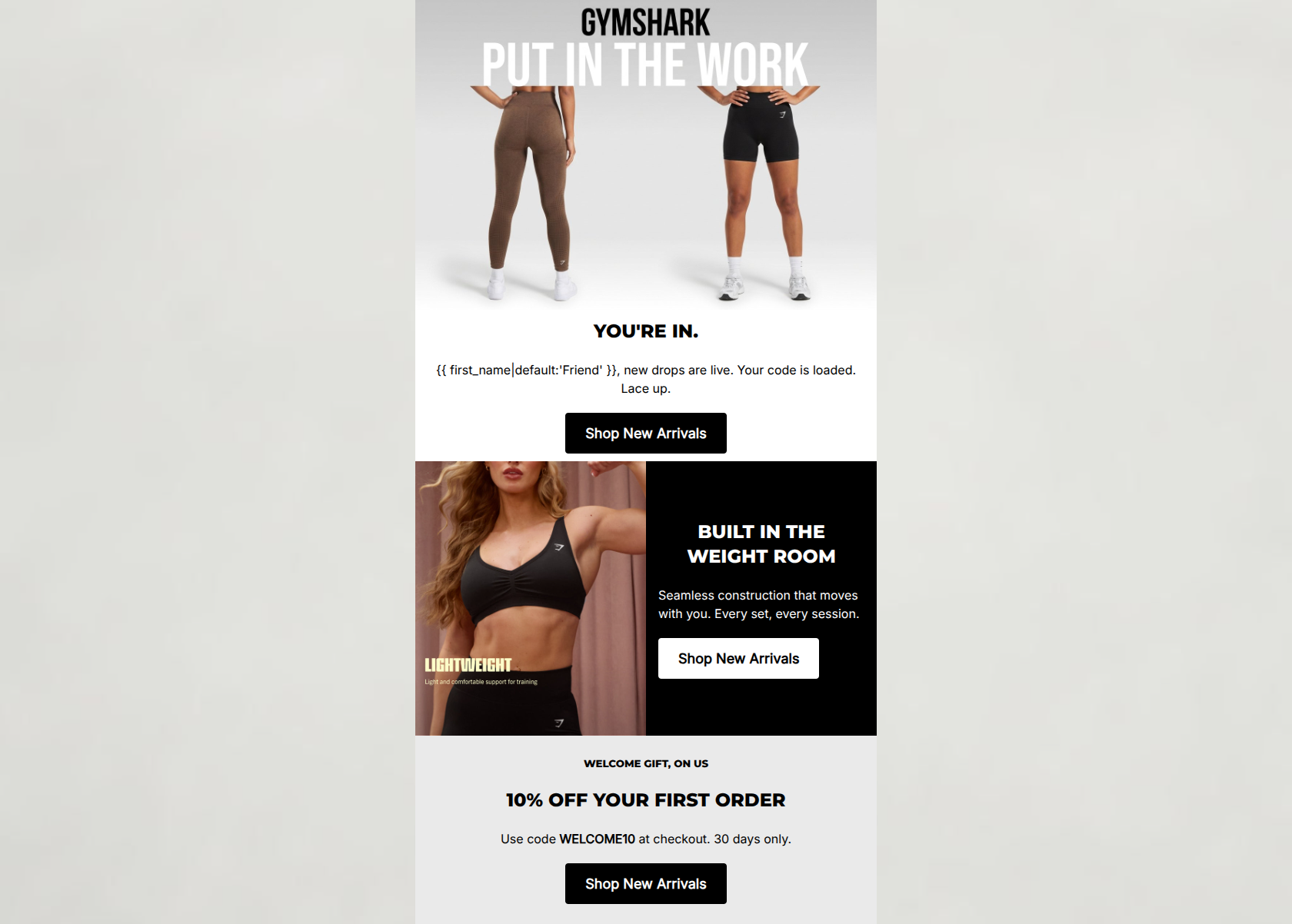
YOU'RE IN.
Friend, new drops are live. Your code is loaded. Lace up.
→ Shop New Arrivals
BUILT IN THE WEIGHT ROOM
Seamless construction that moves with you. Every set, every session.
→ Shop New Arrivals
WELCOME GIFT, ON US
10% OFF YOUR FIRST ORDER
Use code WELCOME10 at checkout. 30 days only.
→ Shop New Arrivals
Why This Email Works
This is a strong, highly on-brand welcome email that effectively utilizes Gymshark's minimalist, high-contrast aesthetic and authoritative tone. The word economy is exceptional, and the strict adherence to a single primary CTA destination reduces cognitive load. However, the email suffers from a structural disjoint: the hero copy promises a 'loaded' code, but the actual 10% offer is buried at the very bottom. Bridging this gap will significantly reduce friction and likely lift first-purchase conversions.
Hero (top/initial part) Impact
75/100- Extremely punchy, on-brand headline ('YOU'RE IN').
- Seamless integration of typography and imagery in the header graphic.
- Clear, high-contrast CTA immediately visible above the fold.
Content Structure & Flow
72/100- Excellent use of stark color blocking to clearly delineate sections.
- Logical progression of visual weight, funneling the eye down the page.
Visual Hierarchy & Layout
85/100- Strong, predictable alignment of CTAs makes scanning effortless.
- High-contrast black-and-white theme perfectly matches brand guidelines.
- The alternating left/right balance in the middle section prevents vertical fatigue.
Call-to-Action Strength
95/100- Strict adherence to a single primary destination (href).
- Identical CTA copy reinforces the desired action.
- Button colors flip (black-on-white vs. white-on-black) to maximize contrast against their respective section backgrounds.
Message Clarity & Tone
80/100- Highly authentic, athletic brand voice.
- Zero fluff or corporate throat-clearing.
Readability & Scannability
90/100- Excellent typographic hierarchy (H2s clearly dominant over body text).
- Short, punchy sentences facilitate rapid scanning.
Offer & Value Proposition
75/100- Clear, unambiguous offer (10% off).
- Strong use of urgency ('30 days only').
- Clear product value proposition ('Seamless construction that moves with you').
Personalization & Audience Fit
85/100- Effective use of a fallback variable ('Friend') if the name is missing.
- Imagery authentically reflects the raw, gritty gym environment the audience aspires to.
Copy Conciseness & Word Economy
95/100- Absence of filler adjectives.
- Action-oriented sentence structures ('Lace up', 'Built in the weight room').
Quick Wins
- Clarify whether the discount code is auto-applied ('loaded') or requires manual entry ('Use code'). Align the copy to match the technical reality.
- Apply a distinct visual styling (like a dashed border or gray highlight box) to the 'WELCOME10' text so it immediately registers as a promo code when scanning.
- Change the hero image to a full-body action shot to create a more compelling aspirational hook upon opening.




Create Professional Email Designs
Generate beautiful, on-brand email designs in seconds. Just enter your brand URL and let AI do the rest.