Design Score
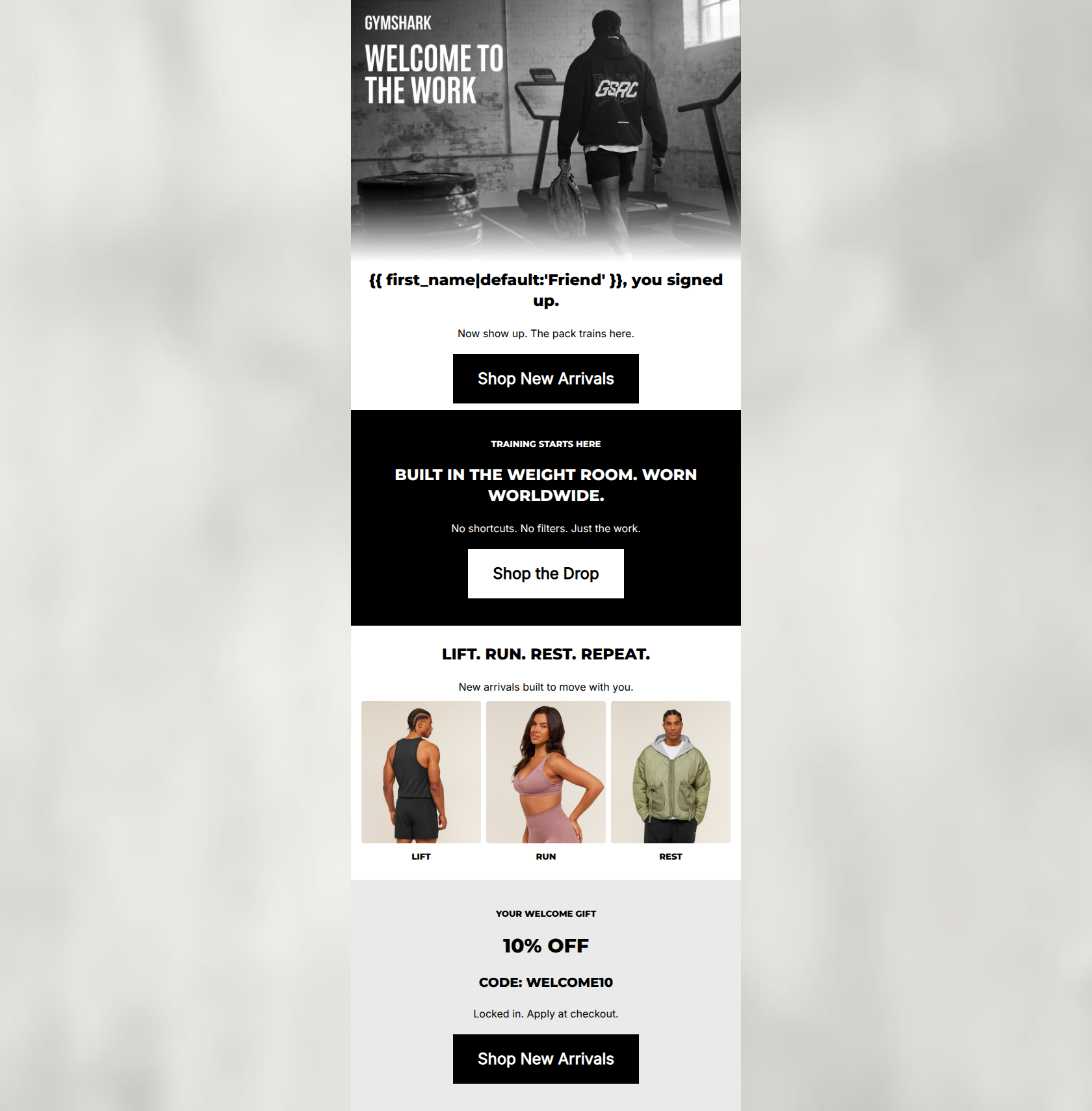
83/100This welcome email executes Gymshark's gritty, no-nonsense brand voice and minimalist aesthetic flawlessly. The copy is exceptionally tight, and the CTA strategy is highly disciplined, with all primary buttons driving to the same destination. However, the email suffers from a significant structural flaw: it buries the primary conversion driver (the 10% off welcome code) at the very bottom of the email. By forcing the user to scroll past a brand manifesto and product categories to find their incentive, the email leaves significant revenue on the table.
Create Your Own
Generate professional email designs like this one in seconds with Kopi AI.
Email Details
- Subject Line
- You're in. Now train.
- Brand
- Gymshark
- Industry
- Fitness
- Email Type
- Welcome
- Created
- May 6, 2026
Brand Colors
Email Copy
Friend, you signed up.
Now show up. The pack trains here.
→ Shop New Arrivals
TRAINING STARTS HERE
BUILT IN THE WEIGHT ROOM. WORN WORLDWIDE.
No shortcuts. No filters. Just the work.
→ Shop the Drop
LIFT. RUN. REST. REPEAT.
New arrivals built to move with you.
LIFT
RUN
REST
YOUR WELCOME GIFT
10% OFF
CODE: WELCOME10
Locked in. Apply at checkout.
→ Shop New Arrivals
Why This Email Works
This welcome email executes Gymshark's gritty, no-nonsense brand voice and minimalist aesthetic flawlessly. The copy is exceptionally tight, and the CTA strategy is highly disciplined, with all primary buttons driving to the same destination. However, the email suffers from a significant structural flaw: it buries the primary conversion driver (the 10% off welcome code) at the very bottom of the email. By forcing the user to scroll past a brand manifesto and product categories to find their incentive, the email leaves significant revenue on the table.
1. Hero (top/initial part) Impact
65/100- Strong, gritty on-brand imagery immediately sets the desired tone.
- Clear, confident, no-nonsense introductory copy ('you signed up. Now show up.').
2. Content Structure & Flow
55/100- Distinct visual blocks (white, black, grey backgrounds) create clear, logical section breaks.
3. Visual Hierarchy & Layout
85/100- Excellent stark aesthetic that aligns perfectly with the Gymshark brand.
- High contrast ensures all text and CTAs stand out clearly against their respective backgrounds.
4. Call-to-Action Strength
95/100- Strict adherence to a single primary destination across all main buttons.
- High-contrast color choices (black on white, white on black) make the buttons unmistakable.
5. Message Clarity & Tone
95/100- Short, punchy sentences reduce cognitive load ('No shortcuts. No filters. Just the work.').
- Directly addresses the reader's ambition and commitment.
6. Readability & Scannability
90/100- Text is broken down into easily digestible, single-line sentences.
- Ample padding around text elements prevents crowding.
7. Offer & Value Proposition
75/100- The code itself ('WELCOME10') is memorable and easy to type.
- Clear instructions ('Locked in. Apply at checkout.').
8. Personalization & Audience Fit
90/100- Direct use of personalization tag in the highest-visibility area.
- Visuals and copy accurately reflect the target audience's desired state.
9. Copy Conciseness & Word Economy
95/100- Extremely tight copy that respects the reader's time.
- Avoids generic marketing speak in favor of brand-specific intensity.
Quick Wins
- Move the '10% OFF' welcome offer to the top of the email, either as a banner or integrated into the hero section.
- Add explicit text links (e.g., 'Shop Mens', 'Shop Womens') beneath the LIFT/RUN/REST images to clearly indicate they are clickable.
- Place a dashed border around the 'WELCOME10' code to make it visually distinct as a copyable element.




Create Professional Email Designs
Generate beautiful, on-brand email designs in seconds. Just enter your brand URL and let AI do the rest.