Health & Wellness Product Launch Email Template
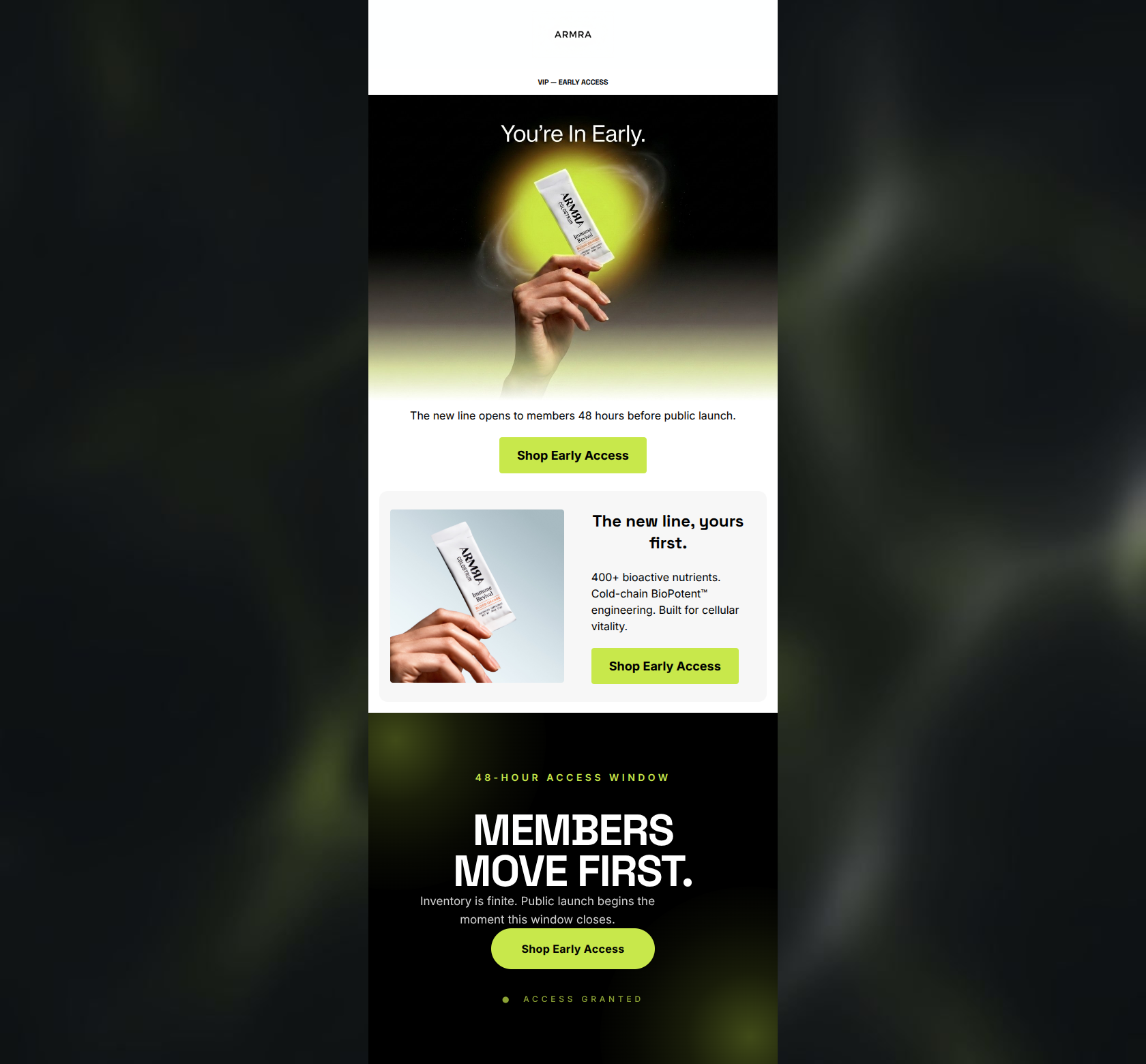
“You're in. Early access starts now.”
Design Score
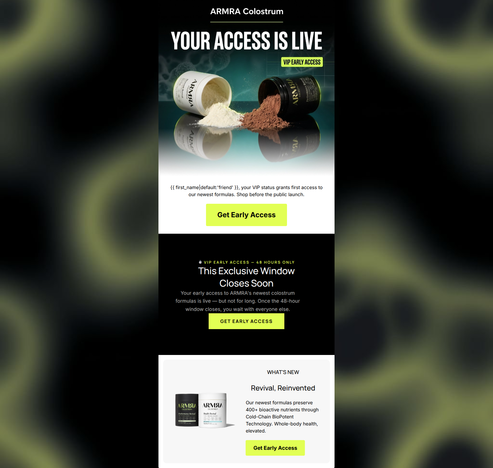
83/100This is a strong, effective promotional email that successfully leverages exclusivity and urgency to drive clicks. The visual application of ARMRA's 'Clinical Vibrancy' brand identity is striking, particularly in the hero section, and the repetitive, high-contrast calls-to-action are perfectly executed. However, the email relies slightly too heavily on FOMO ('VIP Early Access') at the expense of reminding the user *why* they want the product in the first place. The visual flow also becomes slightly disjointed due to the harsh color-blocking transitions. Overall, it's a high-performing baseline that needs only minor structural and messaging tweaks to reach excellence.
Create Your Own
Generate professional email designs like this one in seconds with Kopi AI.
Email Details
- Subject Line
- You're in. Early access starts now.
- Brand
- ARMRA [eval-prod 2026-04-15]
- Industry
- Health & Wellness
- Email Type
- Product Launch
- Created
- April 15, 2026
Brand Colors
Email Copy
friend, your VIP status grants first access to our newest formulas. Shop before the public launch.
→ Get Early Access
WHAT'S NEW
Revival, Reinvented
Our newest formulas preserve 400+ bioactive nutrients through Cold-Chain BioPotent Technology. Whole-body health, elevated.
→ Get Early Access
Why This Email Works
This is a strong, effective promotional email that successfully leverages exclusivity and urgency to drive clicks. The visual application of ARMRA's 'Clinical Vibrancy' brand identity is striking, particularly in the hero section, and the repetitive, high-contrast calls-to-action are perfectly executed. However, the email relies slightly too heavily on FOMO ('VIP Early Access') at the expense of reminding the user *why* they want the product in the first place. The visual flow also becomes slightly disjointed due to the harsh color-blocking transitions. Overall, it's a high-performing baseline that needs only minor structural and messaging tweaks to reach excellence.
Hero (top/initial part) Impact
85/100- Striking visual design that perfectly captures the brand's 'Clinical Vibrancy' aesthetic.
- Strong, action-oriented headline that immediately communicates the email's purpose.
- High-quality product imagery that feels premium and aspirational.
Content Structure & Flow
80/100- Logical progression from high-level announcement to specific product details.
- Clear demarcation of different content areas.
- The urgency block is strategically placed to capture attention before the final product push.
Visual Hierarchy & Layout
82/100- Excellent use of color contrast to highlight calls to action.
- Clear typographic hierarchy makes scanning easy.
- The use of space generally feels airy and premium.
Call-to-Action Strength
95/100- Perfect repetition of the primary CTA.
- High-contrast button color ensures maximum visibility.
- Clear, action-oriented button copy.
Message Clarity & Tone
82/100- Successfully creates a sense of exclusivity and VIP treatment.
- Maintains a professional yet energetic tone.
- Clear communication of timelines and expectations.
Readability & Scannability
88/100- Excellent contrast between text and background colors.
- Short, punchy sentences.
- Effective use of negative space to prevent visual clutter.
Offer & Value Proposition
75/100- The exclusivity of the offer is highly appealing to a premium demographic.
- The urgency factor is clear and compelling.
Personalization & Audience Fit
78/100- Effective use of basic personalization tags.
- Appeals directly to the audience's desire for premium, exclusive experiences.
Copy Conciseness & Word Economy
85/100- No unnecessary fluff or throat-clearing.
- Direct and to the point.
- Strong use of active verbs.
Quick Wins
- Standardize CTA button text casing across all three buttons.
- Tighten the copy in the central urgency block to remove repetition ('window closes' is used twice).
- Left-align the text in the final 'WHAT'S NEW' block for better readability.
Create Professional Email Designs
Generate beautiful, on-brand email designs in seconds. Just enter your brand URL and let AI do the rest.