SaaS & Software Promotional Email Template
“Your website should work harder than you”
Design Score
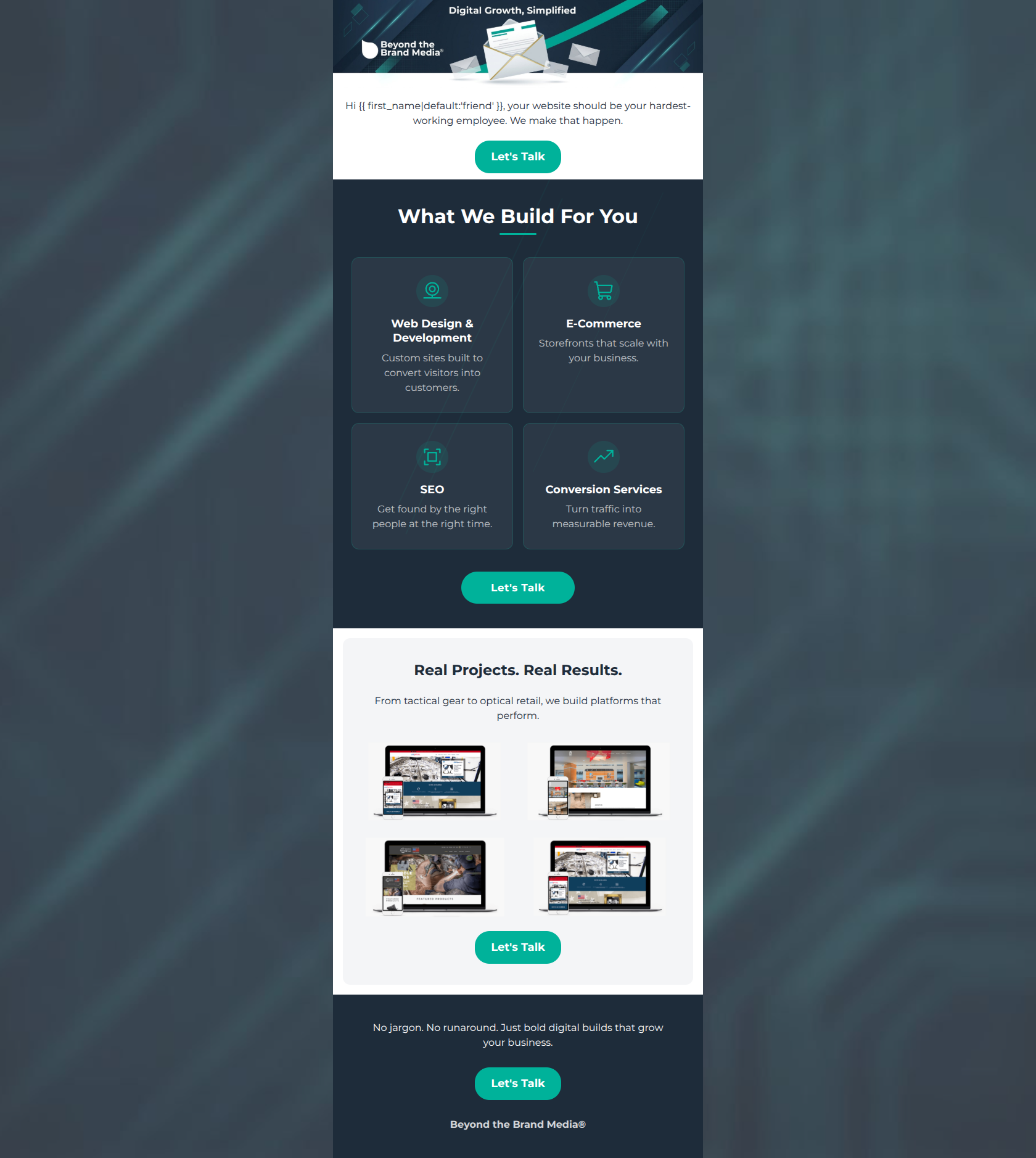
84/100This is a strong, highly competent promotional email that clearly communicates the brand's value proposition without relying on jargon. The visual hierarchy is clean, the color contrast is excellent, and the execution of a singular, repeated Call-to-Action is flawless. The primary areas holding this back from a 90+ score are a somewhat generic, abstract hero image that doesn't immediately scream 'web development' and portfolio thumbnails that are too small to serve as effective social proof.
Create Your Own
Generate professional email designs like this one in seconds with Kopi AI.
Email Details
- Subject Line
- Your website should work harder than you
- Brand
- Beyond the Brand Media®
- Industry
- SaaS & Software
- Email Type
- Promotional
- Created
- April 23, 2026
Brand Colors
Email Copy
Hi friend, your website should be your hardest-working employee. We make that happen.
→ Let's Talk
Real Projects. Real Results.
From tactical gear to optical retail, we build platforms that perform.
→ Let's Talk
No jargon. No runaround. Just bold digital builds that grow your business.
→ Let's Talk
Beyond the Brand Media®
Why This Email Works
This is a strong, highly competent promotional email that clearly communicates the brand's value proposition without relying on jargon. The visual hierarchy is clean, the color contrast is excellent, and the execution of a singular, repeated Call-to-Action is flawless. The primary areas holding this back from a 90+ score are a somewhat generic, abstract hero image that doesn't immediately scream 'web development' and portfolio thumbnails that are too small to serve as effective social proof.
Hero Impact
75/100- The opening hook ('your website should be your hardest-working employee') perfectly targets the business owner's mindset.
- Immediate use of personalization alongside a highly visible primary CTA.
Content Structure & Flow
85/100- Excellent progression from high-level value proposition to specific service details.
- The footer section serves as a great final summation rather than just throwing away space.
Visual Hierarchy & Layout
80/100- The alternating dark navy and light grey/white backgrounds create clear, distinct sections.
- The use of Phosphor-style icons in the services grid draws the eye naturally through the options.
Call-to-Action Strength
95/100- Perfect repetition: four buttons, identical copy ('Let's Talk'), all driving to the exact same destination.
- The vibrant teal (#00B29A) creates phenomenal contrast against both the dark navy (#1E2C3A) and white backgrounds, easily passing the squint test.
Message Clarity & Tone
90/100- Phrases like 'No jargon. No runaround.' perfectly encapsulate the brand's positioning against competitors.
- Service descriptions are benefit-driven (e.g., 'Turn traffic into revenue' instead of 'A/B testing and analytics').
Readability & Scannability
88/100- Excellent use of short, punchy sentences.
- The card layout for the four services breaks down complex offerings into easily digestible visual chunks.
Offer & Value Proposition
75/100- The core value prop is stated plainly in the first two sentences.
- Connects technical services directly to revenue and scale.
Personalization & Audience Fit
80/100- Speaks to specific B2B pain points (jargon, platforms that don't perform).
- Uses the first name tag organically in the opening line.
Copy Conciseness & Word Economy
92/100- Zero throat-clearing or fluffy introductory paragraphs.
- The footer summary ('Just bold digital builds that grow your business') is a perfect distillation of the brand.
Quick Wins
- Make the portfolio images significantly larger so the quality of the work is actually visible on mobile devices.
- Trim minor words in the services cards to ensure all four descriptions are exactly the same length visually.
- Constrain the width of the opening text paragraph to improve readability.




Create Professional Email Designs
Generate beautiful, on-brand email designs in seconds. Just enter your brand URL and let AI do the rest.