Electronics & Tech Promotional Email Template
“Your website should work as hard as you do”
Design Score
86/100This is a highly competent, well-executed promotional email that clearly understands its target audience. It embraces the brand's 'complex things made simple' ethos by using tight copy, a logical inverted-pyramid structure, and a unified, repeating primary Call-to-Action. While it excels in word economy and structural flow, it leaves minor conversion opportunities on the table regarding contrast in the dark section and the substantiation of its 'Real Results' claims.
Create Your Own
Generate professional email designs like this one in seconds with Kopi AI.
Email Details
- Subject Line
- Your website should work as hard as you do
- Brand
- Beyond the Brand Media®
- Industry
- Electronics & Tech
- Email Type
- Promotional
- Created
- April 23, 2026
Brand Colors
Email Copy
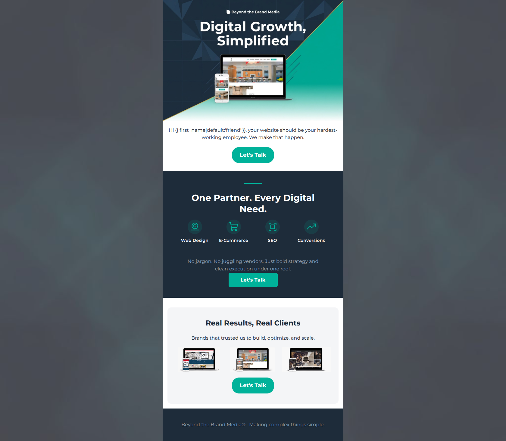
Hi friend, your website should be your hardest-working employee. We make that happen.
→ Let's Talk
Real Results, Real Clients
Brands that trusted us to build, optimize, and scale.
→ Let's Talk
Beyond the Brand Media® · Making complex things simple.
Why This Email Works
This is a highly competent, well-executed promotional email that clearly understands its target audience. It embraces the brand's 'complex things made simple' ethos by using tight copy, a logical inverted-pyramid structure, and a unified, repeating primary Call-to-Action. While it excels in word economy and structural flow, it leaves minor conversion opportunities on the table regarding contrast in the dark section and the substantiation of its 'Real Results' claims.
Hero Impact
82/100- Headline instantly communicates the core value proposition.
- Strong use of brand colors sets a professional tone immediately.
Content Structure & Flow
88/100- Excellent use of distinct sections to break up cognitive load.
- The flow logically builds the case for booking a consultation.
Visual Hierarchy & Layout
80/100- Good use of whitespace in the 'Real Results' section to prevent clutter.
- Clear distinction between headers and body copy.
Call-to-Action Strength
96/100- Perfect repetition of a single, clear action.
- Excellent color contrast makes the buttons the most prominent elements on the screen.
Message Clarity & Tone
92/100- Tone is confident, professional, and empathetic to the user's frustrations.
- Directly addresses the desire to avoid 'juggling vendors'.
Readability & Scannability
85/100- Short, punchy sentences cater to skimming behavior.
- Service pillars allow users to quickly identify their specific need.
Offer & Value Proposition
78/100- The core offer of consolidating digital services under one roof is compelling.
- The value proposition is stated clearly and early.
Personalization & Audience Fit
85/100- Language directly targets the specific pain points of the defined audience.
- Appropriate use of personalization tags without being overly familiar.
Copy Conciseness & Word Economy
94/100- Zero filler content; highly distilled messaging.
- The description in the dark section is a masterclass in concise value communication.
Quick Wins
- Lighten the gray text (`#94A3B8`) in the dark navy section to a brighter off-white to improve contrast and readability.
- Increase the size of the portfolio thumbnails in the bottom section so the work is easier to see on a quick scan.
- Slightly enlarge the teal service icons in the middle section to better anchor the text below them.




Create Professional Email Designs
Generate beautiful, on-brand email designs in seconds. Just enter your brand URL and let AI do the rest.