Other Promotional Email Template
“Your website should be closing deals”
Design Score
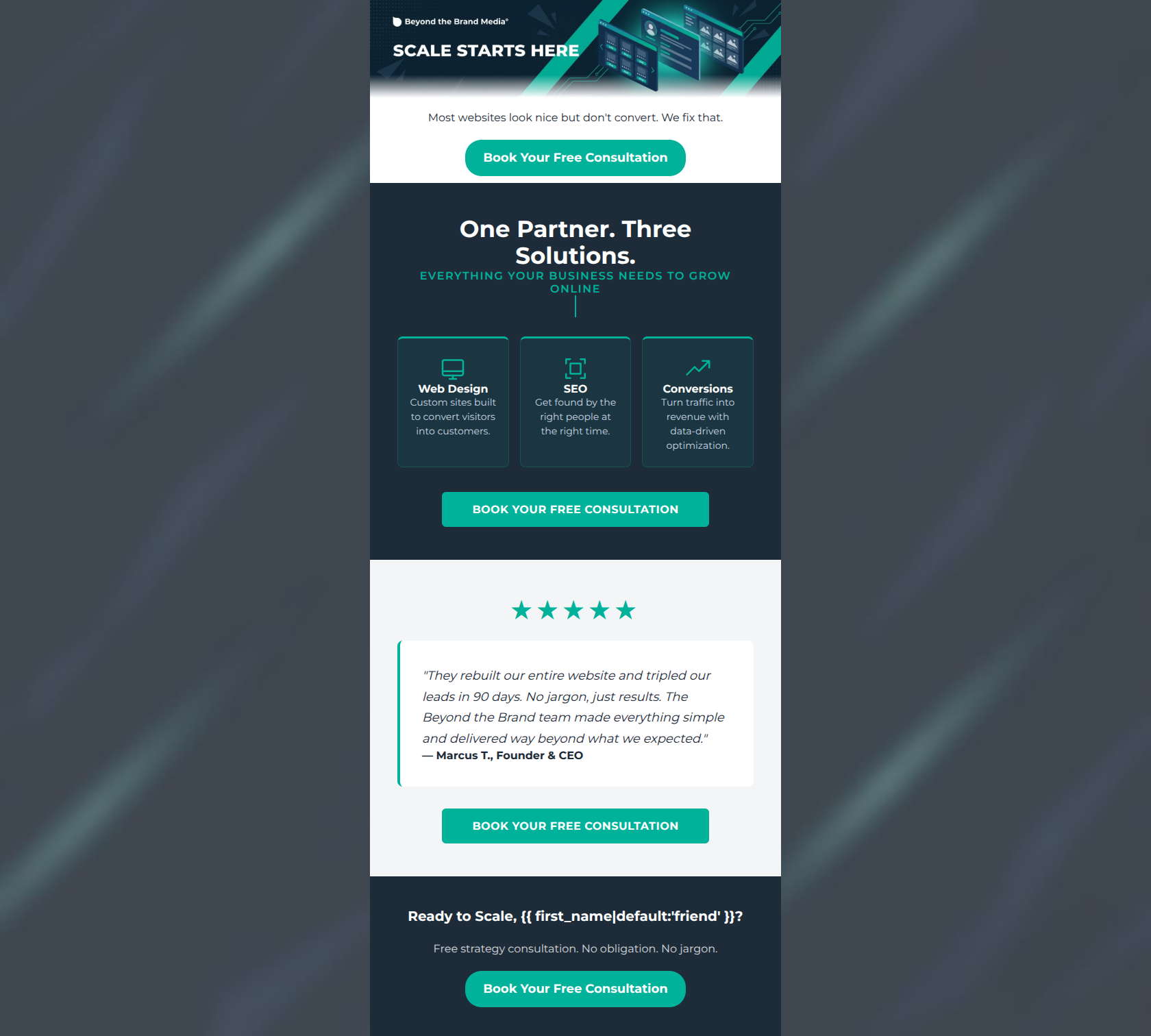
82/100This is a strong, highly focused promotional email that effectively captures the 'no-jargon' brand voice. It clearly identifies a core customer pain point ('Most websites look nice but don't convert') and offers a low-friction solution (a free consultation). The structure is logical, moving from problem to solution to social proof. The email's biggest strength is its relentless focus on a single primary call-to-action. However, it suffers from some visual hierarchy issues—specifically, relying on text baked into the hero image and utilizing font sizes that are too small in the service grid and hero text block, which slightly diminishes its overall impact.
Create Your Own
Generate professional email designs like this one in seconds with Kopi AI.
Email Details
- Subject Line
- Your website should be closing deals
- Brand
- Beyond the Brand Media®
- Industry
- Other
- Email Type
- Promotional
- Created
- April 23, 2026
Brand Colors
Email Copy
Most websites look nice but don't convert. We fix that.
→ Book Your Free Consultation
Ready to Scale, friend?
Free strategy consultation. No obligation. No jargon.
→ Book Your Free Consultation
Why This Email Works
This is a strong, highly focused promotional email that effectively captures the 'no-jargon' brand voice. It clearly identifies a core customer pain point ('Most websites look nice but don't convert') and offers a low-friction solution (a free consultation). The structure is logical, moving from problem to solution to social proof. The email's biggest strength is its relentless focus on a single primary call-to-action. However, it suffers from some visual hierarchy issues—specifically, relying on text baked into the hero image and utilizing font sizes that are too small in the service grid and hero text block, which slightly diminishes its overall impact.
Hero Impact
75/100- Immediately addresses a core customer pain point.
- Graphic style aligns perfectly with the brand's technical and bold aesthetic.
Content Structure & Flow
82/100- Logical flow from problem identification to solution to proof.
- Clear visual delineation of different content sections using the brand palette.
Visual Hierarchy & Layout
72/100- Spacious grid-based layout for services aligns well with the brand guidelines.
- Testimonial card effectively breaks the visual rhythm to draw attention.
Call-to-Action Strength
95/100- Relentless focus on a single primary action.
- High-contrast teal buttons ensure the CTA pops against both white and navy backgrounds.
- Button copy is action-oriented and clear about the value (Free Consultation).
Message Clarity & Tone
88/100- Excellent adherence to the 'no jargon' brand mandate.
- Confident, problem-solving tone that builds trust.
Readability & Scannability
76/100- Use of icons helps anchor the eye when scanning the services.
- Short, focused text blocks prevent cognitive overload.
Offer & Value Proposition
84/100- Clear statement of value in the hero text.
- Low-friction, logical next step offered as the primary CTA.
Personalization & Audience Fit
78/100- Addresses specific pain points of the target demographic effectively.
Copy Conciseness & Word Economy
90/100- Zero filler text; highly distilled messaging.
- Respects the busy reader's time by getting straight to the point.
Quick Wins
- Increase the font size of the text immediately below the hero image.
- Change the color of the 'EVERYTHING YOUR BUSINESS NEEDS TO GROW ONLINE' subhead to white to fix low contrast against the navy background.
- Update the personalization fallback tag from 'friend' to 'founder' for a more professional B2B tone.




Create Professional Email Designs
Generate beautiful, on-brand email designs in seconds. Just enter your brand URL and let AI do the rest.