SaaS & Software Promotional Email Template
“Your website is losing you money”
Design Score
90/100This is an exceptionally strong, conversion-focused promotional email. It masterfully applies an inverted pyramid structure, utilizing tight, benefit-driven copy that directly addresses the target audience's pain points. The tone perfectly hits the 'no jargon' brand promise, and the CTA strategy is flawless, relying on repetition of a single, highly visible action. The only notable flaws are locking the primary headline inside an image file and utilizing a curved visual transition that conflicts with the brand's geometric aesthetic.
Create Your Own
Generate professional email designs like this one in seconds with Kopi AI.
Email Details
- Subject Line
- Your website is losing you money
- Brand
- Beyond the Brand Media®
- Industry
- SaaS & Software
- Email Type
- Promotional
- Created
- April 23, 2026
Brand Colors
Email Copy
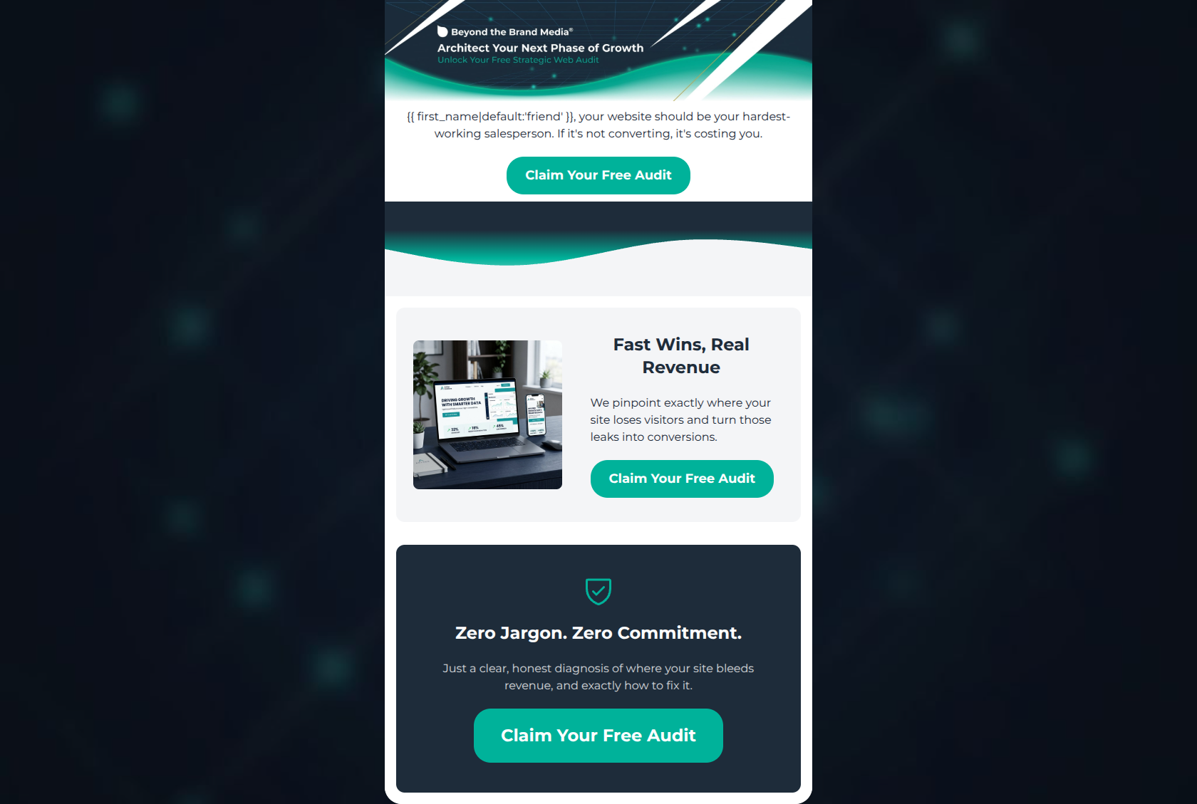
friend, your website should be your hardest-working salesperson. If it's not converting, it's costing you.
→ Claim Your Free Audit
Fast Wins, Real Revenue
We pinpoint exactly where your site loses visitors and turn those leaks into conversions.
→ Claim Your Free Audit
Zero Jargon. Zero Commitment.
Just a clear, honest diagnosis of where your site bleeds revenue, and exactly how to fix it.
→ Claim Your Free Audit
Why This Email Works
This is an exceptionally strong, conversion-focused promotional email. It masterfully applies an inverted pyramid structure, utilizing tight, benefit-driven copy that directly addresses the target audience's pain points. The tone perfectly hits the 'no jargon' brand promise, and the CTA strategy is flawless, relying on repetition of a single, highly visible action. The only notable flaws are locking the primary headline inside an image file and utilizing a curved visual transition that conflicts with the brand's geometric aesthetic.
Hero Impact
82/100- Establishes immediate relevance with the 'costing you' pain-point hook.
- Contrasting teal CTA button is instantly visible against the white background.
Content Structure & Flow
88/100- Logical progression from problem awareness to solution to risk reversal.
- Distinct visual blocks make it easy to digest the three core concepts.
Visual Hierarchy & Layout
85/100- High-contrast background blocking keeps the reader's eye moving downward.
- Generous whitespace around text prevents the 'wall of text' feeling and reduces cognitive load.
Call-to-Action Strength
98/100- Perfect consistency in CTA copy ('Claim Your Free Audit') reinforces the user's expected outcome.
- Exceptional color contrast makes the buttons the most visually prominent elements in the email.
- Frequent repetition ensures a click opportunity is always within the viewport.
Message Clarity & Tone
95/100- Avoids technical jargon entirely, focusing purely on business outcomes.
- Uses direct, confident language that positions the agency as an expert guide.
Readability & Scannability
90/100- Zero dense paragraphs; every text block is ruthlessly edited down to its core message.
- Excellent use of clear, contrasting typography.
Offer & Value Proposition
88/100- The offer is highly relevant to the pain points of the target persona.
- Strong risk-reversal tactics ('Zero Commitment') reduce the friction of claiming the offer.
Personalization & Audience Fit
90/100- Uses liquid tags to personalize the opening greeting.
- Addresses the emotional pain point of feeling like digital efforts are 'costing' them.
Copy Conciseness & Word Economy
95/100- The copy reads as intentional and heavily edited.
- Fewer sections with tighter copy outperforms many sections with diluted messaging—this email proves that rule.
Quick Wins
- Clarify the format of the audit in the copy (e.g., 'Receive a custom video breakdown' or 'Get your PDF report').
- Replace the curved 'swoopy' visual transition with a stark, geometric diagonal line to adhere to brand guidelines.




Create Professional Email Designs
Generate beautiful, on-brand email designs in seconds. Just enter your brand URL and let AI do the rest.