Other Promotional Email Template
“Your website is losing you money 👀”
Design Score
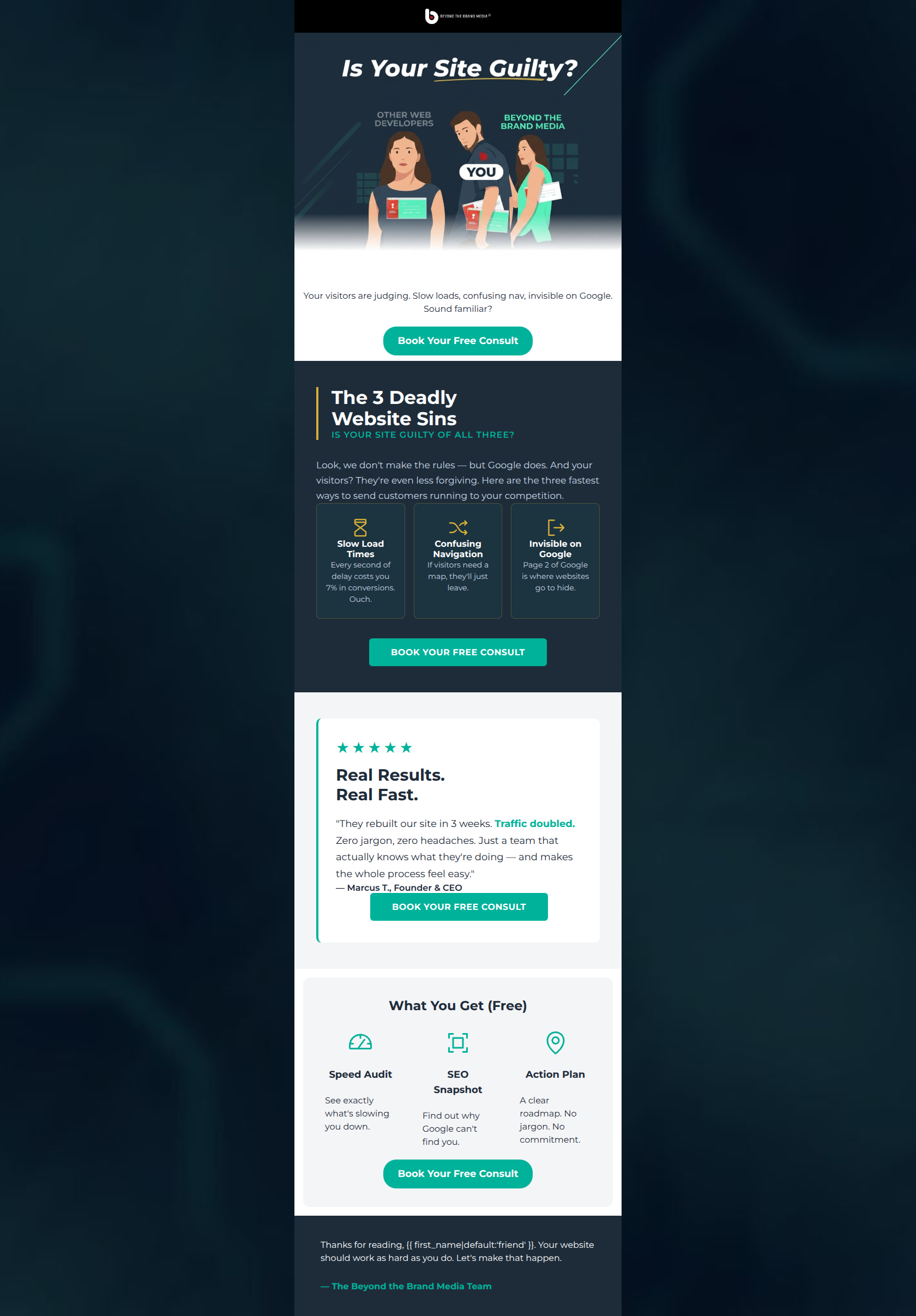
82/100This is a structurally sound promotional email that effectively utilizes a Problem-Agitation-Solution (PAS) framework to drive users toward a well-defined 'Free Consult' offer. The breakdown of the consult into tangible deliverables (Audit, Snapshot, Action Plan) is a masterclass in lowering the barrier to entry. The repetition of a single, high-contrast primary CTA is excellent. However, the email's premium B2B positioning is slightly undermined by the use of an internet meme in the hero section, which may alienate the target demographic of established business owners. Additionally, there is noticeable copy redundancy early in the email that dilutes the impact of the core message.
Create Your Own
Generate professional email designs like this one in seconds with Kopi AI.
Email Details
- Subject Line
- Your website is losing you money 👀
- Brand
- Beyond the Brand Media®
- Industry
- Other
- Email Type
- Promotional
- Created
- April 23, 2026
Brand Colors
Email Copy
Your visitors are judging. Slow loads, confusing nav, invisible on Google. Sound familiar?
→ Book Your Free Consult
What You Get (Free)
Speed Audit
See exactly what's slowing you down.
SEO Snapshot
Find out why Google can't find you.
Action Plan
A clear roadmap. No jargon. No commitment.
→ Book Your Free Consult
Thanks for reading, friend. Your website should work as hard as you do. Let's make that happen.
— The Beyond the Brand Media Team
Why This Email Works
This is a structurally sound promotional email that effectively utilizes a Problem-Agitation-Solution (PAS) framework to drive users toward a well-defined 'Free Consult' offer. The breakdown of the consult into tangible deliverables (Audit, Snapshot, Action Plan) is a masterclass in lowering the barrier to entry. The repetition of a single, high-contrast primary CTA is excellent. However, the email's premium B2B positioning is slightly undermined by the use of an internet meme in the hero section, which may alienate the target demographic of established business owners. Additionally, there is noticeable copy redundancy early in the email that dilutes the impact of the core message.
Hero (top/initial part) Impact
70/100- Establishes an immediate 'us vs. them' dynamic.
- Headline hooks the reader with a provocative question.
Content Structure & Flow
88/100- Excellent use of the Problem-Agitation-Solution (PAS) framework.
- The placement of the testimonial immediately before the final offer builds necessary trust.
Visual Hierarchy & Layout
85/100- Strong horizontal banding to separate logical sections.
- Grid layouts in the 'Sins' and 'What You Get' sections make complex information easy to scan.
Call-to-Action Strength
98/100- Perfect repetition of the primary conversion goal.
- Excellent color contrast for the buttons against all background variations.
Message Clarity & Tone
80/100- Effectively translates technical web issues into business impacts (e.g., 'Every second of delay costs you 7% in conversions').
- Absolutely nails the jargon-free brand voice requirement.
Readability & Scannability
86/100- Excellent use of icons as visual anchors for text blocks.
- Strategic bolding and colored text (like 'Traffic doubled') draws the eye to key benefits.
Offer & Value Proposition
92/100- Brilliant tangibilization of a service offer.
- Directly addresses and neutralizes user objections ('No jargon. No commitment').
Personalization & Audience Fit
72/100- Accurately diagnoses the exact frustrations of the target market.
- Uses basic personalization in the sign-off to feel slightly more direct.
Copy Conciseness & Word Economy
75/100- The actual descriptions inside the grid cards are incredibly concise and punchy.
Quick Wins
- Delete the text block 'Your visitors are judging. Slow loads, confusing nav, invisible on Google. Sound familiar?' located directly under the hero image to remove immediate redundancy.
- Change the 5-star rating color in the testimonial card to gold (#D4AF37) to prevent visual competition with the primary CTA button.
- Condense the introductory paragraph in the '3 Deadly Sins' section into a single sentence, such as: 'Here are the three fastest ways to send customers running to your competition:'.




Create Professional Email Designs
Generate beautiful, on-brand email designs in seconds. Just enter your brand URL and let AI do the rest.