Electronics & Tech Promotional Email Template
“Your website is losing you money”
Design Score
81/100This promotional email from Beyond the Brand Media is visually striking and tightly written, effectively leveraging the agency's 'jargon-free' and highly capable brand positioning. The inverted pyramid structure logically guides the reader from a strong pain-point hook (outdated websites) through the solution and into reassuring social proof. The copy is punchy and respectful of the reader's time. However, the conversion path is diluted at the very end by a competing secondary button, and the core offer ('Free Quote') could be framed to sound less like a commodity. Removing the split path and tightening the narrative arc will push this into top-tier territory.
Create Your Own
Generate professional email designs like this one in seconds with Kopi AI.
Email Details
- Subject Line
- Your website is losing you money
- Brand
- Beyond the Brand Media®
- Industry
- Electronics & Tech
- Email Type
- Promotional
- Created
- April 22, 2026
Brand Colors
Email Copy
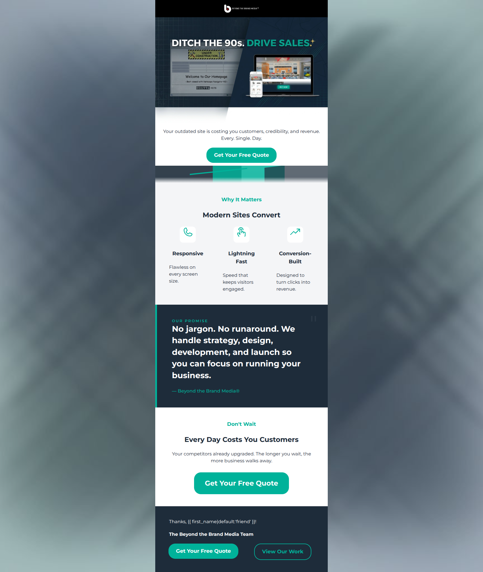
Your outdated site is costing you customers, credibility, and revenue. Every. Single. Day.
→ Get Your Free Quote
Why It Matters
Modern Sites Convert
Responsive
Flawless on every screen size.
Lightning Fast
Speed that keeps visitors engaged.
Conversion-Built
Designed to turn clicks into revenue.
Don't Wait
Every Day Costs You Customers
Your competitors already upgraded. The longer you wait, the more business walks away.
→ Get Your Free Quote
Thanks, friend!
The Beyond the Brand Media Team
→ Get Your Free Quote
→ View Our Work
Why This Email Works
This promotional email from Beyond the Brand Media is visually striking and tightly written, effectively leveraging the agency's 'jargon-free' and highly capable brand positioning. The inverted pyramid structure logically guides the reader from a strong pain-point hook (outdated websites) through the solution and into reassuring social proof. The copy is punchy and respectful of the reader's time. However, the conversion path is diluted at the very end by a competing secondary button, and the core offer ('Free Quote') could be framed to sound less like a commodity. Removing the split path and tightening the narrative arc will push this into top-tier territory.
Hero (top/initial part) Impact
85/100- Immediate, visceral visual communication of the problem.
- Punchy, contrasting headline that pairs a directive ('Ditch') with an outcome ('Drive Sales').
- Clear alignment of the initial copy with the primary target audience's financial anxieties.
Content Structure & Flow
88/100- Textbook problem-agitation-solution (PAS) framework application.
- The pull quote serves as a perfect tonal break, providing reassurance right before the final pitch.
- Clear demarcation of sections using alternating background colors.
Visual Hierarchy & Layout
78/100- Strong use of the vibrant teal brand color to isolate and elevate key information and CTAs.
- The dark navy background on the pull quote provides excellent contrast and visual weight, signaling its importance.
- Clean, sans-serif typography enhances scannability.
Call-to-Action Strength
65/100- The primary CTA color (teal) contrasts perfectly with both white and dark backgrounds.
- Repetition of the primary CTA establishes a clear expected action for the user.
- Button copy is action-oriented.
Message Clarity & Tone
92/100- Exceptional alignment with the 'make complex things simple' brand ethos.
- Direct, confident voice that establishes authority without arrogance.
- The pull quote directly addresses the audience's likely primary objection (time/hassle).
Readability & Scannability
85/100- Excellent use of short, punchy statements ('Every. Single. Day.').
- High-contrast text on all background elements.
- Headings successfully tell the story independently of the body copy.
Offer & Value Proposition
72/100- The connection between the service (web design) and the client's goal (revenue) is made explicit.
- The value prop is focused on outcomes, not features.
Personalization & Audience Fit
75/100- Deep understanding of the target audience's pain points (wasted time, lost revenue, confusing agencies).
- Consistent use of 'You/Your' places the customer at the center of the narrative.
Copy Conciseness & Word Economy
85/100- Zero filler language or meaningless adjectives.
- Benefits are distilled into bite-sized, three-word phrases ('Designed to turn clicks into revenue').
Quick Wins
- Remove the secondary 'View Our Work' button at the bottom of the email to eliminate visual competition and funnel all clicks to the primary CTA.
- Update the icon for 'Lightning Fast' to ensure the visual matches the copy (e.g., a stopwatch or literal lightning bolt, rather than a pointing hand).
- Reduce the vertical padding slightly around the hero subtext to visually group it with the hero image and the first CTA button.




Create Professional Email Designs
Generate beautiful, on-brand email designs in seconds. Just enter your brand URL and let AI do the rest.