Beauty & Skincare Promotional Email Template
“Your summer skin routine, sorted.”
Design Score
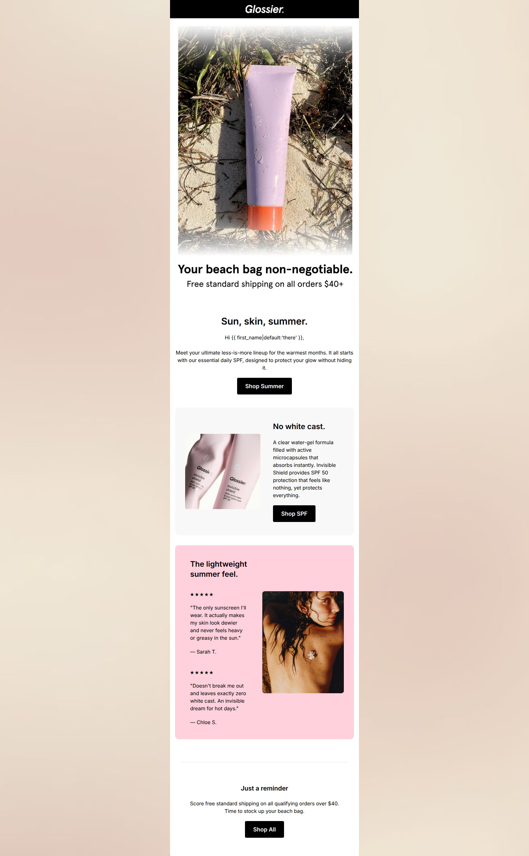
78/100This email effectively captures Glossier's 'cool-girl', effortless aesthetic with strong editorial imagery and spot-on copywriting. The messaging directly addresses core customer pain points regarding sunscreen (white cast, heavy feel, breakouts) and frames the product as a solution. However, the email suffers from structural and formatting issues—most notably a disjointed hero section with competing headlines and centered body copy that makes scanning difficult. By tightening the visual hierarchy and bringing the primary value proposition higher up, this email could perform significantly better.
Create Your Own
Generate professional email designs like this one in seconds with Kopi AI.
Email Details
- Subject Line
- Your summer skin routine, sorted.
- Brand
- Glossier [eval 2026-03-21]
- Industry
- Beauty & Skincare
- Email Type
- Promotional
- Created
- March 21, 2026
Brand Colors
Email Copy
Sun, skin, summer.
Hi there, Meet your ultimate less-is-more lineup for the warmest months. It all starts with our essential daily SPF, designed to protect your glow without hiding it.
→ Shop Summer
No white cast.
A clear water-gel formula filled with active microcapsules that absorbs instantly. Invisible Shield provides SPF 50 protection that feels like nothing, yet protects everything.
→ Shop SPF
The lightweight summer feel.
★ ★ ★ ★ ★
"The only sunscreen I'll wear. It actually makes my skin look dewier and never feels heavy or greasy in the sun."
— Sarah T.
★ ★ ★ ★ ★
"Doesn't break me out and leaves exactly zero white cast. An invisible dream for hot days."
— Chloe S.
Just a reminder
Score free standard shipping on all qualifying orders over $40. Time to stock up your beach bag.
→ Shop All
Why This Email Works
This email effectively captures Glossier's 'cool-girl', effortless aesthetic with strong editorial imagery and spot-on copywriting. The messaging directly addresses core customer pain points regarding sunscreen (white cast, heavy feel, breakouts) and frames the product as a solution. However, the email suffers from structural and formatting issues—most notably a disjointed hero section with competing headlines and centered body copy that makes scanning difficult. By tightening the visual hierarchy and bringing the primary value proposition higher up, this email could perform significantly better.
Hero (top/initial part) Impact
65/100- Highly textural, unposed brand photography sets the right mood immediately.
- The $40+ free shipping offer is stated right away, establishing clear value.
Content Structure & Flow
75/100- Follows a classic, proven conversion structure: Hook -> Solution -> Proof -> Urgency.
- The alternating layout (hero -> centered -> left-aligned cards) helps distinguish different content types.
Visual Hierarchy & Layout
70/100- Excellent use of the brand's stark black-and-white UI elements against soft background colors.
- The millennial pink background on the testimonial block effectively draws attention to the social proof.
Call-to-Action Strength
82/100- Stark black buttons on light backgrounds ensure passing the 'squint test' with flying colors.
- Verbs are clear and direct, leaving no ambiguity about the action.
Message Clarity & Tone
92/100- Exceptional translation of product features (active microcapsules, water-gel) into tangible benefits (no white cast, absorbs instantly).
- The tone is confident, conversational, and peer-to-peer, perfectly matching the brand voice.
Readability & Scannability
68/100- Short, punchy section headers ('No white cast.', 'The lightweight summer feel.') are excellent for skimmers.
- High color contrast between text and background across all sections.
Offer & Value Proposition
88/100- Directly tackles the biggest friction points of the product category (white cast, greasiness, breakouts).
- Free shipping offer is stated early in the hero and reinforced at the bottom as a final push.
Personalization & Audience Fit
85/100- Visuals match the aspirational, effortless lifestyle of the target demographic perfectly.
- Copy uses 'your' effectively to help the reader visualize themselves using the product ('your beach bag', 'your ultimate lineup').
Quick Wins
- Left-align the body copy in the hero section to dramatically improve readability.
- Remove the secondary 'Sun, skin, summer.' headline and combine the hero text into a single cohesive hook.
- Add an extra 10-15px of vertical space between the two testimonial quotes to make them easier to digest.
- Drop the generic 'Hi {{ first_name }},' to maintain the sleek, editorial feel of the email.

Create Professional Email Designs
Generate beautiful, on-brand email designs in seconds. Just enter your brand URL and let AI do the rest.