Beauty & Skincare Cart Abandonment Email Template
“Your considered selections await”
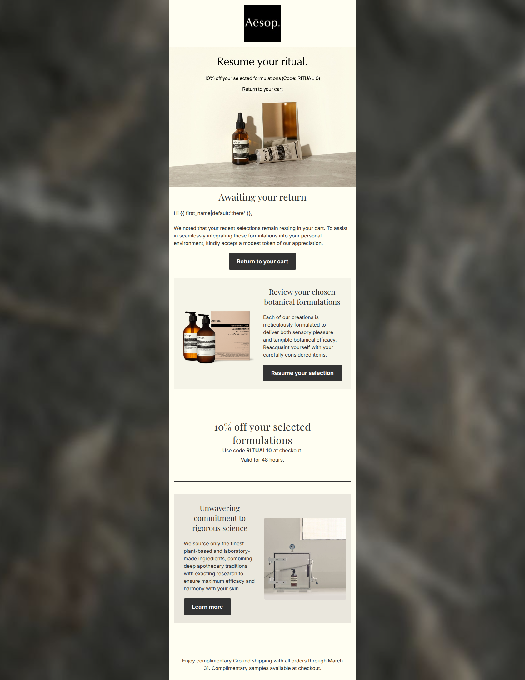
Design Score
74/100While aesthetically aligned with Aesop’s sophisticated brand identity, this cart abandonment email suffers from a fragmented layout and a lack of dynamic product personalization. Consolidating the repetitive offer sections and injecting actual abandoned cart items will significantly reduce cognitive load and lift conversion.
Create Your Own
Generate professional email designs like this one in seconds with Kopi AI.
Email Details
- Subject Line
- Your considered selections await
- Brand
- Aesop
- Industry
- Beauty & Skincare
- Email Type
- Cart Abandonment
- Created
- March 5, 2026
Brand Colors
Email Copy
Awaiting your return
Hi there, We noted that your recent selections remain resting in your cart. To assist in seamlessly integrating these formulations into your personal environment, kindly accept a modest token of our appreciation.
→ Return to your cart
Review your chosen botanical formulations
Each of our creations is meticulously formulated to deliver both sensory pleasure and tangible botanical efficacy. Reacquaint yourself with your carefully considered items.
→ Resume your selection
Unwavering commitment to rigorous science
We source only the finest plant-based and laboratory-made ingredients, combining deep apothecary traditions with exacting research to ensure maximum efficacy and harmony with your skin.
→ Learn more
Enjoy complimentary Ground shipping with all orders through March 31. Complimentary samples available at checkout.
Why This Email Works
While aesthetically aligned with Aesop’s sophisticated brand identity, this cart abandonment email suffers from a fragmented layout and a lack of dynamic product personalization. Consolidating the repetitive offer sections and injecting actual abandoned cart items will significantly reduce cognitive load and lift conversion.
Hero Impact
70/100- Immediately answers 'why should I care?' by placing the 10% discount and code right at the top of the email.
- The minimalist logo placement establishes immediate brand trust without pushing core content below the fold.
Content Structure & Flow
65/100- The inclusion of a 'brand proof' section ('Unwavering commitment to rigorous science') is an excellent way to rebuild value and justify the premium price point to hesitant buyers.
- Logical use of alternating layouts (image left/text right, text left/image right) keeps the eye moving downward.
Visual Hierarchy & Layout
75/100- Excellent use of subtle background color shifts (from cream to pale grey/beige) to delineate different sections without relying on harsh borders.
- Ample padding around text blocks prevents the layout from feeling cluttered, perfectly matching Aesop's premium positioning.
Call-to-Action Strength
72/100- The dark charcoal buttons provide excellent, unmistakable contrast against the cream background.
- The CTA copy ('Resume your selection') is highly on-brand and elevates the standard 'Checkout' language.
Message Clarity & Tone
90/100- Flawless brand voice. Phrases like 'botanical efficacy', 'sensory pleasure', and 'meticulously formulated' perfectly resonate with the affluent, considered target demographic.
- The framing of self-care as a 'ritual' and the home as a 'personal environment' elevates the product from a mere commodity to a lifestyle enhancement.
Readability & Scannability
75/100- Line heights are generous, giving the text room to breathe and reinforcing the calm brand tone.
- High contrast between the dark grey text (#333333) and the cream background (#FFFEF2) ensures perfect legibility.
Offer & Value Proposition
80/100- The 10% offer provides a tangible incentive without severely devaluing the luxury perception of the brand.
- Adding a 48-hour expiration window introduces necessary urgency to an audience that might otherwise procrastinate.
Personalization & Audience Fit
50/100- Basic first-name personalization is present in the greeting.
- The imagery, though generic, is highly tailored to the aesthetic expectations of the target audience (amber glass, minimalist staging).
Quick Wins
- Left-align the centered paragraph under 'Awaiting your return' to instantly improve readability.
- Change the inline 'Return to your cart' text link at the very top into a prominent, high-contrast button.
- Explicitly mention the 10% discount in the body copy instead of vaguely referring to a 'modest token'.
- Move the free shipping note from the footer into a more visible position near a primary CTA.

Create Professional Email Designs
Generate beautiful, on-brand email designs in seconds. Just enter your brand URL and let AI do the rest.